7 Pattern-Mixing Rules for a Cohesive Look in Any Room
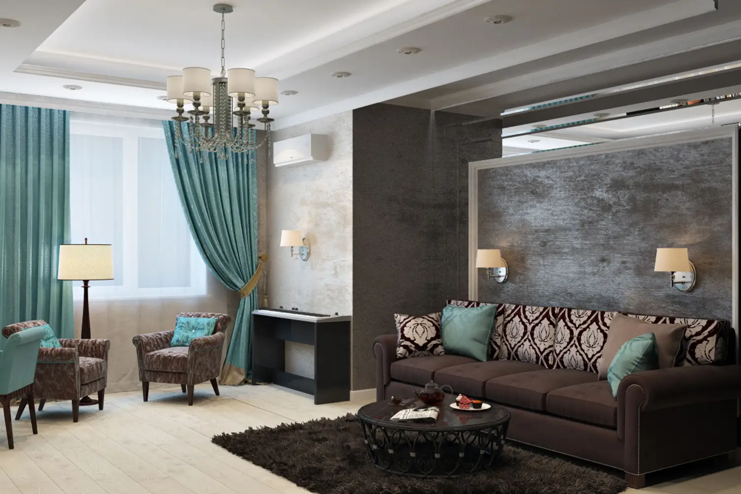
Pattern mixing can feel intimidating, but it follows a surprisingly simple logic. A three‑part sequence — starting with a bold large‑scale pattern, adding a small‑scale coordinate, then finishing with texture — creates a pulled‑together look in any room. The key is adjusting the order to match the room’s purpose: a kitchen calls for a quieter lead‑in, a bedroom asks for texture first. These seven rules walk you through that adaptable sequence so every room feels intentionally layered, not haphazard.
Quick Picks: Top Rules for Every Situation
- Best overall: Anchor with a large‑scale pattern (Rule 1) – it gives any room an instant focal point.
- Best budget: Finish with texture as the third dimension (Rule 3) – affordable throws, baskets, and woven accessories add depth without buying more printed pieces.
- Best for beginners: Step back and test the mix from across the room (Rule 7) – a simple distance check reveals whether the patterns work together before you commit.
- Best for high‑energy rooms: Let a small‑scale coordinate lead (Rule 5) – in a kitchen or hallway, a quieter pattern keeps the space from feeling overbusy.
Foundation Rules: The Sequence That Works Everywhere
These four rules give you a reliable method for cohesive mixing — use them whenever you want a sure result, no matter the room.
Anchor with a Large‑Scale Pattern First
Choose a generous print — floral drapes with blooms the size of a dinner plate, a wide‑stripe area rug, or an oversized geometric wallcovering. A pattern like this grounds the room, giving the eye a calm place to land. Standout strength: Instantly defines the space and sets the emotional tone. Main limitation: In a very small room, a giant pattern can feel overpowering; pick one with plenty of negative space so it breathes.
Add a Small‑Scale Coordinate Next
Introduce a second pattern in a noticeably smaller scale — a gingham cushion, a tiny dot throw pillow, or a pin‑stripe lampshade. The jump in scale creates a quiet rhythm that feels intentional rather than cluttered. Standout strength: Builds visual interest without competition. Main limitation: Scale contrast alone won’t save a mix that lacks a color link; always thread a shared hue between the two patterns.
Finish with Texture as the Invisible Third Pattern
Woven surfaces, nubby linen, velvet, rattan, or a chunky knit throw act like a pattern without a print. Texture completes the composition, making the room feel layered and inviting. Standout strength: Adds depth without demanding another printed piece. Main limitation: Over‑relying on texture can leave the space feeling under‑designed; it should support the visible patterns, not replace them.
Bridge the Scales with a Shared Color
Pull one color from the large‑scale pattern and repeat it in the small‑scale coordinate or the texture. A muted green from a floral drape can reappear as the background of a striped cushion or the edge of a rattan basket. Standout strength: Unifies even very different motifs instantly. Main limitation: Using only an exact match can feel stiff; a tonal variation — darker or lighter — looks more nuanced.
Room‑Specific Rules: Adapt the Order to How You Live
These three rules adjust the sequence based on a room’s energy and purpose, ensuring the final mix feels right for the way you actually use the space.
In High‑Energy Rooms, Let a Small‑Scale Coordinate Lead
Kitchens, mudrooms, and hallways already hum with activity. A quieter first impression helps — start with a small‑scale pattern (a miniature hexagon tile backsplash, a micro‑stripe runner), then introduce a larger pattern in a contained area like a valance or a seat cushion. Texture follows last. Standout strength: Prevents the room from tipping into visual chaos. Main limitation: If every pattern stays small, the space can feel busy in a different way; include at least one medium‑ or large‑scale element to break the rhythm.
In Restful Spaces, Start with Texture
Bedrooms and reading nooks need to feel like a retreat. Begin with a textural anchor — a velvet headboard, a chunky wool throw — then layer in a small‑scale pattern (a subtle stripe on a pillow) and finally a single large‑scale motif (a soft landscape‑print mural or a duvet with oversized leaves). Standout strength: Texture‑first creates a quiet envelope that feels restorative. Main limitation: Without enough actual pattern, the room can read as unfinished; the one large‑scale motif anchors the whole scheme.
Step Back and Test the Mix from Across the Room
After you’ve arranged the patterns and textures according to the room’s adapted order, walk to the doorway and look again. From a distance, do the patterns blend into a single cohesive vision, or does one leap out awkwardly? Tweak the scale or placement if needed. Standout strength: A quick, free check that catches mistakes before they become permanent. Main limitation: Distance won’t reveal color mismatches up close — test from a few different spots.
Choosing Between Foundation and Room‑Specific Rules
If you’re unsure where to begin, start with the foundation rules. They deliver a polished look in any room without asking you to analyze function first. Once you’re comfortable with the baseline, bring in the room‑specific adjustments for more tailored results. A living room often thrives on the foundation sequence, while a bedroom benefits from texture‑first. Beginners can safely mix groups: use the foundation method everywhere and borrow the distance‑testing rule to verify each room.
Comparison Table: Rules at a Glance
| Rule | Group | Sequence Role | Best Room Function | Difficulty | Budget |
|---|---|---|---|---|---|
| Anchor with a large‑scale pattern | Foundation | First step | Living, dining | Low | Varies |
| Add a small‑scale coordinate | Foundation | Second step | Any room | Low | Low |
| Finish with texture | Foundation | Third step | Any room | Low | Low |
| Bridge scales with shared color | Foundation | Throughout | Any room | Medium | Low |
| Let a small‑scale coordinate lead | Room‑Specific | Inverts order | Kitchen, hallway | Medium | Low |
| Start with texture first | Room‑Specific | Reorders sequence | Bedroom, reading nook | Medium | Low |
| Step back and test the mix | Room‑Specific | Final check | All rooms | Low | Free |
Frequently Asked Questions
Can I mix more than two printed patterns using this sequence?
Yes. Add a third print as a medium‑scale bridge — a stripe between a large floral and a tiny dot, for example. Keep the progression large, medium, small, then finish with texture. The underlying order stays the same.
What if I can’t find a large‑scale pattern for a small room?
Look for texture or a pattern with oversized elements but generous open space. A sheer curtain with large‑scale embroidery adds presence without weighing the room down.
Should all patterns share the same color palette?
Not exactly the same, but at least one color should thread through each pattern. A palette of three to four related hues plus a neutral gives the mix structure without feeling forced.
Is texture always necessary as the third dimension?
It’s highly effective but not mandatory. If a large‑scale and a small‑scale pattern already feel complete, texture remains optional — though it nearly always adds polish and keeps the eye moving.
The Best Starting Point for Any Room
For the reader decorating a living room or bedroom for the first time, begin with the foundation rule of anchoring a large‑scale pattern. Choose a piece you genuinely enjoy, and let it guide every decision that follows. That one confident choice shapes a cohesive look faster than any other step.

Clara Bennett
After five years of transforming my 1920s bungalow room by room, I’ve refinished floors, hung blinds in bay windows, and spent more time choosing light bulbs than I’d like to admit. I learned paint sheens by painting my kitchen ceiling three times, and I found out the hard way that a rug too small makes a room feel unfinished. I believe every home can be both functional and beautiful, no matter the budget.
Related posts

Decor Mixing That Works: A Realistic Plan for New Homeowners
Stop memorizing rules. Use this anchor-first framework to mix any furniture, finishes, and accessories into a room that feels intentional—step by step, with real-life starting points.
Matching Sets Are Over: How to Mix Furniture Styles Successfully
Stop buying matching sets. Use the 'common thread' method to mix furniture styles without chaos—one shared detail unifies the room. Learn how.
The Decor Rule Pros Break When Mixing Old and New
Pros ignore the 'one antique per room' rule. Learn the focal-point method that makes vintage pieces the star and modern items the frame — so the contrast reads as intentional, not accidental.

How Interior Designers Mix Colors in a Room (Steal Their System)
Stop guessing with 60-30-10. Learn how to assign square footage to each color so the eye lands where you want it first. A designer’s system you can steal.
Stop Losing Style: How to Mix Wood and Metal Finishes Right
Stop guessing with wood and metal finishes. Use a warm/cool temperature system to pair brass, chrome, oak, and walnut—no design mistakes, just a clear rule.