How Interior Designers Mix Colors in a Room (Steal Their System)
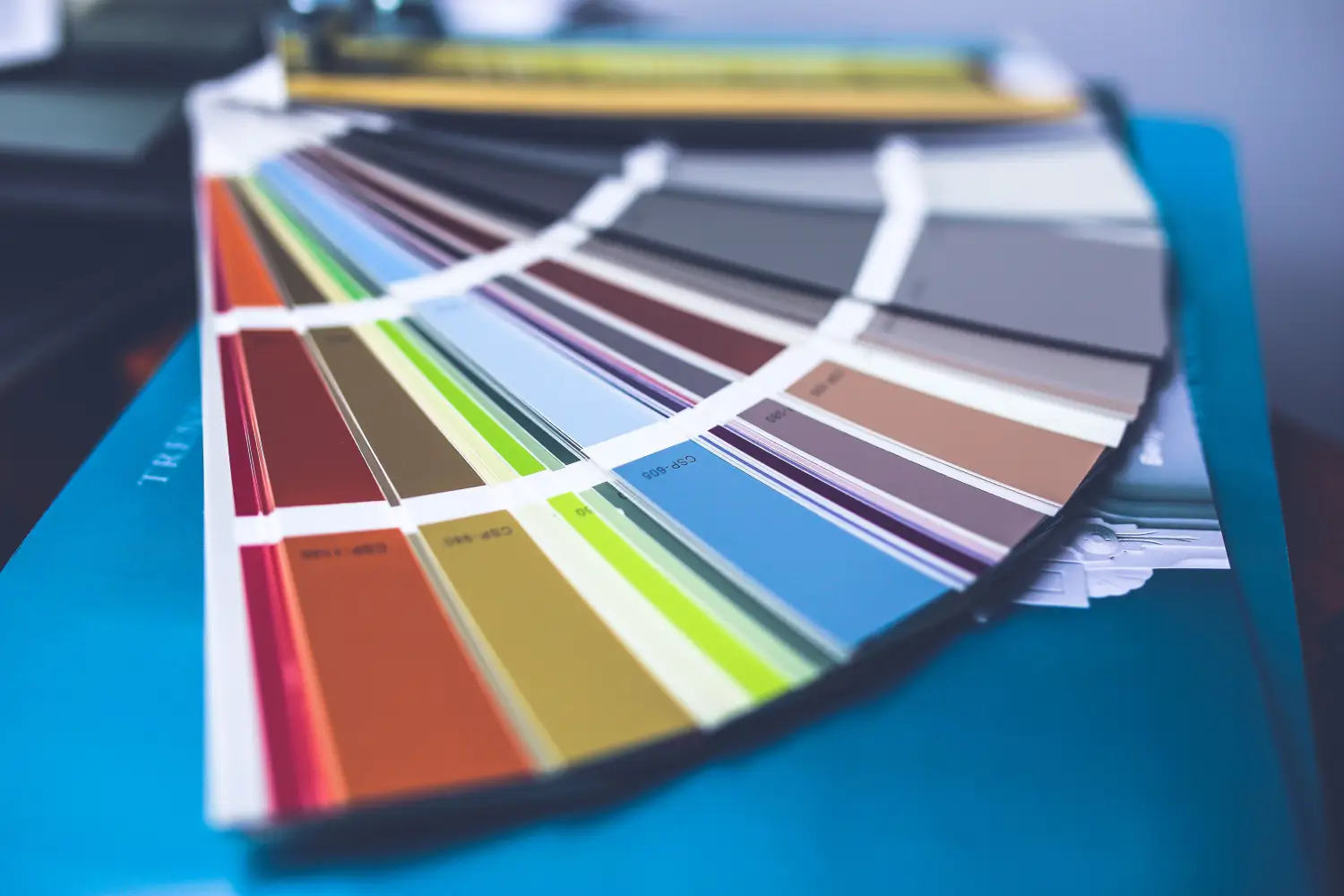
Interior designers mix colors by controlling square footage, not by following a percentage formula. The eye scans a room and locks onto the largest uninterrupted area of a single color first. That surface dictates where attention lands, and every other hue either supports the path or disrupts it. The 60-30-10 rule is a coarse approximation; the usable system is proportion as a visual flow instrument.
Which Room Problem Brought You Here?
- A beige box needs one wall to carry the room — the route starts by selecting the surface that fills the most of the entry sightline, then assigning a dominant color that pulls the eye straight to it.
- The 60-30-10 rule felt too vague — the article swaps that formula for a placement-first logic: which plane gets the largest color block, not any arbitrary 60%.
- A bold sofa now seems to fight the walls — the fix requires checking whether the largest color mass sits where the eye expects it or gets undercut by a competing expansive plane.
- Starting from zero and wanting it right the first time — the stages allow a visual-weight map to be built before any brush touches the surface.
Decode How the Eye Reads a Room First
In under a second, the eye defaults to the biggest continuous color mass in the line of sight. That plane becomes the hook; everything else registers as background detail. Treat this as a hard rule, not a suggestion.
Stand in the doorway and note which surface dominates the view. It could be a full wall behind a sofa, a floor-to-ceiling drapery panel, or a large sectional. That surface will wear the dominant color — not because of proportion numbers, but because its size alone makes it the primary anchor.
What to do: Take a phone photo from the main entry and convert it to grayscale. The largest dark or light block — not a throw pillow — is the spot for the dominant hue. Removing color reveals mass without distraction.
Move on when you can point to that single largest continuous surface from the doorway without hesitation.
Treat That Anchor Surface as the Dominant Color’s Territory
Once identified, assign the dominant color to the anchor surface. The larger the area, the stronger the pull — and that is exactly what you want at the room's first-read point.
An accent wall at the end of a narrow hallway is not equivalent to a ten-foot living room wall behind a console. If the fireplace is the intended focal point, the chimney breast must wear a color that claims its real estate. If the seating area needs to anchor, the largest fabric plane — the sofa — carries the dominant color, not the wall.
Resist placing the dominant color on a surface the eye can't absorb in one glance, like a sharply angled ceiling, unless that surface is genuinely meant to dominate.
What to do:
- Measure the anchor surface’s square footage (height × width in feet).
- Decide whether that plane is paint, textile, or millwork; material changes how the color reads across distance and light.
- Test the color on a 2×2-foot section of the actual surface. A card swatch on a white background lies about undertone and mass because it removes the substrate.
Move on when the dominant color lives on that real surface and you can state, in one phrase, the mood it sets — calm, grounded, energetic — with zero second-guessing.
Build the Supporting Colors Around the Flow, Not the Formula
With the dominant color locked in place, secondary and accent colors have a single job: support the visual path the anchor established. Their placement and proportion follow how the eye moves after that first landing.
Secondary colors occupy the next-largest areas: adjacent walls, a primary rug, large upholstered pieces. Their role is to create a quiet bridge from the anchor to the rest of the room, not to split attention. A secondary surface comparable in size to the anchor will fracture the room's focus.
Accent colors live on the smallest surfaces — cushions, frames, a side chair — and function as punctuation. Position them along the sightline the dominant color has already drawn so the eye travels anchor → secondary → accent in one uninterrupted sweep.
What to do:
- List every surface by descending square footage.
- Assign dominant to the top entry, secondary to the next two or three entries, and accent to the smallest.
- Check for conflicts: if a secondary plane sits directly opposite the anchor and is near-equal in size, reduce its color intensity or break it into smaller panels with trim.
Move on when you can walk through the room and the eye lands first on the anchor, then slides to the secondary elements, then registers accents — no stalling or zigzagging.
Pressure-Test the Proportion with a Real-World Snapshot
Light, angle, and distance alter how much weight a color carries. A well-proportioned floor plan can fail at 5 p.m. with west-facing glare. This stage confirms the system works under actual conditions.
Take a wide-angle photo from the main entry and from the primary seat. Convert both to grayscale. Check whether the largest gray block still matches your intended anchor. If a sunlit rug now rivals the wall, the problem is proportion, not color. Fix it by adjusting relative area: swap the rug for a smaller one, or extend the dominant color onto an adjacent plane to reclaim visual mass.
What to do:
- Photograph the room at three different times of day.
- Overlay a grid (basic phone editing tools can do this) and count the grid squares your dominant color covers versus each secondary color.
- Adjust until the dominant grid count exceeds the next-largest competitor by at least 25%.
Move on when all three grayscale photos confirm the anchor surface is unmistakably the largest continuous tone, and the accent colors register as punctuation marks, not mid-sized blocks.
The Checkpoints That Tell You to Continue
- You can name the single largest continuous surface from the entry point, and it's the surface you want seen first.
- The dominant color is tested on that actual surface (no card), and you can describe its mood without hesitation.
- A walk-through shows the eye landing on anchor first, then moving to secondary, then accents — no back-and-forth.
- Grayscale photos at morning, noon, and late afternoon confirm the anchor holds the largest area and the accents stay small.
Worries You Can Set Aside for Now
Undertone matching across brands — park this until the dominant color is fixed on the surface; undertones shift with adjacent materials and light. Compare swatches together on the same wall only after the anchor and secondary colors are chosen.
Paint sheen and light reflectance — sheen alters how color mass reads (matte recedes, satin advances), but it's a refinement step. Lock the proportion first, then select sheen per surface based on whether that plane should advance or retreat.
Design trends — a trend cycle is shorter than the time it takes to get this proportion right. A room with correct visual weight survives any trend because the foundation is solid.
Open-plan spaces — postpone this until proportion in a single room is mastered. Open-plan flow adds sightline intersections; control one room first, and the skill transfers.
Shortcuts That Speed Up the Work Without Bypassing the Thinking
- A room visualizer app — block in color areas on a photo. It won't replace the grayscale proportion test, but it speeds up placement experiments before sample pots are opened.
- A projector — aim a digital image of the dominant color onto the wall at night to judge how the area shifts the room's weight. Instant feedback without painting.
Frequently Asked Questions
What if no single surface clearly dominates?
In a square room with equal walls, pick the surface facing the entry — it claims attention by position, not just size. Treat it as the anchor even if a side wall is marginally larger.
Can a patterned textile serve as the dominant color area?
Yes, if the pattern reads as a single color field from a distance. High-contrast, busy patterns fracture attention and defeat anchoring. A tone-on-tone or large-scale, low-contrast design preserves the mass.
Do trim and doors count toward the dominant square footage?
Trim and doors separate planes. Painting them the dominant color expands the anchor's territory; leaving them white carves into the color mass and reduces its pull. Decide based on whether the wall needs more or less anchoring power.
How much larger must the dominant area be than the secondary?
Aim for at least 25% more area than the next-largest colored surface. The gap matters more than the absolute numbers.
Does this apply to any design style?
Yes — the human eye reads spatial information the same way in minimal and maximal spaces. Every room has a largest surface; that surface will carry the first glance if you let it.
A room where the eye lands exactly where intended reads as intentional. The single first move remains identical for every starting point: stand in the doorway, take a grayscale photo, and find the surface that consumes the most field of view. Assign the dominant color there — everything else falls into place after.

Clara Bennett
After five years of transforming my 1920s bungalow room by room, I’ve refinished floors, hung blinds in bay windows, and spent more time choosing light bulbs than I’d like to admit. I learned paint sheens by painting my kitchen ceiling three times, and I found out the hard way that a rug too small makes a room feel unfinished. I believe every home can be both functional and beautiful, no matter the budget.
Related posts

Decor Mixing That Works: A Realistic Plan for New Homeowners
Stop memorizing rules. Use this anchor-first framework to mix any furniture, finishes, and accessories into a room that feels intentional—step by step, with real-life starting points.

Matching Sets Are Over: How to Mix Furniture Styles Successfully
Stop buying matching sets. Use the 'common thread' method to mix furniture styles without chaos—one shared detail unifies the room. Learn how.
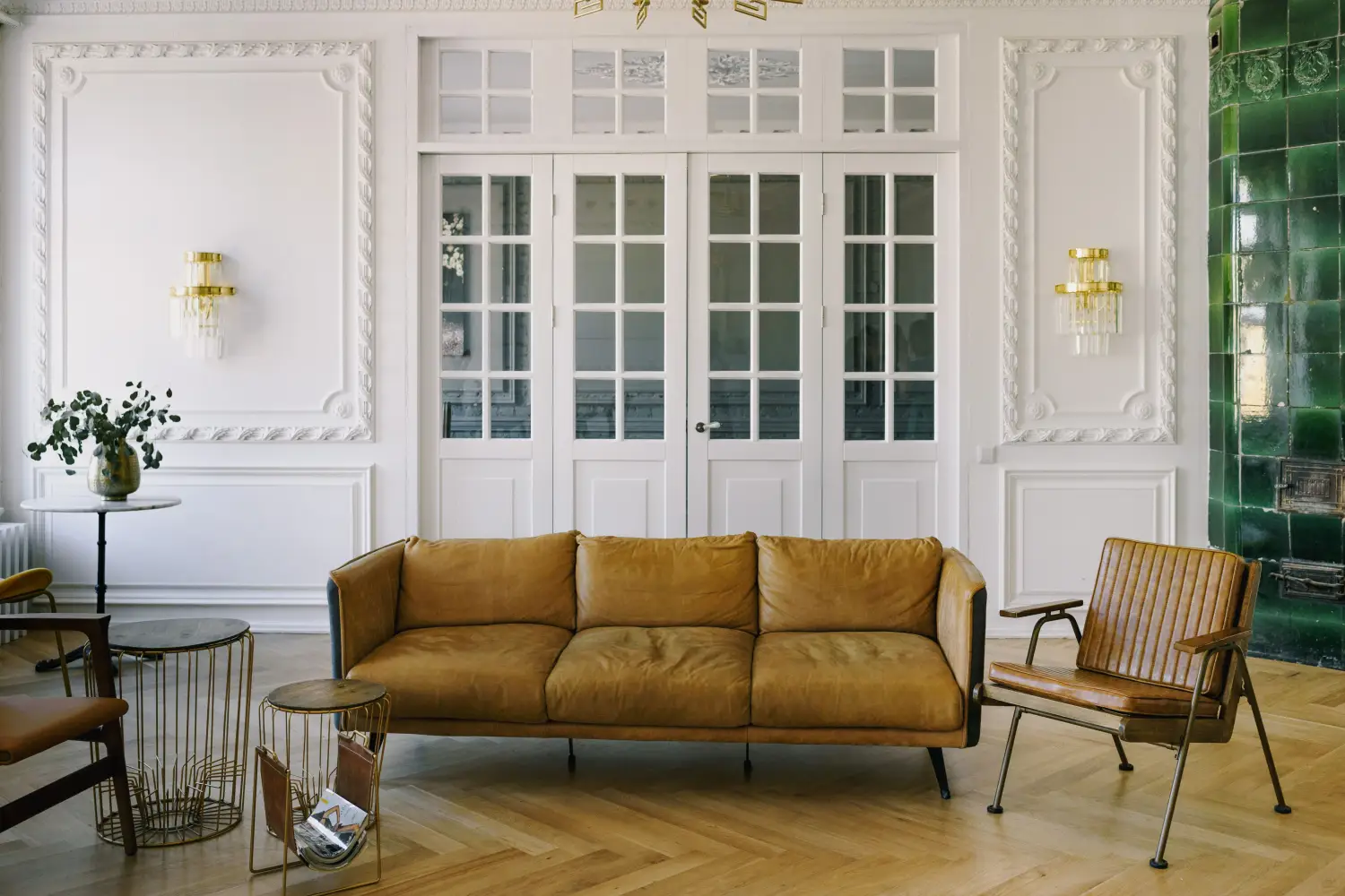
The Decor Rule Pros Break When Mixing Old and New
Pros ignore the 'one antique per room' rule. Learn the focal-point method that makes vintage pieces the star and modern items the frame — so the contrast reads as intentional, not accidental.
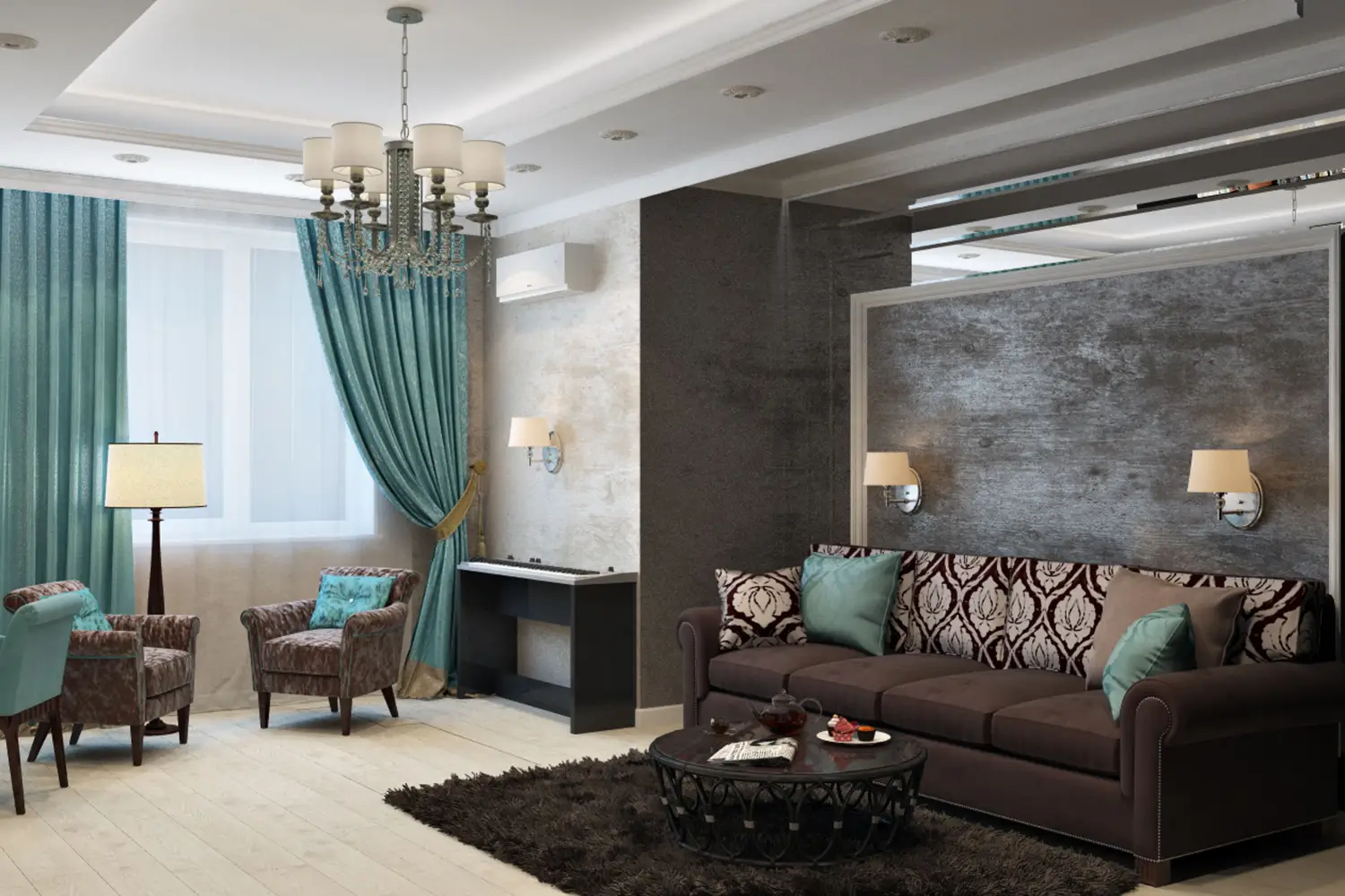
7 Pattern-Mixing Rules for a Cohesive Look in Any Room
Learn the room-specific sequence for pattern mixing: start with a large-scale pattern, add a small-scale coordinate, finish with texture. Adjust order for kitchens, bedrooms, and more. Beginner-friendly rules.
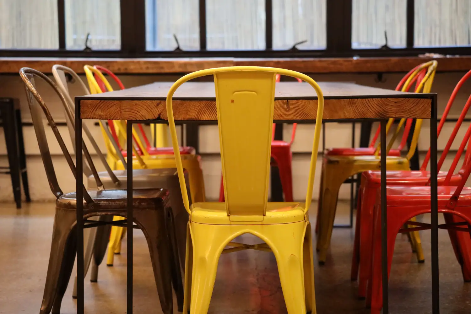
Stop Losing Style: How to Mix Wood and Metal Finishes Right
Stop guessing with wood and metal finishes. Use a warm/cool temperature system to pair brass, chrome, oak, and walnut—no design mistakes, just a clear rule.