The One Color Palette Mistake That Makes Your Style Look Cheap

A single miscalibration in wall color can take a room from curated to cut-rate, and the culprit is usually a mismatch between the paint’s temperature and the home’s historical DNA. When the color fights the architecture—when a cool gray lands on an Arts & Crafts interior—the trim that should feel handcrafted reads as cheap. This isn't about hue; it's about heat. The native palette temperature of a style is non-negotiable if you want the room to look intentional rather than accidentally assembled.
Which of These Describes Your Room?
Each symptom below corresponds to a specific fix path. Identify the one that matches what you see.
- The Period Detail Problem: Original woodwork, tile, or millwork that should anchor the room instead looks flat and builder-grade against the wall color.
- The Flat Historical Palette: You bought from a "heritage" fan deck, but the room lacks the richness and depth the style is known for.
- The Contemporary Gray Clash: Modern neutral walls sit uneasily beside vintage furnishings or a period shell, and the combination never clicks.
When Original Woodwork Reads as Cut-Rate Trim
The clearest example of temperature failure. Period styles like Craftsman and Colonial Revival were built around warm wood—golden oak, chestnut, cherry. Their original wall colors were chosen to coexist with that warmth, not cool it down.
Likely Cause: Cool Wall Colors Against Warm Wood
A blue-leaning gray or a beige with green undertones saps the wood’s amber life. The trim picks up the wall’s cold reflection and turns muddy, losing its depth.
How to confirm: At mid-morning, look at a piece of trim without directly facing a window. If the wood appears grayish-brown instead of rich amber, the wall is cooling it. Hold a known warm chip—cream with a red oxide base—next to the trim. The difference should be immediate; the wood will brighten against the warmer chip.
Exact fix: Repaint with a wall color that shares the wood’s undertone. For golden oak, flax, warm ochre, or a buttercream with a hint of red works. For darker walnut, move toward warm sage or muted terra cotta. The key is matching the undertone family, not just the lightness.
Expected result: The trim snaps back into its architectural role and looks deliberate, not like a mistake.
Why Your 'Historic' Palette Falls Flat
Manufacturers’ “historic” collections often nail the surface hue but miss the warmth that aged linseed oil, yellowed varnish, and soot once gave those colors. The result is a palette that reads as thin and reproductive, not substantial.
Likely Cause: Copying a Hue Without Its Native Undertone
You selected the right name from the chip but got a modern acrylic formulation whose undertone has drifted cooler—blues and grays replace the browns and yellows that gave the original its weight.
How to confirm: Take the chip outside on an overcast day. If it veers icy or gray rather than dusky or earthy, the temperature is wrong for a pre-1950s interior.
Exact fix: Switch to a version of the color that carries a brown, red, or yellow base. A seemingly cool color like Prussian blue should have a deep indigo or teal undertone, not a sharp cerulean. Introduce at least one warm anchor—a terra-cotta rug, an amber-finish picture frame—to pull the palette back into the room’s historical gravity.
Expected result: The colors feel grounded and weathered in the right way, not like a museum reproduction that never quite convinces.
The Gray Walls, Vintage Furniture Disconnect
Often happens in mid-century homes where the owner installs authentic teak or walnut pieces but paints the walls a stark cool gray because that’s what they think “modern” means.
Likely Cause: Pairing Contemporary Cool Neutrals with Warm-Modern Pieces
Mid-century materials—even chrome and laminate—carry warmth from the manufacturing processes of the time. A high-cool gray wall reduces the furniture’s presence, making it look disconnected and cheaper than it is.
How to confirm: Examine the furniture’s primary material. Teak, rosewood, and warm-toned laminates all need a warm-neutral backdrop. Tape a greige swatch (one with brownish undertones) next to your current cool gray; if the furniture suddenly looks more expensive and grounded, you have your answer.
Exact fix: Replace the cool gray with a warm greige, taupe, or a white with a cream base. The furniture will present as richer, and the room will read as curated rather than coincidental.
Expected result: The space coheres around a warm-modern center, and the vintage pieces gain the prominence they deserve.
The Swatch Test That Saves a Repaint
Before repainting a full room, run a temperature-critical swatch test. This isn't about picking a prettier color; it’s about verifying that the undertone doesn't degrade the fixed finishes.
- When it helps: Paint a two-foot square in at least two different lights (morning and evening). Observe how it interacts with wood tones, tile, and trim. This will expose cool undertones that a tiny chip hides.
- When it wastes time: If the room’s real problem is layout—ill-sized furniture, a rug that’s too small, awkward traffic flow—no paint will fix it. Address those structural issues before you open a can.
Evaluate the swatch by asking a single question: “Does this color make the next surface look better or worse?” If it dulls the trim or flattens the floor, it’s the wrong temperature.
Lock in the Right Temperature Before You Open a Can
Prevention comes down to one disciplined step: research the style’s native temperature before you pick colors.
- Establish the style’s baseline warmth. Federal, Victorian, Craftsman, and mid-century all have an inherent temperature (warm, for anything pre-late-modern). Read the wood finishes and permanent tile. A north-facing room may need amplified warmth, but the rule holds.
- Use tools that reveal undertone, not just hue. A fan deck that notes Light Reflectance Value and undertone family (yellow, red, blue) is worth far more than a vague name. Some historic paint companies offer spectrophotometer-matched colors that preserve the original temperature.
- Test swatches against the one finish you can’t change. Paint the swatch next to that oil-rubbed bronze fixture or the honey-toned floor. If they fight, the swatch loses.
- Confine any cool accents to replaceable items. A pale blue pillow on a warm wood chair works; a pale blue wall behind that chair doesn’t.
Questions Homeowners Ask After a Temperature Mismatch
What’s the difference between a warm gray and a cool gray?
Warm gray contains brown, beige, or yellow; cool gray contains blue or green. Place a chip next to pure white—the undertone declares itself immediately.
Can I ever use a cool color in a warm historical style?
In a small, enclosed space like a powder room that transitions to a warm living area, a cool wall can work if it reads as deliberate. The acid test: does the sightline from that room connect to a warm space without clashing? If not, don’t do it.
How do I find out my home’s style’s native temperature?
Start with the original fixed finishes—floors, trim, built-ins. They will Lean either warm (yellow/red) or cool (blue/gray). Cross-reference with a preservation society’s color guidelines or a period-appropriate paint book, not a generic fan deck.
Does this apply to a house without historical architecture?
Yes. Any room with warm wood floors, trim, or furniture will punish a cool wall color with the same cheapening effect. The rule holds even in a 1990s tract home.
If the Problem Persists: Escalate to a Color Specialist
When adjusting temperature still leaves the room feeling off, assemble the following before you call for help: photos in morning and evening light, a list of permanent finishes (trim, floors, tile), and the paint chips you’ve tried. Present this to a historic paint consultant, a designer with preservation experience, or a dedicated online forum where users post “diagnose my room” threads. Beyond temperature, the issue may involve sheen, value contrast, or lighting—but temperature remains the most common root cause of that cheap-looking result, and it’s the place you must start.

Clara Bennett
After five years of transforming my 1920s bungalow room by room, I’ve refinished floors, hung blinds in bay windows, and spent more time choosing light bulbs than I’d like to admit. I learned paint sheens by painting my kitchen ceiling three times, and I found out the hard way that a rug too small makes a room feel unfinished. I believe every home can be both functional and beautiful, no matter the budget.
Related posts
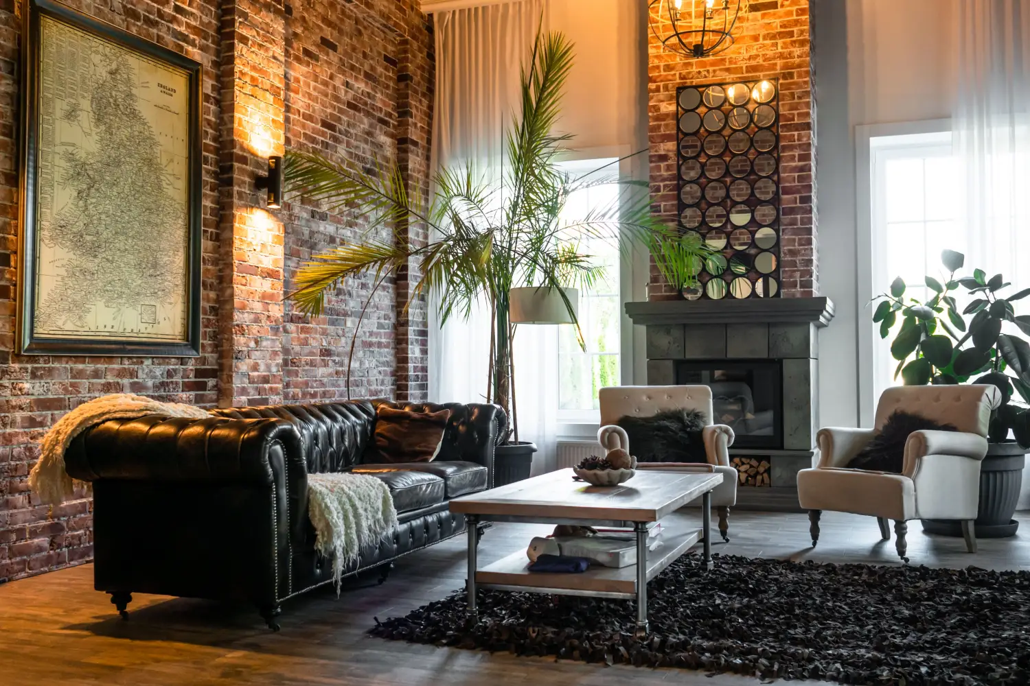
What’s Your Home’s Style? The 3 Questions That Decide
Forget style labels. Answer three practical questions about your architecture, daily life, and one anchor piece to create a filter that makes every decor decision easier.
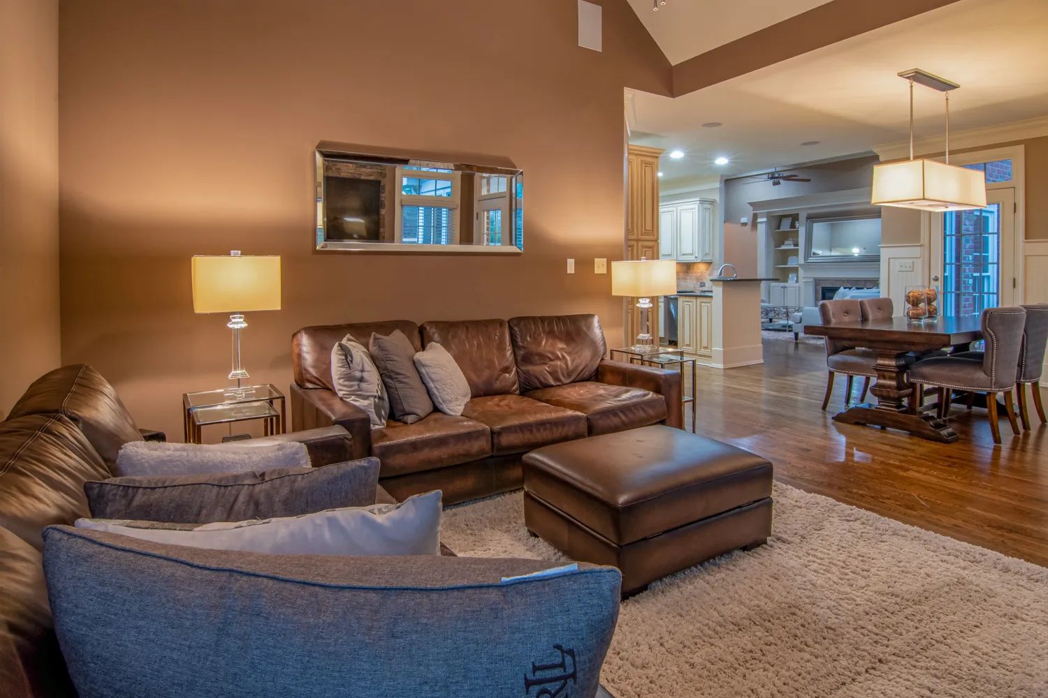
How 8 Out of 10 Designers Actually Mix Opposing Decor Styles
Pair industrial with coastal, or rustic with modern, without chaos. This repeatable 2-axis method (chromatic undertone + profile weight) shows you exactly how.
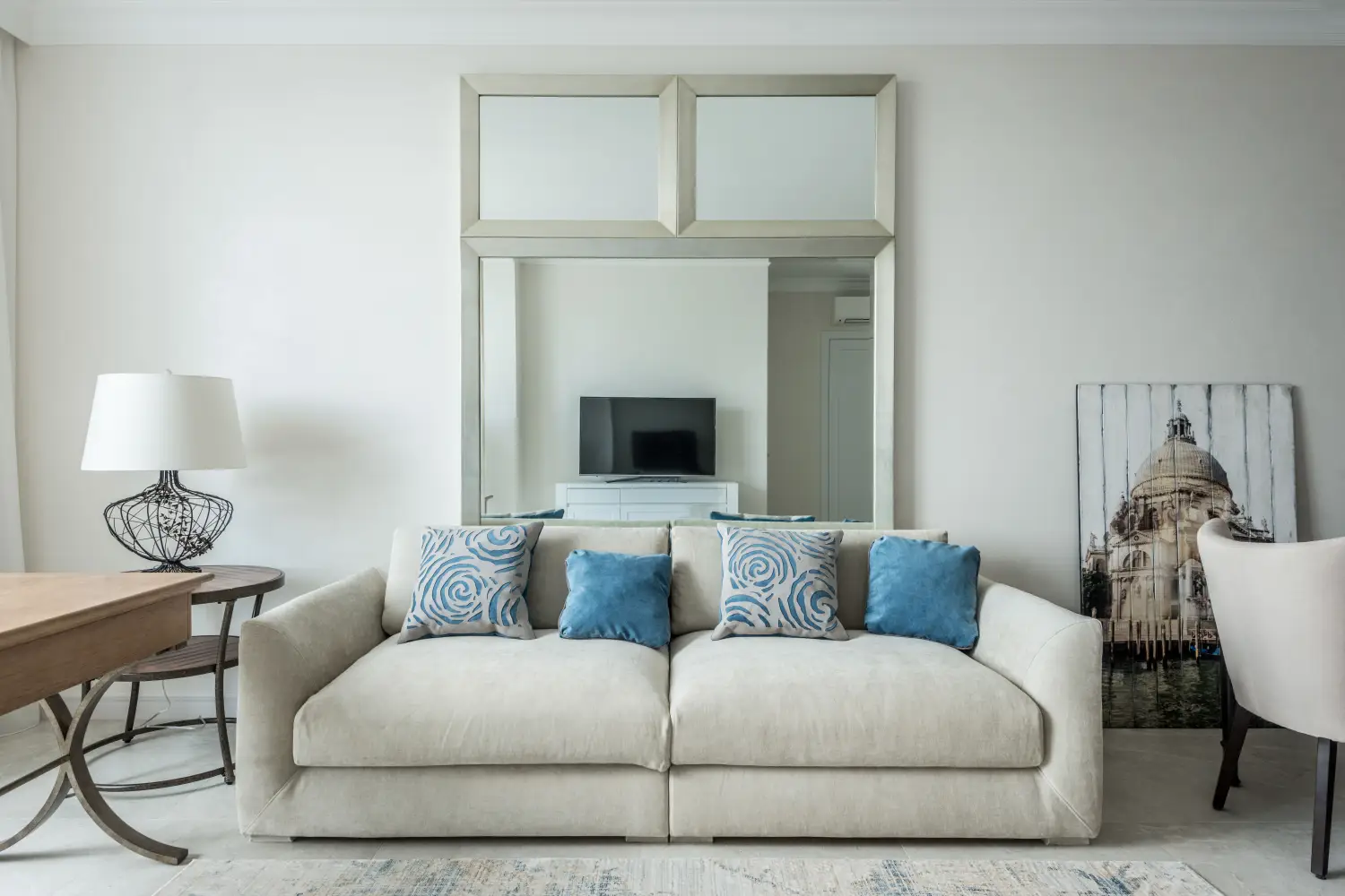
The One Focal Point Interior Designers Build Every Room Around
Learn how a room’s fireplace, bay window, or built-in shelving holds its own style DNA — and why aligning furniture and color to that era creates a home that feels truly cohesive.

5 Signs Your Decor Style Will Look Dated by 2026
Use a color picker, a tape measure, and a material-age check to catch dated décor before 2026. Five quantifiable signs that predict when a room will turn stale.
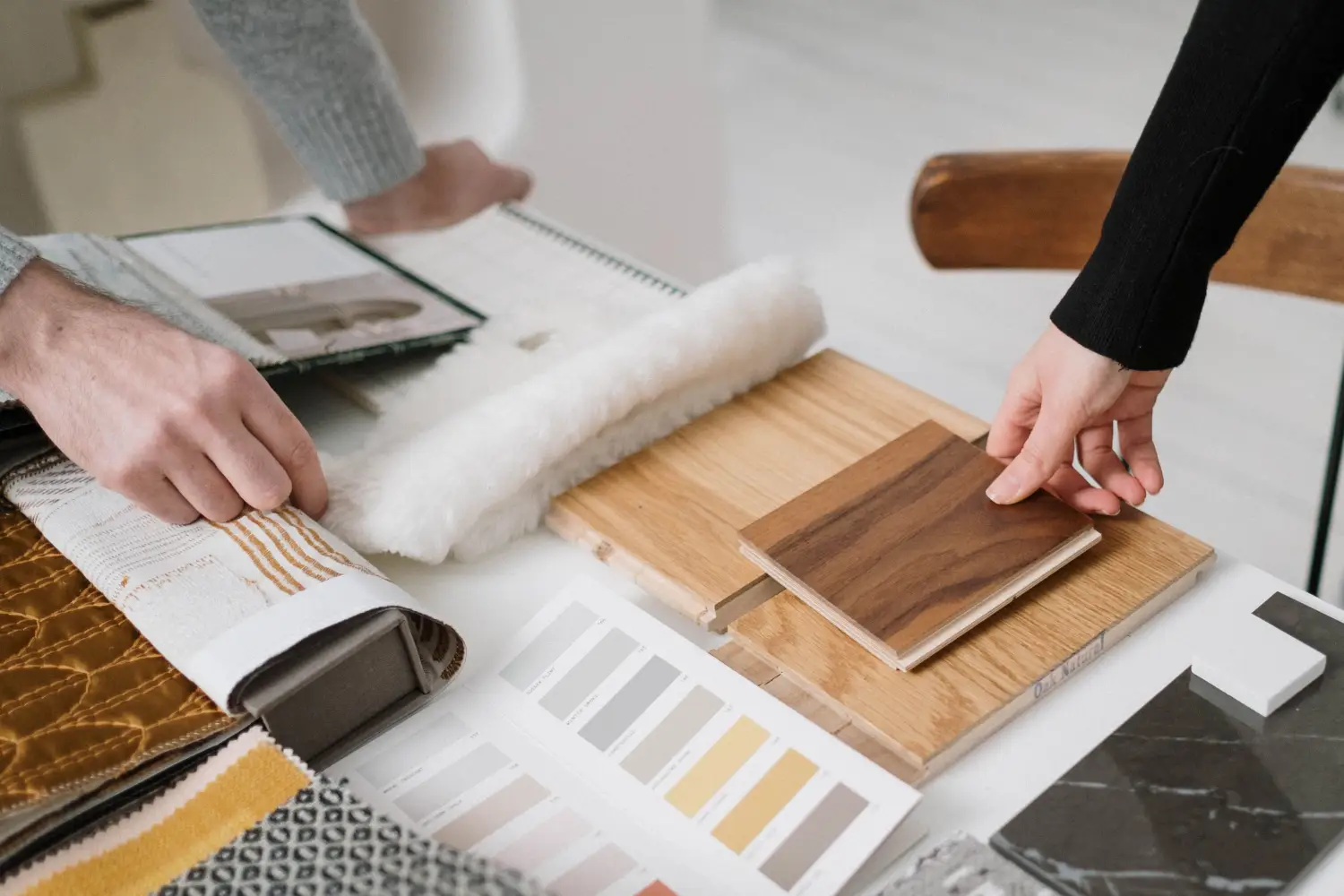
The One Decor Detail That Commits to a Style Before You Do
Before you buy the sofa, test a finish with a $4 drawer pull. Learn how hardware samples let you lock in a whole-room style with zero regret.