How 8 Out of 10 Designers Actually Mix Opposing Decor Styles
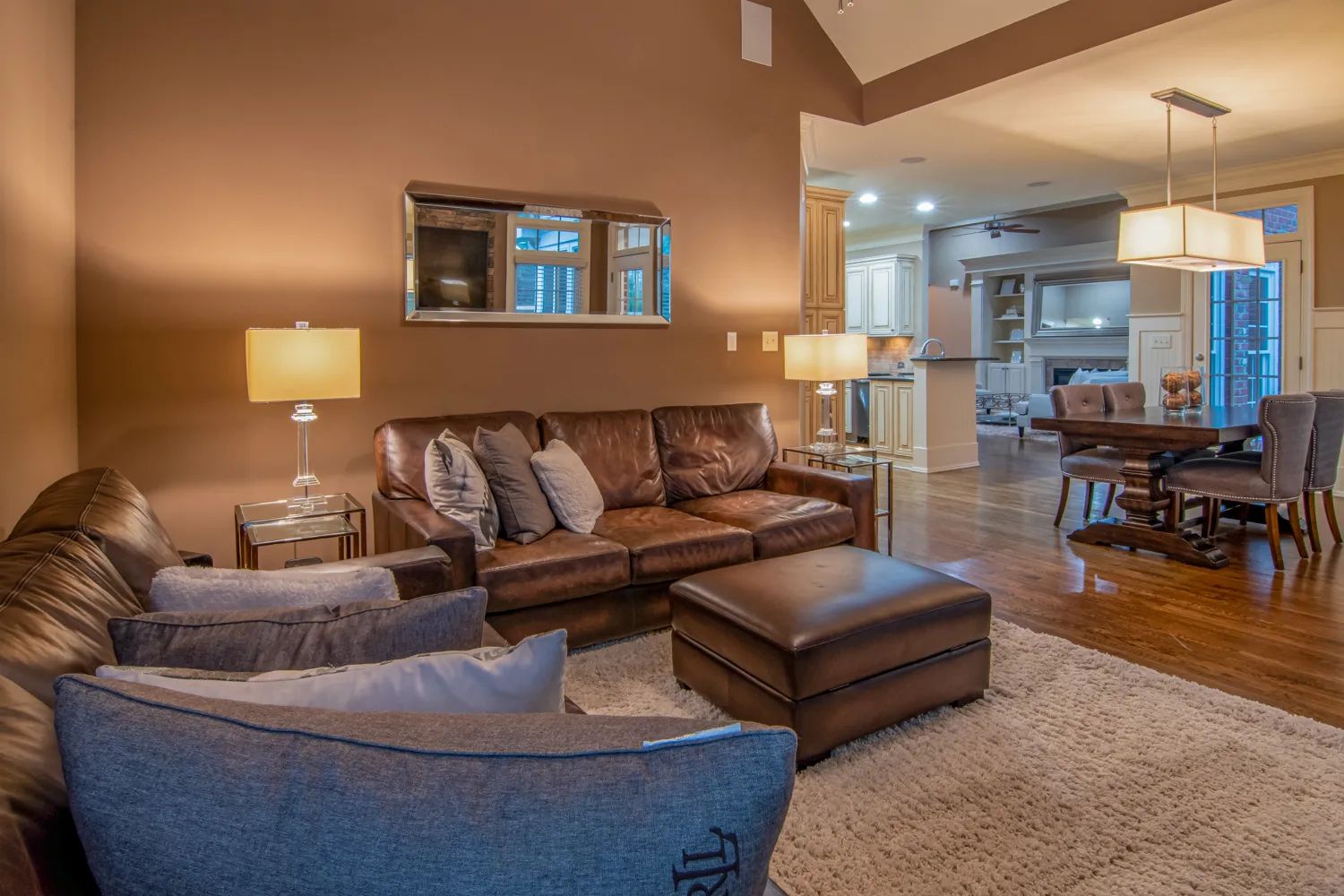
Mixing industrial edge with coastal ease usually ends in a room that looks like a lobster shack with pipe shelving — not because the styles can’t coexist, but because nobody checked the two hidden numbers every design carries: chromatic undertone and visual weight. The method 8 out of 10 pros use isn’t a moodboard or a list of “do’s and don’ts.” It’s a compatibility matrix that treats style like a set of coordinates — if you lock the undertone or the weight, you can pair anything without the room looking like a dare.
The way it actually works is that style mash-ups fail when there’s no shared axis holding the tension together. Give the room one invisible through-line — a consistent cool cast or a consistent feeling of lightness — and suddenly a bleached-wood bench and a blackened-steel console belong in the same photograph. What follows is how to build that axis, step by step, and what to do when it snaps.
The 4-Step Compatibility Check: Undertone + Weight
- Label each style’s chromatic undertone (cool, warm, or neutral).
- Decide each style’s profile weight (light, medium, or heavy).
- Confirm they share at least one axis — same undertone or same weight.
- Use a 70/30 split and place a transitional piece right on the shared axis.
Step 1: Pull the Chromatic Undertone Out of Each Style
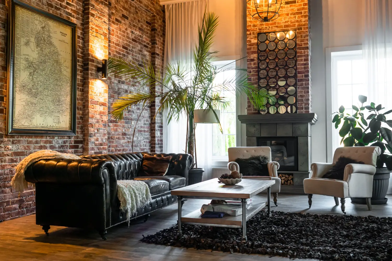
Chromatic undertone isn’t about the accent color you spotted on a pillow; it’s the color temperature that runs through every neutral — the white of the walls, the gray of the sofa, the wood tone that keeps reappearing. Industrial palettes fall into cool territory: the blue-gray of raw steel, the greenish cast of oiled concrete, the almost-purple shadows on exposed brick. Coastal sits cool too, pulled from sandy-beige that drifts toward gray, sea-glass greens, and bleached oak that refuses to warm up.
Ignoring undertone is the single fastest way to create a room that feels like a headache. A warm terracotta-toned rug under a cool-blue gallery wall doesn’t look eclectic; it looks like two rooms that got pushed together during a move. To spot undertone fast, pull five images of a single style and note the one color that never leaves — the halo that clings to every surface. If it’s a gray-blue veil, you’re in cool territory; if every picture is suffused with buttercream or rust, it’s warm. That’s your axis reading.
Step 2: Weigh Each Style’s Visual Heaviness
Profile weight is how solid a style feels when you blur your eyes — the thickness of legs, the bulk of upholstery, the presence of ornament. Industrial styles sit in the heavy zone: chunky welded joints, thick tabletops, hardware meant to hold up a factory. Coastal defaults to light: spindly turned legs, sheer linen, rattan that could snap in a stiff breeze. Mid-century modern often hovers at medium because the tapered legs slim the silhouette but the solid walnut adds heft.
This isn’t about a single chair in a room; it’s about the style’s default gravity. Once you label it, you’ve got your second coordinate. The power move is realizing that if two styles share the same weight — both heavy, both light — you’ve already built the bridge, and undertone becomes a detail you can dial up or down with accessories rather than a dealbreaker.
Step 3: Run the Axis Match — One Shared Coordinate Is Enough
Now the matrix delivers. For every pair, ask two questions:
- Do they live in the same undertone family?
- Do they occupy the same weight class?
A single “yes” means the pairing is structurally sound. Industrial (cool, heavy) and coastal (cool, light) click because the cool undertone threads through both, and the weight difference reads as deliberate texture, not noise. Rustic farmhouse (warm, heavy) and mid-century modern (warm, medium) pass on undertone; the one-step weight gap is manageable because both feel substantial. Glam (cool, light) and boho (warm, light) hold together because shared lightness acts like a visual floor — everything floats at the same altitude even when the temperature shifts.
When neither axis lines up — warm/heavy traditional meets cool/light Scandinavian — the pairing isn’t impossible, but it’s expensive. You’ll need a bridge piece that carries neutral undertone and medium weight, which often means buying a dedicated item rather than shopping your existing stash. Proceed with caution and a single room, not a whole floor plan.
Step 4: Split the Room and Insert a Bridge Piece
With an axis locked, set a 70/30 distribution: let one style own the large furniture and fixed finishes, the other style claims accessories and a statement piece or two. Then drop the transitional piece precisely where the two styles touch — on a shared area rug, at the visual center, or on the boundary line of a sight path.
When the shared axis is undertone, the transitional piece amplifies that temperature and adjusts the weight. For that industrial-plus-coastal room, a deep charcoal velvet sofa on a thick platform base echoes the cool undertone while pulling the weight from spindly coastal to something the room can anchor around. When the shared axis is weight, the transitional piece imports the missing undertone. In a glam/boho mix (both light), a slender pendant woven with silvery thread drags in a flicker of cool metal without adding visual pounds.
For the hard case — no shared axis — the transitional piece must do double duty: stay neutral in undertone and medium in weight. A stone-topped console on slim black steel legs is a classic solve. It’s not a magic trick; it’s a deliberate compromise that signals you knew the mismatch and handled it instead of hoping nobody noticed.
How to Confirm the Matrix Before You Spend a Dime
- Undertone litmus test: Hold a pure-white chip and a warm/cool paint strip against the two palettes. If the “whites” look bluish on one side and creamy on the other, the undertones are fighting and you’ll need that bridge.
- Weight squint test: Blur your eyes at a photo of each style. The silhouette that softens first is lighter; the one that stays blocky is heavier. That’s your reading.
- Distraction scan: Mock up one key piece from each style next to each other. If you can’t rest your eye on either for more than a second, the axes aren’t locked.
- Ratio walkthrough: Count how many visible items belong to the dominant style. If you’re not seeing roughly 7 out of 10, the mix reads as a tie, and ties look like indecision, not design.
When the Room Still Reads Wrong
The undertone split is a gulf, not a gap. Maybe you paired a cool gray wall with warm honey oak and hoped the weight would save you. It didn’t. Paint one big surface — an accent wall, a rug perimeter — in a color that sits on the temperature fence: a true greige with equal cool and warm undertones. That neutral buffer resets the room’s temperature reading.
The weight is lopsided. All the heavy pieces (the puffy sofa, the cast-iron coffee table, the dark armoire) live on one side, and the light ones cluster on the other. The room tilts. Move at least one substantial piece across the center line, or insert a medium-weight anchor — a sling chair, a leather pouf — as a pivot.
The split is a polite 50/50. When neither style leads, the room has no opinion. Pull the accent style back to 25–30% and let one dominate. Asymmetry is the signal that the mixing was intentional.
Frequently Asked Questions About the Undertone-Weight Matrix
What do I do with a style like minimalism that seems to have no undertone?
Minimalist rooms usually default to cool or neutral undertone because they lean so heavily on white, black, and raw materials. Look at the wall and floor — those are the tell. Pale gray or blue-tinged walls make it cool; bone-white walls with natural oak floors usually read neutral. Treat the closest match as the undertone and plug it into the matrix.
Can the matrix handle three styles at once?
Yes, but only if each addition passes the axis check with something already in the room. Start with a primary pair, then add a third that shares an undertone or weight with either. Keep the dominant at 60%, the second at 25%, and the third at 15%. More than three and the room starts to feel like a sample library, not a home.
Is there ever a time to ignore the matrix and just trust your eye?
Absolutely — if the eye is trained enough to know why something works. The matrix is a shortcut to avoid the most predictable failures. If you stumble on a combination that breaks both axes and still feels right, stop and figure out what’s holding it: a single overscaled color, a repeated shape, or a deliberate jarring effect. Those wins are real, but they come from intention, not luck.
My room’s base style is already set — how do I pick an accent?
Reverse-engineer the fixed elements first: extract the undertone and weight of your floors, trim, and largest furniture piece. Then choose an accent style that shares at least one of those coordinates. If your built-in shaker cabinets are warm and medium-heavy, you can mix in warm/light boho or cool/heavy industrial — you decide which axis to borrow and bridge from there.
What You Do Now
The matrix gives you a repeatable way to pair any style that looks like an argument waiting to happen. The next practical step is a quick audit of the room you already live in: pin down the undertone and weight of the floor, the biggest piece of furniture, and the dominant wall finish. Then pick one accent style that shares an axis — and let the tension pull itself together.

Clara Bennett
After five years of transforming my 1920s bungalow room by room, I’ve refinished floors, hung blinds in bay windows, and spent more time choosing light bulbs than I’d like to admit. I learned paint sheens by painting my kitchen ceiling three times, and I found out the hard way that a rug too small makes a room feel unfinished. I believe every home can be both functional and beautiful, no matter the budget.
Related posts
What’s Your Home’s Style? The 3 Questions That Decide
Forget style labels. Answer three practical questions about your architecture, daily life, and one anchor piece to create a filter that makes every decor decision easier.

The One Color Palette Mistake That Makes Your Style Look Cheap
One wrong temperature choice can make expensive trim and furniture look cut-rate. Learn how ignoring a historical style's native warmth cheapens your room—and how to fix it.
The One Focal Point Interior Designers Build Every Room Around
Learn how a room’s fireplace, bay window, or built-in shelving holds its own style DNA — and why aligning furniture and color to that era creates a home that feels truly cohesive.

5 Signs Your Decor Style Will Look Dated by 2026
Use a color picker, a tape measure, and a material-age check to catch dated décor before 2026. Five quantifiable signs that predict when a room will turn stale.
The One Decor Detail That Commits to a Style Before You Do
Before you buy the sofa, test a finish with a $4 drawer pull. Learn how hardware samples let you lock in a whole-room style with zero regret.