5 Signs Your Decor Style Will Look Dated by 2026
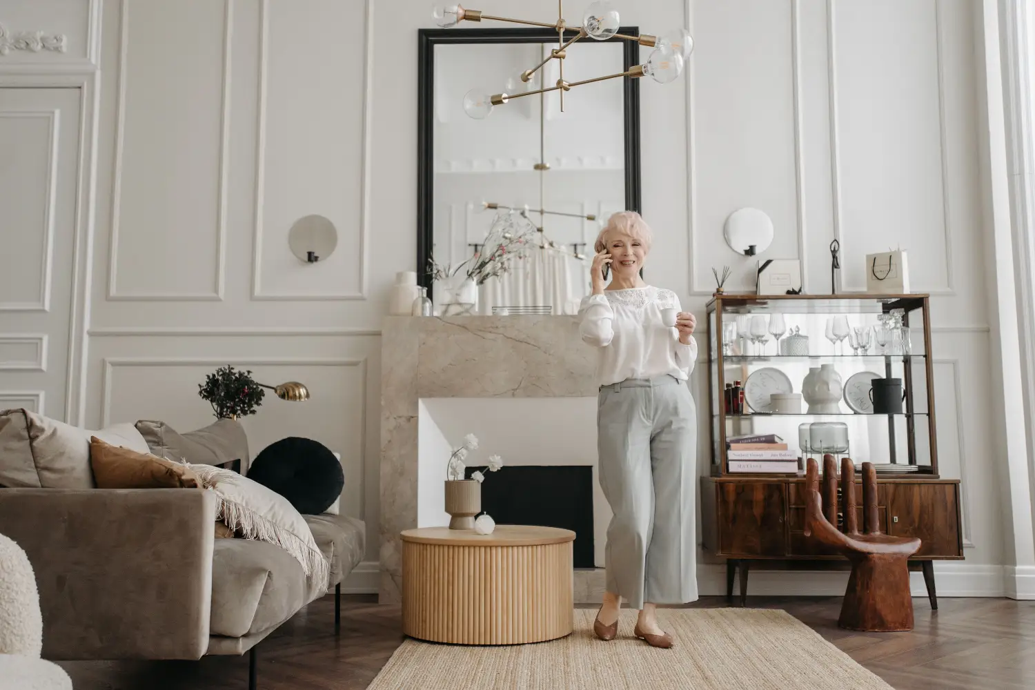
A room’s décor has measurable indicators that predict when it will look behind the times. Five specific checks — from saturation percentages on a phone color picker to the age of a surface material in retail distribution — tell you whether a space will age past its prime by 2026. By the end, you will have a concrete audit checklist to test any room before you commit to costly changes.
1. Color Saturation Reaching the 75% Mark
Colors that push chroma above 75% on a standard digital saturation scale tend to date a space faster than more muted tones. In 2025–2026, the design market is pulling back from vivid accent walls and saturated jewel-toned upholstery that dominated earlier years. A saturation reading above 75% signals that a color will read as a moment-specific choice within roughly two years.
How to Read the Number
A phone camera pointed at a wall or fabric with any basic color-picking app gives a saturation value out of 100. Values in the 50–75% range have enough gray or earth undertone to hold steady across style shifts. Cross the 75% line, and the color’s overt intensity makes it a timestamp that requires repainting or replacing.
Where the Risk Concentrates
The threshold applies most to fixed surfaces: wall paint, kitchen cabinetry, large upholstered pieces. Small accessories — a cushion cover, a tabletop vase — can carry high saturation without anchoring the whole room to a fading trend.
2. Materials Still Within Their First Hype Cycle
Every surface material follows a novelty curve. When a new engineered surface — think terrazzo-look quartz, heavily veined porcelain slabs, ribbed glass, or concrete-effect laminates — shows up in mass-market retailers, its acceptance is already beginning to sag. A material introduced broadly into affordable retail within the last three years usually reaches consumer fatigue 18 to 30 months later.
The Steady-Material Reference
Subway tile, solid oak, honed limestone — materials with decades of consistent use across multiple style cycles — rarely date a room. The test is simple: if the material has only been widely available at accessible price points for fewer than three years, assume its hold on public attention is temporary.
How to Act on This
Examine the permanent surfaces in your room. Floors, backsplashes, and countertops that rely on a material newer than 36 months to the mainstream carry a quantifiable risk. Swapable items — a lamp body, a decorative tray — let you participate in a trend without a long-term penalty.
3. Pattern Scale Designed for Phone Screens
Patterns optimized for impact on a small screen often fatigue the eye in physical space. A repeat unit larger than 12 inches, especially when paired with a contrast level above 80% (nearly black-on-white), creates a graphic presence that works for an image but not for daily living. These patterns follow the same cycle as social media trends — rapid rise, then sharp decline.
The 24-Inch Fatigue Point
In real rooms, patterns with repeats exceeding 24 inches tend to overwhelm within a single year. Patterns with hand-span-size repeats (under 6 inches) or organic, non-repeating motifs mimic natural textures and endure longer.
A Quick Check
Measure the repeat distance on any wall covering, rug, or curtain panel. If the repeat is larger than the length of an adult hand and contrast is harsh, the pattern will likely look dated by 2026. A similar design in a tonal palette — same hue, low contrast — poses far less risk.
4. Metallic and Ornamentation Count Exceeding Two Reflective Families
Mixing metallic finishes or layering carved surface details can accelerate visual fatigue. Count the distinct metallic finishes visible from one standing point (polished brass, satin nickel, brushed gold, chrome, blackened steel). Two is a coherent limit. Add a heavily textured ornament — deep channel tufting, all-over fluting, nailhead trim — and the space tips toward excess.
Why This Count Works
The eye perceives more than two reflective families as clutter. As design moves toward quieter, softer interiors in the 2025–2026 cycle, even skillfully combined mixed metals and overapplied decorative texture read as belonging to a previous design moment.
Audit from One Spot
Stand in a doorway and tally every metallic surface and ornamental treatment in your direct sightline. Three or more metallic finishes, or a single metallic finish covering over 40% of visible surfaces, signals a high exposure to a trend that is already declining.
5. Furniture Proportions Falling Outside the Usable Range
Furniture that sacrifices comfort for visual novelty ages poorly. A reliable reference is the width-to-depth ratio of seating: pieces that fall outside a 1:0.5 to 1:0.7 range tend to be sculptural statements, not usable seats. Overly deep sofas (seat depth above 26 inches without a reclining mechanism), tiny round accent tables, and bulky armrests wider than 10 inches wear out their welcome fast.
Why Size Matters
An oversized arm or a low-slung back that provides no lumbar support catches attention in a showroom but adds daily inconvenience. Within two years, the impracticality overrides the initial appeal and the piece is more likely to be discarded.
Measuring What You Own
Take a tape measure to your largest seating piece. Check seat depth and arm width against the usable benchmarks. A sectional with a 30-inch seat depth forces an unnatural slouch that becomes a chore to live with, dating the entire seating arrangement.
Key Takeaways
- Saturation audit: anything fixed above 75% saturation will likely need a refresh within two years.
- Material age: surfaces younger than three years in the mass market carry a short half-life.
- Pattern scale: repeats over 12 inches with high contrast speed up the look of being out-of-date.
- Metallic clutter: more than two metallic finishes in a single view accelerates perceived obsolescence.
- Proportion check: pieces far from a 1:0.6 ratio swap durability for temporary novelty.
Conclusion
The most useful next step is a thirty-minute audit of the room you suspect is most vulnerable. Open a color picker app, measure your largest pattern, count the metallics in one sightline, and check the width-to-depth ratio of the biggest piece of furniture. The numbers will surface the highest-priority fix — often a paint color — which costs a gallon of a more neutral tone and a weekend of work.

Clara Bennett
After five years of transforming my 1920s bungalow room by room, I’ve refinished floors, hung blinds in bay windows, and spent more time choosing light bulbs than I’d like to admit. I learned paint sheens by painting my kitchen ceiling three times, and I found out the hard way that a rug too small makes a room feel unfinished. I believe every home can be both functional and beautiful, no matter the budget.
Related posts
What’s Your Home’s Style? The 3 Questions That Decide
Forget style labels. Answer three practical questions about your architecture, daily life, and one anchor piece to create a filter that makes every decor decision easier.
How 8 Out of 10 Designers Actually Mix Opposing Decor Styles
Pair industrial with coastal, or rustic with modern, without chaos. This repeatable 2-axis method (chromatic undertone + profile weight) shows you exactly how.

The One Color Palette Mistake That Makes Your Style Look Cheap
One wrong temperature choice can make expensive trim and furniture look cut-rate. Learn how ignoring a historical style's native warmth cheapens your room—and how to fix it.
The One Focal Point Interior Designers Build Every Room Around
Learn how a room’s fireplace, bay window, or built-in shelving holds its own style DNA — and why aligning furniture and color to that era creates a home that feels truly cohesive.
The One Decor Detail That Commits to a Style Before You Do
Before you buy the sofa, test a finish with a $4 drawer pull. Learn how hardware samples let you lock in a whole-room style with zero regret.