Which Wall Colors Really Calm You Down?
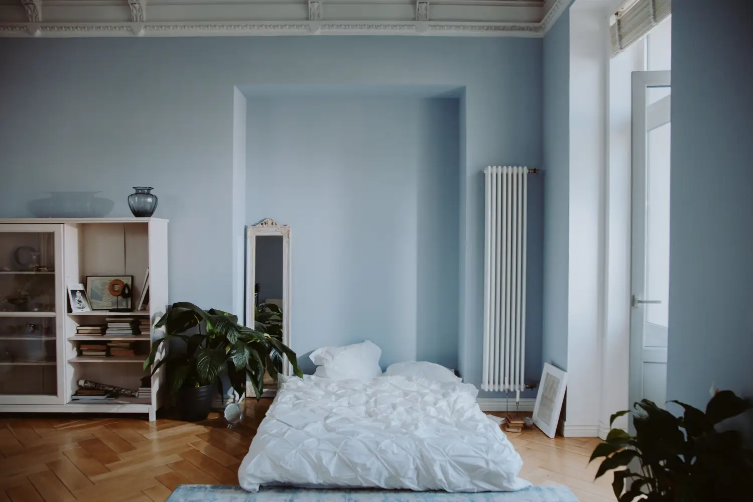
Low-saturation, cool-to-neutral wall colors—muted blue-greens, dusty lavenders, warm taupes, pale sage greens—tend to settle the nervous system most reliably. They mirror the restful tones found in nature and reduce the visual stimulation that keeps stress levels high. A bedroom painted a soft, grayed blue can slow a racing heart; a home office in quiet sage can ease the mental static that builds through a workday. Calm is less about which color you choose than about whether that color respects the room’s real purpose.
A Living Room Green-Gray Transforms the Day’s Edge
A living room that doubles as a work-from-home station and evening refuge sits under a coat of stark, warm white. That white glares in afternoon light, never really letting the mind mark a boundary between labor and rest. After living with the tension, the homeowner tests swatches and lands on a muted green-gray—something between sea mist and dried sage. The change is immediate. The room softens. Light still enters, but it no longer feels like an assault. The harsh edges dissolve into a quiet envelope, and for the first time, the space signals day’s end without effort. The takeaway: a calming wall color doesn’t avoid pigment; it dials back the demand.
Why That Muted Green-Gray Soothes the Nervous System
The response isn’t mysterious. It travels through the visual system into deeper, older parts of the brain.
Muted Pigment Silences Visual Noise
Bright, saturated colors—scarlet, true yellow, even a singing turquoise—raise physiological arousal. They command notice. The green-gray in this living room has remarkably low saturation; enough gray mixes into the pigment to make it recede rather than announce itself. The eye moves over it without a startle reflex, and that calm signal tells the autonomic nervous system there is nothing to brace against. Heart rate and muscle tension can finally ease.
Blue-Green Undertones Activate Safety Circuits
Across thousands of generations, humans learned to read blue and green as safety: water, vegetation, navigable sky. A wall paint that carries even a whisper of those hues can nudge that ancient wiring. The green-gray’s undertone leans just enough into blue-green territory to remind the brain of shelter without the person ever noticing. It’s not a landscape; it’s a near echo—enough to steer the nervous system toward rest.
The Room’s Purpose Ties It All Together
The same color placed in another room could feel wrong. This living room has to hold intense focus and then release it. A low-stimulus, slightly cool neutral succeeds because it doesn’t compete with either state. During a video call, it stays quiet and doesn’t steal cognitive bandwidth. After work, it melts into the background, making space for recovery. The calm isn’t in the pigment alone; it lives in the fit between the color and what the room is being asked to do.
Rooms Where Color Choice Directly Lowers Stress
Every room’s demands shape which hue will truly dial down tension. The principle stays the same, but the application shifts.
In a Bedroom, Blue Slows the Heart
A bedroom’s job is sleep and intimacy, and blue—especially a muted, dusty sky or a grayed periwinkle—can lower blood pressure and pulse rate. That physiological downshift makes falling asleep less of a fight. The nuance matters: a blue needs a touch of warmth in its undertone, a hint of gray or lavender, or it can drift into a sterile coldness that keeps the room at arm’s length. A crisp, icy blue in this space can feel more like an alarm than a lullaby.
In a Home Office, Muted Green Eases Cognitive Load
Focus under pressure breeds anxiety. A soft sage or an olive-tinged gray reduces visual fatigue and keeps the brain from overreacting to minor stressors. Green is the easiest color for the human eye to process, which means less mental energy goes into seeing and more remains for thinking. In a room full of screen glare, a low-saturation green wall acts as a visual reset—a place for the eyes to land without extra work.
In a Bathroom, Lavender Softens Overstimulation
Bathrooms deliver the day’s most abrupt sensory bookends—morning brightness, evening wind-down. A pale lavender or a dusty mauve can wrap the space in a moment of quiet without turning saccharine. Because lavender sits right where cool and warm meet, it soothes without pulling the temperature too far in either direction. In a small powder room, that enveloping quality feels like a small, deliberate retreat.
In a Kitchen, Warm Neutrals Anchor Chaos
Kitchens are high-traffic zones of sharp tools, hot surfaces, and layered family emotion. A creamy taupe or a warm griege (gray-beige) provides a stable, grounding background that refuses to compete with the activity. The warmth adds a layer of comfort—vital in a room that often holds tension as much as it holds meals. A purely cool neutral here can amplify the room’s natural chill, so a hint of brown or gold in the undertone matters.
Why the Whitest Room Can Feel the Most Agitated
One of the most persistent misunderstandings about calm is that it lives in a blank white box. Pure, bright white walls can in fact be among the most overstimulating choices, especially when the room gets strong natural light. White throws more light energy into the eyes, raising glare and arousal. In the living room example, the original warm white felt piercing because it bounced too much light and carried no soothing undertone. The green-gray succeeded because it absorbed enough light to soften the room’s sensory load. Calm isn’t the absence of color; it’s the careful management of the signals color broadcasts.
When a ‘Calming’ Color Backfires: The Icy Blue Bedroom
A bedroom painted a crisp, icy blue—the shade of a winter sky—often starts with the goal of serenity and ends with an emotionally cool, distant space. Sleep needs warmth and enclosure, not a visual chill. A blue that leans hard toward green, without any gray or lavender to soften it, can read as sterile, and the nervous system may register that coldness as a low-grade environmental stressor. Warm lighting and textiles in blush or taupe can pull the room back from the edge, but the wall color itself wasn’t carrying the calm; its lack of warmth made it the wrong fit for that particular purpose. That same icy blue might work beautifully in a sun-drenched sunroom, where the context asks for brightness, not embrace.
Questions About Calming Wall Colors
What is the most calming color for anxiety?
A soft, grayed blue or blue-green tends to be the strongest starting point for general anxiety. The cool hue gently lowers physiological arousal, and the low saturation keeps stimulation in check. Still, the best color depends on the individual; someone who instinctively finds cool colors unsettling may do better with a warm, muted neutral.
Does pink really make you calm down?
The association comes from Baker-Miller pink, a specific, vivid hue tested in holding cells for its short-term aggression-lowering effect. That bright pink can be too stimulating for sustained use in a home. A dusty, clay-blush pink can feel soothing in a small space when used with restraint, but a whole room of saturated pink often backfires into agitation.
Should I use the same calming color in every room?
Rarely. A single color repeated through an entire home tends to flatten the emotional variety a house needs to feel alive. Each room asks for something different, and the colors should shift in response. A bedroom may want a deeper, cocoon-like blue, while a hallway works better with a lighter, more open neutral. The consistent thread should be low saturation, not identical pigment.
What wall color helps a child calm down?
Muted blues and soft greens are reliable starting points, but warmth is particularly important so the room doesn’t register as cold or frightening. A washed-out aqua or a gentle sage with a subtle yellow undertone can hold both serenity and comfort. Darker shades, even when muted, can feel enclosing rather than safe in a child’s room.
The simplest way to anchor a calming room is to remember that color works through the nervous system long before it works as decoration. The green-gray in that living room succeeded not because it was the prettiest swatch, but because it was the most restrained: low saturation, a nature-leaning undertone, and a shade that understood exactly what the room needed from its walls. That kind of listening, more than any specific hue, is what lets a color actually deliver calm.

Clara Bennett
After five years of transforming my 1920s bungalow room by room, I’ve refinished floors, hung blinds in bay windows, and spent more time choosing light bulbs than I’d like to admit. I learned paint sheens by painting my kitchen ceiling three times, and I found out the hard way that a rug too small makes a room feel unfinished. I believe every home can be both functional and beautiful, no matter the budget.
Related posts
The Framework Most Homeowners Miss When Choosing Colors
Stop painting room by room. Use this sequential framework: start with permanent finishes, pick a whole-house neutral, then build accents. Cohesion guaranteed.
Finally Nail Color Balance: The 60-30-10 Rule Made Simple
Stop guessing. A direct room-by-room guide to the 60-30-10 rule that fixes the top mistakes making your rooms feel off-balance—no design experience needed.

The Color Wheel Trick Pros Use for Whole-House Flow
A step-by-step method to use the color wheel to map a cohesive palette that flows through doorways and sightlines, focusing on the transitions most homeowners overlook.
Neutral Walls? The Hidden Price You’re Paying
Neutral walls cost you measurable light, perceived space, and mood. Learn the break-even rule for when to add bold accents and where they earn the biggest return.