Neutral Walls? The Hidden Price You’re Paying
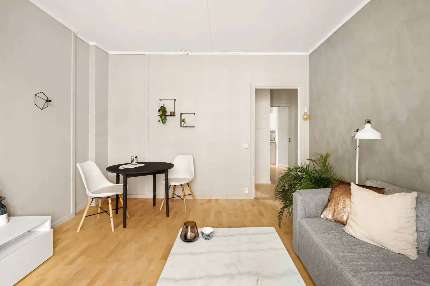
Neutral walls appear safe. That safety is a bill you pay in three measurable losses: light, perceived space, and mood. By the end of this, you will have a clear filter for deciding when neutral walls steal too much and a rule for putting bold color exactly where it earns its keep.
The Light Tax: How Gray and Beige Dim Your Room
Every wall color has a light reflectance value (LRV). Pure white reflects roughly 85–90 percent of visible light; deep colors can drop below 15. The neutrals most people settle on — greige, warm gray, creamy beige — typically sit between 55 and 70 LRV. That range absorbs 30 to 45 percent of the light that hits it before your eyes ever see it.
Take a north-facing room with one window. Switch the walls from a popular mid-tone greige to a clean off-white at LRV 80 or higher, and the room brightens immediately — no new lamps required. The bill here is double: you lose free daylight and then pay to replace it with electricity.
Why Flat Finish Makes It Worse
Flat and matte sheens scatter light in every direction, dulling perceived brightness even further. Use a flat greige and you can lose another 5–10 percent of visible light compared to the same color in eggshell or satin. A mid-tone neutral plus a flat finish equals a room that fights the light twice.
The Space Shrink: How Beige Steals Square Footage
Your eye reads room size by contrast. Lighter walls set against a darker floor and a bright white ceiling create clean edges that signal spaciousness. Mid-tone neutrals — the ubiquitous “versatile greige” — blur those edges. Walls bleed into floors and furniture, and the clear boundary your brain uses to measure space disappears.
A 10-by-12-foot bedroom with a single window painted in a medium greige feels smaller than its actual dimensions. The loss is not imaginary. The eye compresses the room by denying it the contrast needed to perceive depth. A lighter, cleaner neutral on those same walls restores the distinction instantly and gives back the 10–15 percent of perceived space the dark neutral took.
Ceiling and Trim Are Part of the Equation
When walls, ceiling, and trim all wear the same off-white, the room loses its edges entirely. Painting the trim a crisp white and the ceiling a shade cooler than the walls carves those boundaries back, even if the walls stay neutral. Sheen alone begins to rebuild the room’s dimensions.
The Mood Deficit: Neutral Walls Drain Purpose
Color drives behavior. Warm neutrals feel comfortable in a living room but deadening in an office. Cool neutrals soothe in a bedroom but chill a dining room. The loss is not subtle — it shows up every time the room works against what you are trying to do in it.
A powder room painted a timid mushroom tone never feels like a retreat. A breakfast nook in flat gray never invites anyone to sit. The friction is constant. People spend less time in rooms that fail to match their primary activity.
The Sharp Correction a Bold Accent Delivers
Place one deep, saturated accent wall — navy, terracotta, forest green — and the entire room reorients. The eye lands on it, the surrounding neutrals step back, and the space gets a clear emotional signal. A dining room with a single plum wall feels intentional and intimate. A home office with a burnt orange accent wakes up attention the moment you enter. The bold wall earns back the mood the neutral walls surrendered.
The Break-Even Rule: Exactly When to Go Bold
You do not need to guess. This three-point checklist tells you when neutral walls are costing too much. Introduce a bold accent wall if at least two of these are true:
- Limited natural light. North-facing rooms, small windows, heavy tree cover. A bold wall becomes a visual anchor that diverts attention from the dimness.
- Unbalanced room dimensions. A long, narrow room. Paint the far short wall a strong color, and the hallway effect shortens visually.
- No natural focal point. No fireplace, no large window, no built-in feature. The accent wall creates the missing focal point.
If none of the three apply — the room is bright, well-proportioned, and has a clear focal point — keep all walls neutral. The instant two conditions are true, bold is the smarter play.
The Accent Strategy: Where Bold Gets the Most Return
Random placement wastes the effect. Place bold color with purpose.
The Entry Wall
Paint the wall opposite the door you enter through. That is the first thing anyone sees. It sets the room’s tone before the eye registers anything else.
The Furniture Anchor
In a bedroom, the wall behind the headboard. In a living room, the wall behind the main seating area. The color reinforces the focal point the furniture already creates.
Avoid Fragmented Surfaces
Skip walls broken by large windows, multiple doors, or bulky radiators. Bold color on a chopped-up wall loses impact. The strongest return comes from the most uninterrupted wall you have.
What Neutral Walls Cost You: A Recap
- Light: Mid-tone neutrals swallow up to 45 percent of available daylight, forcing more artificial light and higher energy bills.
- Space: Muddy neutrals blur visual boundaries, compressing perceived room size by 10–15 percent.
- Mood: The wrong tone drains energy, shortens use time, and never aligns with the room’s function.
The Rule That Ends the Guesswork
Neutral walls are not the problem. Choosing them without measuring the cost is the problem. The break-even rule clears the fog. Run the room you spend the most waking hours in through the three conditions: light, dimensions, focal points. If two are missing, add one accent wall in a color that supports the activity. That single move — less than a gallon of paint — buys back light, space, and emotional payoff every day you walk in.

Clara Bennett
After five years of transforming my 1920s bungalow room by room, I’ve refinished floors, hung blinds in bay windows, and spent more time choosing light bulbs than I’d like to admit. I learned paint sheens by painting my kitchen ceiling three times, and I found out the hard way that a rug too small makes a room feel unfinished. I believe every home can be both functional and beautiful, no matter the budget.
Related posts

The Framework Most Homeowners Miss When Choosing Colors
Stop painting room by room. Use this sequential framework: start with permanent finishes, pick a whole-house neutral, then build accents. Cohesion guaranteed.
Finally Nail Color Balance: The 60-30-10 Rule Made Simple
Stop guessing. A direct room-by-room guide to the 60-30-10 rule that fixes the top mistakes making your rooms feel off-balance—no design experience needed.

The Color Wheel Trick Pros Use for Whole-House Flow
A step-by-step method to use the color wheel to map a cohesive palette that flows through doorways and sightlines, focusing on the transitions most homeowners overlook.
Which Wall Colors Really Calm You Down?
Discover which low-saturation wall colors reduce stress in every room, from blue bedrooms to green-gray living rooms. Backed by psychology, not just color theory.