The Color Wheel Trick Pros Use for Whole-House Flow

Painting one room at a time without accounting for doorways creates mismatched thresholds. The fix is a whole-home palette built from the color wheel, anchored on sightlines and transition points. Professionals map these invisible seams first, then let the wheel dictate how to connect room to room without abrupt shifts.
Which Whole-House Problem Are You Trying to Solve?
The same method works across these starting situations, but the sequence you follow will differ.
- You have a blank canvas in a new home. Your path: establish the neutral backbone in the second stage, then expand each room’s color outward from doorways.
- You already painted some rooms and they clash. Your path: identify the worst threshold in the first stage, then go directly to the third stage to correct the offending wall.
- Your furniture and decor are fixed, and paint must follow. Your path: begin at the third stage, pulling your palette from existing furnishings and using the color wheel to smooth the points where rooms meet.
Map the Sightlines You Actually Walk Through
The first stage isolates the transition points homeowners typically overlook. The objective is to catalog every location where two wall colors appear together in a single view. Walk the house, pause at each doorway or archway, and note the surfaces you see simultaneously. A simple bubble diagram helps: sketch each room, mark openings, and list the color field visible from each standing spot.
Actions: walk the entire floor, including hallways and landings. Check sightlines through partially open doors — the angle often exposes more adjacent wall than expected. Draw arrows on your floor plan indicating each shared view.
You are ready for the next stage when you can identify at least five transition zones where two painted surfaces will be seen together, and you have a diagram showing which walls share a sightline.
Anchor the Palette with a Neutral That Travels
The goal is to select a single neutral color that runs through halls, stairs, and connecting spaces, creating a continuous visual ribbon. The neutral does not need to be white — it can be a warm greige, a soft taupe, or a muted blue-gray — but it must hold consistency from every angle. On the color wheel, neutrals sit near the center, low in chroma. Pull several neutrals with a shared undertone and test them in the natural light of your main corridor.
Actions: narrow to three candidates. Paint large swatches on both a north-facing and a south-facing wall of the corridor. Observe them morning, midday, and evening. Choose the one that appears intentional in all conditions, not flat or washed out.
You are ready when that neutral makes the corridor look cohesive and provides a calm, reliable base against which other colors will be judged.
Shift Colors at Doorways Using Wheel Relationships
Now the actual color wheel work begins. The aim: assign each room a hue that relates to the neutral spine and to the color of the room just left. At any threshold, the two colors must share a clear relationship. Use the wheel to decide whether the adjacent room is analogous (close on the wheel, such as blue-green to muted teal) or complementary (opposite, such as warm beige to subdued blue), always matched in intensity. The transition should read as a deliberate step, not a surprise.
Actions: for each doorway, place the neutral and the new room’s color swatch next to each other. Verify that the undertone aligns — if the neutral has a pink undertone, a green-tinged beige will create friction. Adjust by moving slightly around the wheel or by reducing saturation (adding gray) to soften the boundary. Test with actual paint chips held at the exact corner where the walls meet.
You are ready when every pair of swatches held at a transition belongs to the same visual family, and no single color stands out as an error.
Verify Under Real Light Before You Commit
A palette that works on a swatch card can fail under actual light. This stage tests the entire flow using the real lighting each transition receives. Paint large rectangular swatches (at least two feet by two feet) on both walls right at the doorframe. Leave them up for a full day, observing at morning, noon, and under artificial light at night. The objective is to catch any color that turns muddy, garish, or disconnected when seen beside its neighbor.
Actions: if a color misbehaves, first adjust its value — test a lighter or darker version. If that fails, shift the hue slightly on the wheel while preserving the undertone. Retest. The threshold itself is the final judge.
You are ready when, walking from one room to the next at any time of day, the color change registers as deliberate rather than arbitrary.
Paint in Sequence to Preserve the Flow
The final stage applies the palette to the walls without breaking the connections you tested. Paint the neutral backbone first — hallways, stairs, any connecting corridors. Then work outward from the center, painting adjacent rooms one at a time. Always paint the two walls at a doorway on the same day so the cut-in line stays clean and your eye remembers the relationship.
Actions: after each room, walk the sightlines again to confirm the flow holds. If a color reads differently than the swatch promised, repaint that single wall now while it is still easy to correct.
The job is finished when you can stand in any open doorway and the connected palette reads as a single, deliberate composition.
Readiness Signs at a Glance
All the checkpoints that signal it’s time to proceed, in sequence:
- You can name at least five transition zones and have a sketch showing which walls share a sightline.
- Your neutral makes the corridor cohesive and serves as an unobtrusive backdrop.
- Every pair of swatches at a transition belongs to the same visual family, with no outlier.
- The color shift from room to room at any time of day feels intentional, not haphazard.
- Standing in any open doorway, the whole palette appears as one planned composition.
Shortcuts That Do Not Compromise the Result
A few legitimate accelerators can speed the testing phase without adding risk:
- Use a physical color wheel with a grey scale to reveal undertones quickly. Slide a paint chip next to the grey strip — any hidden hue bias becomes obvious.
- Order oversized, repositionable adhesive paint samples. The same swatch can be moved from doorway to doorway, saving time and materials.
- Take smartphone photos in a manual mode, then desaturate the image to check the value relationship between two walls. Similar values usually produce a smooth transition, even when hues differ.
Concerns You Can Defer
Homeowners are often told to worry about details that matter later, not now. Keep these on hold:
- Exact light bulb color temperature. This matters after painting, when you install permanent bulbs. Until then, your swatches will shift under temporary light. Address it during the lighting phase.
- Perfect sheen selection. Consistency in sheen across rooms matters more than which exact sheen you choose. Decide an overall rule — eggshell or matte — and stick with it. Fine-tune only after seeing the dried paint.
- Seasonal light variation. A wall that feels cold in January may feel fine in July. If the color works under the room’s dominant light conditions, accept the minor swings. Accessories can later compensate.
- Trend-driven accent colors. Flow relies on enduring relationships, not passing fads. If a trendy color would disrupt a doorway transition, save it for a room with a door that stays closed, or use it strictly in textiles and art.
Frequently Asked Questions
Can I paint every room the same color and still have flow?
Yes, and that is the simplest form of whole-house flow. However, identical color everywhere can read as monotonous. The method above provides variation while preserving the connection. If you want a single color, skip to the neutral spine stage and apply it throughout.
How do I handle an open floor plan where walls do not define rooms?
Open plans still have transition points: a ceiling height change, the end of a half wall, or where a kitchen backsplash meets the living area wall. Treat these architectural breaks exactly as you would a doorway. Apply the same color-wheel relationship tests.
What if my home has a mix of warm and cool fixed elements?
When flooring reads warm and countertops cool, choose a neutral that sits between them on the color wheel. A balanced greige can bridge the gap. Then, select room colors that lean slightly toward each fixed element without fully crossing into cold or warm territory.
Should I paint trim and doors the same color throughout?
Yes, for flow. Consistent trim color frames each room and connects separate spaces. A crisp white or near-white works as a universal border, allowing wall colors to shift behind it without losing continuity.
The Result and Your First Step
When every sightline in your home reads as a single, intentional color story, the trick has delivered. Walk from your front door to the farthest bedroom and note the threshold where a color shift feels wrong — that is your starting point.

Clara Bennett
After five years of transforming my 1920s bungalow room by room, I’ve refinished floors, hung blinds in bay windows, and spent more time choosing light bulbs than I’d like to admit. I learned paint sheens by painting my kitchen ceiling three times, and I found out the hard way that a rug too small makes a room feel unfinished. I believe every home can be both functional and beautiful, no matter the budget.
Related posts
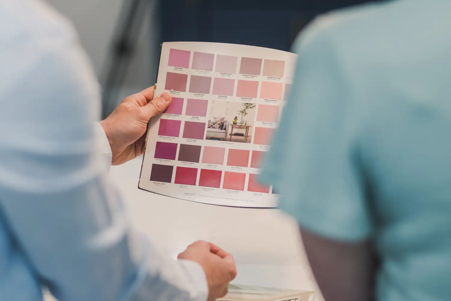
The Framework Most Homeowners Miss When Choosing Colors
Stop painting room by room. Use this sequential framework: start with permanent finishes, pick a whole-house neutral, then build accents. Cohesion guaranteed.
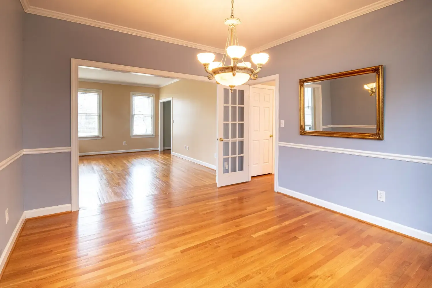
Finally Nail Color Balance: The 60-30-10 Rule Made Simple
Stop guessing. A direct room-by-room guide to the 60-30-10 rule that fixes the top mistakes making your rooms feel off-balance—no design experience needed.
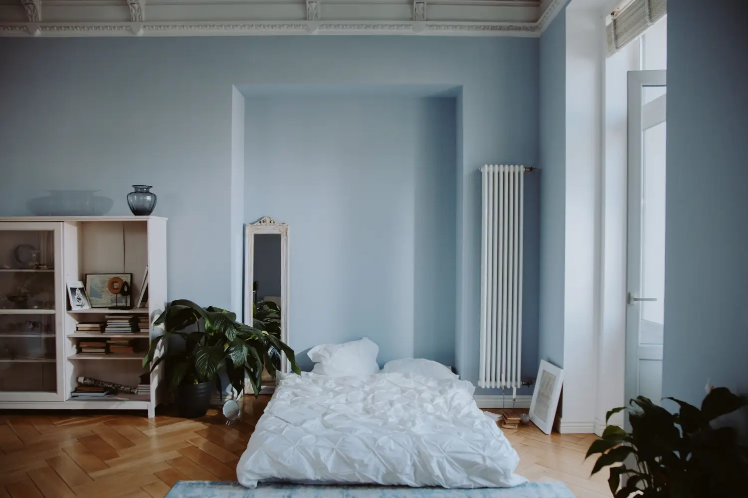
Which Wall Colors Really Calm You Down?
Discover which low-saturation wall colors reduce stress in every room, from blue bedrooms to green-gray living rooms. Backed by psychology, not just color theory.
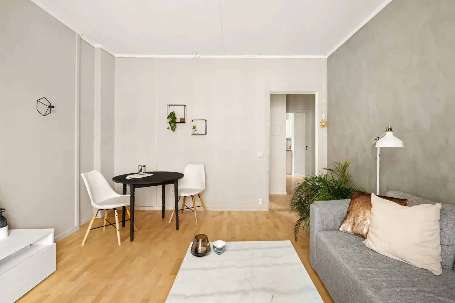
Neutral Walls? The Hidden Price You’re Paying
Neutral walls cost you measurable light, perceived space, and mood. Learn the break-even rule for when to add bold accents and where they earn the biggest return.