The Framework Most Homeowners Miss When Choosing Colors

Picking a paint color for one room is easy. Making every room in a house feel cohesive is not—it’s a sequencing problem, not a taste problem. When homeowners paint room by room without a framework, the result is a patchwork: a living-room gray clashes with the hallway’s beige carpet, a kitchen yellow reads wrong from the adjacent den. The fix starts with permanent surfaces and moves systematically to accents.
Every color decision must begin with what cannot change: flooring, stone fireplaces, tile, exposed brick, large architectural features. Those fixed elements define the palette’s constraints. Build outward from them, and cohesion follows. This article details that staged framework, starting with your own situation, so by the end you have a whole-house color scheme that holds together.
Where You Stand Changes the First Move
Before choosing a single paint chip, identify your starting point. The framework adapts to different homes, but the sequence always begins with what’s fixed. Pick the scenario that fits closest.
- A new construction or gut renovation with no finished surfaces.
Your fixed elements are the ones you’re about to install: flooring, countertops, tile. The route: document these materials first, then progress to the neutral wall color that ties them together.
- An existing home with permanent features you cannot (or won’t) change.
Think mid-century stone fireplace, honey-toned oak floors throughout, original bathroom tile. The route: pull colors directly from those features before you choose wall paint; the entire palette will live in relation to them.
- A house where you’ve already painted several rooms and now nothing feels connected.
You’re not starting from scratch, but the framework still applies. The route: backtrack to the home’s fixed elements, treat them as the anchor, and then repaint only the rooms that break the flow—using the sequence to repair cohesion.
- A home where you plan to change some fixed finishes but not all.
Maybe you’re replacing flooring on the main level but keeping the upstairs carpet. The route: treat the new flooring as the first fixed decision point, then work from there, accommodating any remaining permanent elements as you go.
Stage 1: Pin Down the Non-Negotiables
The point of this stage is to inventory every color that physically exists in the house and cannot be easily altered. That list becomes the palette’s constraints—and its best source of direction.
Concrete actions:
- Walk every room and photograph all permanent surfaces: floors, counters, backsplashes, fireplaces, exposed beams, built-in cabinetry, brick or stone walls, stair railings, even large sections of tile that will remain.
- Using good natural light or daylight-simulating bulbs, note the undertones of each element. The table below shows common permanent materials and the undertones they often carry.
| Permanent Material | Typical Undertone |
|---|---|
| Honey oak flooring | Orange-yellow |
| White oak flooring | Neutral-warm, slight beige |
| Cherry or mahogany wood | Red to red-brown |
| Gray-stained wood | Blue-gray or green-gray |
| Travertine tile | Cream, beige, sometimes pink |
| Slate or dark stone | Blue-gray, charcoal, green-black |
| White marble | Cool gray-blue or warm cream |
| Brick (red/orange) | Warm orange, occasionally brown |
| White tile (glossy) | Cool blue-white or warm yellow-white |
| Carpet (beige) | Yellow-beige or pink-beige |
- Write the two or three most dominant fixed elements and their undertones at the top of a new list. That list is now your color brief.
Observable sign that you’re ready to move on: you have a one-page summary that captures the home’s overarching color temperature—warm-leaning, cool-leaning, or a narrow neutral zone. If you can state without hedging, “This house sits on a warm spectrum because of the oak floors and terracotta tile,” Stage 1 is done.
Stage 2: Choose a Whole-House Neutral That Carries Through Every Space
With the fixed colors understood, the next move is to pick the dominant wall color—often a neutral—that will run through the largest open spaces and hallways. This single color becomes the through-line of the house, so it must sit comfortably next to every permanent surface.
Concrete actions:
- Pull 8–12 neutral paint chips from a single brand’s collection. Look for complex neutrals that contain a bit of the undertones you found in Stage 1. If your fixed elements are warm, filter toward warm whites, greiges, warm taupes. If cool, look at greiges with violet or blue-gray casts, or clean whites with cool blue undertones.
- Order large peel-and-stick swatches (at least 12x12 inches) of your top three to five candidates. Place each one against the most dominant fixed element in the room that gets the most daylight. Then place each against that same element in the room that gets the least natural light. The color will shift dramatically; store lighting is irrelevant here.
- Eliminate any neutral that looks dirty, pink, or off-putting in either extreme. Narrow to two finalists, then live with the swatches for 48 hours, checking under artificial and natural light at morning, noon, and evening.
Observable sign that you’re ready to move on: one neutral looks consistently correct—not necessarily identical—next to every fixed element, in both bright and dim conditions. You don’t feel the need to explain, “Well, it works here but…”
Stage 3: Build a Coherent Accent Palette That Flows Room to Room
With the whole-house neutral chosen, the palette expands into secondary and accent colors that give individual rooms personality without breaking the thread. This stage shifts from matching to composing.
Concrete actions:
- Using a color wheel or a brand’s coordinating collection, pull out 3–6 colors that sit in relationship with your chosen neutral. For a subtle scheme, stay inside the same hue family but vary depth (light, medium, dark). For more contrast, move to adjacent hues (analogous) or incorporate one carefully chosen complementary accent.
- Assign each color to a specific job: a soft blue-green for a powder room, a deeper version of the neutral for a dining room feature wall, a warm greige for the home office. Document assignments on a simple floor plan or list—no need to commit permanently yet.
- Check that the colors you’re adding don’t create a jump in color temperature from room to room. The transition from a warm hallway neutral into a cool bedroom wall, then into another warm den, feels disjointed unless there’s a deliberate bridge. A “bridge color” could be a medium-neutral that shares undertones with both warm and cool ends.
Observable sign that you’re ready to move on: you have a complete palette mapped to rooms, and every proposed color has a logical relationship to the whole-house neutral. Show the list to someone else; they should see a family of colors, not random picks.
Stage 4: Test the Colors Under Real Light and Finalize the Finish
Paint samples on a tiny chip lie. The final stage translates your curated palette into real walls, adjusting for the unpredictable behavior of light and surface texture.
Concrete actions:
- For each assigned room color, paint a large poster board (at least 2x2 feet) with two coats. Move the board around the room: hold it against the trim, the floor, the focal feature, and the wall that receives the strongest natural light versus the darkest corner.
- Check how the colors connect when you stand in a doorway and see two adjacent rooms at once. A hallway color that reads warm might turn dead when viewed next to a cool-toned accent wall. If it does, adjust the accent a few steps warmer or lighter.
- Confirm your sheen choices now: flat or matte for low-traffic areas and ceilings, eggshell for living spaces, satin for kitchens and baths, semi-gloss for trim and doors. Sheen doesn’t change the hue, but it affects perceived depth and reflectivity.
Observable sign that you’re ready to move on: no color in any room surprises you at any time of day, and the flow from space to space feels intentional rather than accidental.
Checkpoints That Confirm You’re Ready to Move On
To keep the sequence clear, here are the readiness signs from each stage, collected in order:
- You’ve documented all fixed surfaces and can state the home’s overarching color temperature.
- One whole-house neutral works next to every fixed element under varied light.
- Your full accent palette maps to rooms and every color relates back to the main neutral.
- Real-condition tests show no unwanted surprises, and you know the correct sheen for every surface.
What Doesn’t Need a Decision Yet (and When It Will)
Homeowners often stall the whole process by worrying about details that belong much later in the timeline. Hold these decisions until the foundation is set.
- Paint sheen (flat, eggshell, satin, etc.)
Trigger: After you’ve locked every color. Start sheen selection once you’re choosing between final paint products.
- Rug and furniture colors
Trigger: After the walls are painted and dry. Decor can and should respond to the walls, not the other way around. Use existing furnishings only as fixed elements if they’re staying permanently.
- Trending paint-of-the-year colors
Trigger: After you have a working palette that looks right with your fixed elements. If the trend still fits, add it as an accent; if not, walk away.
- The “perfect” white for trim
Trigger: After your whole-house neutral is confirmed. Trim white must complement—not clash with—the wall color’s undertones.
- Color psychology for each room
Trigger: After you’ve established cohesion. Then you can tweak a bedroom’s blue to be more calming or a kitchen’s yellow warmer. The consistency of the sequence ensures the shift doesn’t fragment the house.
Tools That Shorten the Timeline Without Cutting Corners
If you want to accelerate the framework without sacrificing accuracy, these resources legitimately compress testing time.
- Digital color visualizers from major paint brands
Upload photos of your rooms to see approximations of your color choices. They’re not perfectly accurate but can eliminate obviously wrong colors fast.
- Pre-coordinated palette collections
Many paint companies sell color sets designed to work together. Pick a collection whose base neutral matches your fixed-element temperature, and you instantly have a palette.
- Peel-and-stick swatches in bulk
Instead of testing two colors at a time, order a set of 6–10 large swatches at once. Place them in multiple rooms simultaneously, cutting decision time from weeks to a few days.
- A handheld light meter or LRV app
Measuring Light Reflectance Values (LRV) of your fixed surfaces can quickly confirm whether two materials share a similar brightness level, helping you avoid contrast surprises.
Common Questions About Whole-House Color Sequencing
How do I start if my house has no fixed elements worth keeping?
If you’re replacing every floor and surface, treat your material samples as the fixed elements. Order flooring, countertop, and tile samples, then follow the framework starting from those. The sequence remains: permanent materials first, then paint.
What if I already painted some rooms—can I still use this framework?
Yes. Go back to the fixed elements that remain unchanged, check whether the already-painted rooms work against them, and repaint only the rooms that break cohesion. The framework becomes a repair tool, not a do-over.
How many colors should a whole-house palette have?
A functional palette uses 3 to 6 colors across a home: one dominant neutral, one or two secondary neutrals, and a few accents. More than that and cohesion becomes harder to maintain.
Can I use different colors in every room and still have cohesion?
Only if you connect them through consistent undertones, similar brightness, and a clear through-line from the whole-house neutral. Without that thread, the house feels like a series of disconnected boxes.
A Whole-House Palette That Works
When the framework is complete, the home reads as a single designed space—each room distinct but connected by an underlying color logic. The feeling isn’t “these rooms match” but “this house makes sense.”
The very first action for the most common starting point—a home with permanent finishes you won’t change—is to photograph every fixed element and document its undertone. If you’re starting with a clean slate, collect your flooring and tile samples and begin Stage 1 with those. That list grounds every color decision that follows.

Clara Bennett
After five years of transforming my 1920s bungalow room by room, I’ve refinished floors, hung blinds in bay windows, and spent more time choosing light bulbs than I’d like to admit. I learned paint sheens by painting my kitchen ceiling three times, and I found out the hard way that a rug too small makes a room feel unfinished. I believe every home can be both functional and beautiful, no matter the budget.
Related posts
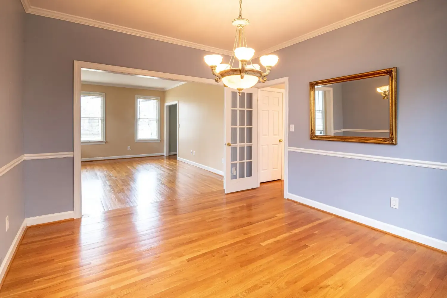
Finally Nail Color Balance: The 60-30-10 Rule Made Simple
Stop guessing. A direct room-by-room guide to the 60-30-10 rule that fixes the top mistakes making your rooms feel off-balance—no design experience needed.

The Color Wheel Trick Pros Use for Whole-House Flow
A step-by-step method to use the color wheel to map a cohesive palette that flows through doorways and sightlines, focusing on the transitions most homeowners overlook.
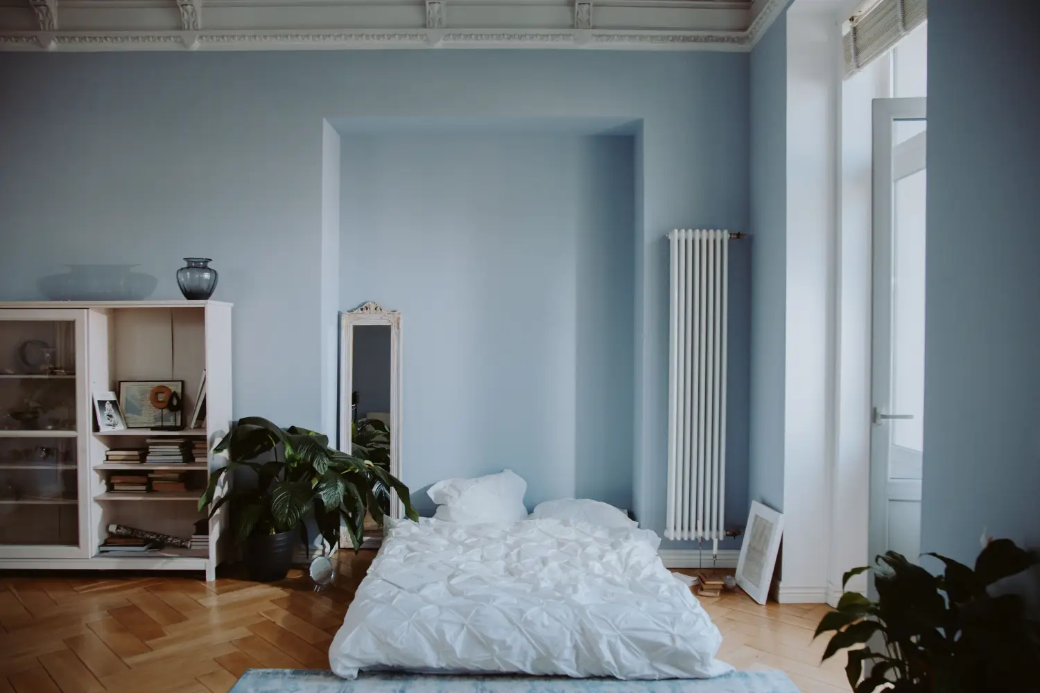
Which Wall Colors Really Calm You Down?
Discover which low-saturation wall colors reduce stress in every room, from blue bedrooms to green-gray living rooms. Backed by psychology, not just color theory.
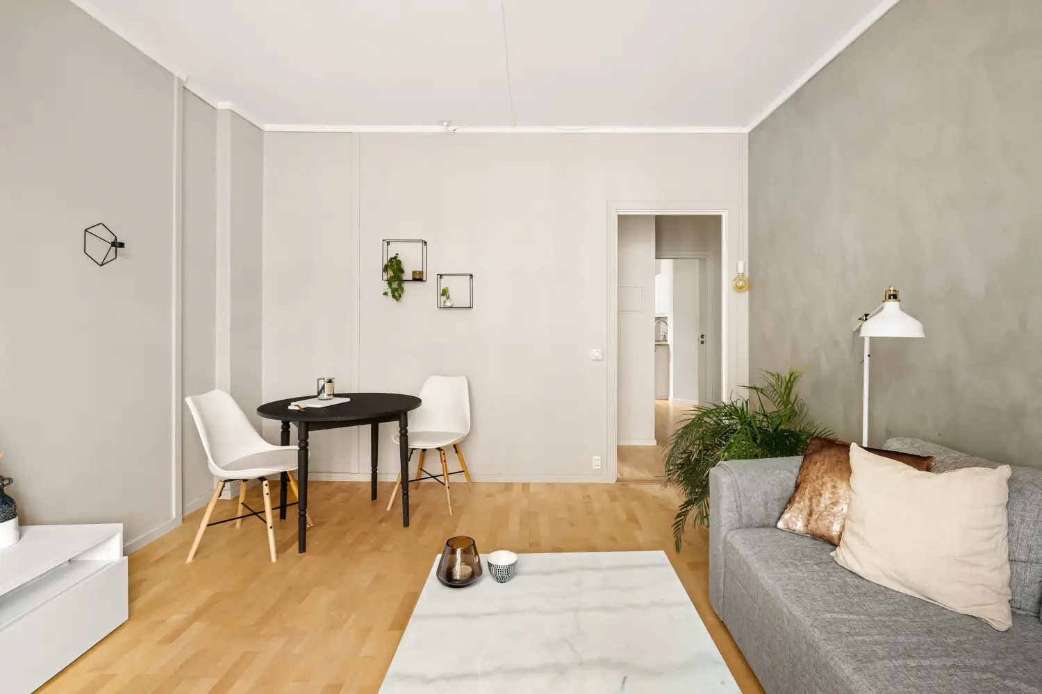
Neutral Walls? The Hidden Price You’re Paying
Neutral walls cost you measurable light, perceived space, and mood. Learn the break-even rule for when to add bold accents and where they earn the biggest return.