These Monochrome Palettes Actually Work in Small Rooms
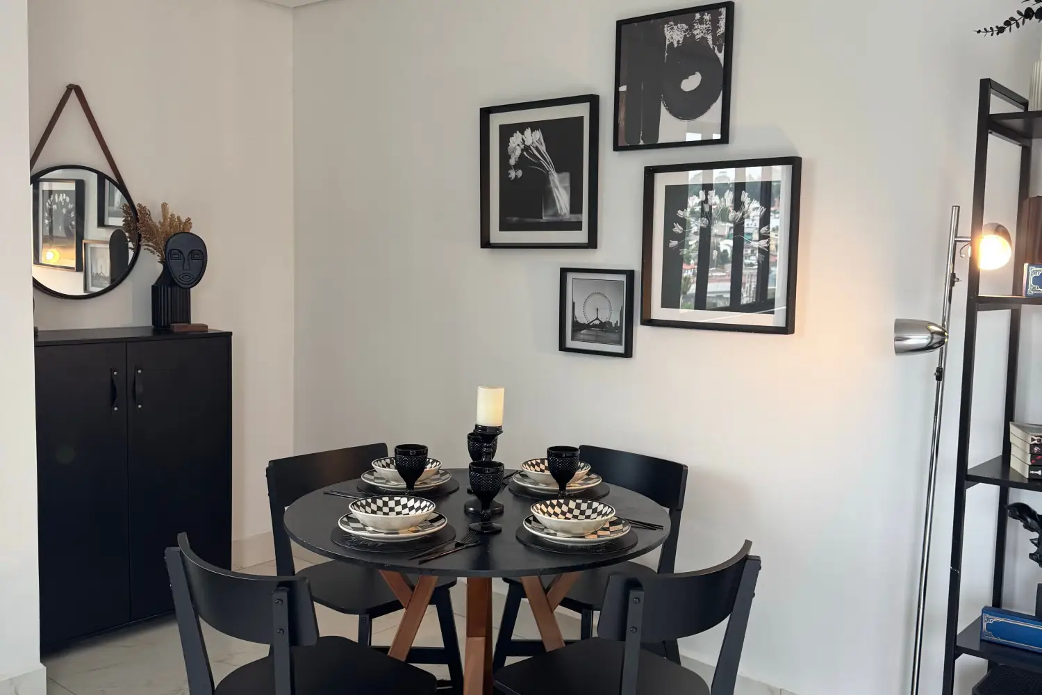
Monochrome palettes don't just work in small rooms—they're quietly transformative. Not because you pick one paint chip and call it done, but because you're building with light itself: a gentle progression of pale, mid, and deep values that whispers to the eye, "There's more room here than you think." Add the right sheen on the right surface, and suddenly a cramped corner breathes. The walls stop closing in. That's not an accident; it's a careful, almost meditative layering of how light falls and reflects. If the room feels small, you don't need to love a bigger home; you need to see how paint can carry you there.
Which Small-Room Monochrome Challenge Matches Yours?
If your north-facing room feels permanently muted and uncertain, your path forward begins with finding a light-value base that drinks in every scrap of daylight and gives it back softly. From there, you'll add mid-tone relief and a gentle sheen so the room never turns clinical.
If you're drawn to deep, enveloping walls but worry they'll swallow the space whole, your route keeps the darkness where it belongs: as a quiet accent tucked into a recess, or wrapping a single wall like a piece of heavy velvet in a well-lit room, letting the lighter values hold the perimeter.
If the room's architecture feels chaotic—sloped ceilings, odd alcoves, inexplicable bump-outs—your route uses three values of one hue to pull every surface into a calm, unified whole, then uses sheen to separate what needs to be separate without adding visual noise.
Anchor the Room with the Lightest Value First
This step is about giving the room a feeling of generosity. Select a value that sits in the 85–95 LRV range: the palest whisper of gray, a buttery cream barely tinted, the faintest hint of a sea-mist hue. Paint the broadest walls and the ceiling in a flat or ultra-matte finish—the kind that absorbs light rather than echoing it, making hard edges dissolve.
Concrete actions: Don't commit to a color you've only seen on a tiny card. Order large peel-and-stick swatches and press them onto the wall that faces the window, and also into the darkest corner. Spend a day watching how daylight moves across them. The right value will make the wall feel less like a solid thing and more like a soft boundary.
You're ready to move on when you can stand in the middle of the room and feel that the walls aren't boxing you in—they're just holding the light.
Let Mid-Tones Ground the Space Without Weighing It Down
A room that stays entirely pale can feel untethered. Mid-tones, around 45–65 LRV, offer a quiet anchor. Use them on the surfaces that naturally break the vertical plane: baseboards, the sill of a window, the back of a shelf. Stay within the same color family, nudging the hue two to four steps darker on a fan deck. Keep the sheen the same as the walls—eggshell on both, for instance—so the eye registers the shift in depth but never a clash in finish.
Concrete actions: Paint all the trim in that mid-tone, or if the room lacks trim, create your own grounding line with a painted band at chair-rail height or a darker shelf above a door. The goal is a quiet visual weight, not a graphic stripe.
You're ready to move on when the room finally feels settled. Intentional, whole, but still open—a room that knows what it is, not a pale echo of itself.
Use Dark Values to Create Depth, Not a Cave
Dark values in the 15–30 LRV range are potent; a little goes a long way. Use them sparingly, on perhaps 10–15% of the visible surfaces, applied only where the architecture naturally recedes. The back wall of a bookcase, the inside of a window reveal, a small alcove—these are safe havens for deep color. The eye reads the darkness as shadow, and shadow translates to depth.
Concrete actions: Choose the deepest version of your hue. Paint it on a surface that's set back, not forward. If the room has no built-in recesses, a tall, slim panel of dark color behind a piece of furniture can create the same sink-away effect. Never paint an entire large wall black—that declares, "I am here," and in a small room, that's the opposite of what you want.
You're ready to move on when the dark accent doesn't call attention to itself; it simply exists, and the whole room feels more layered and interesting because of it.
Let Sheen Carry the Palette the Rest of the Way
Sheen is the quiet engine of spaciousness. A flat ceiling never competes with the walls; it recedes upward, making the ceiling feel lifted. Eggshell walls possess just enough soft glow to keep the lightest value from feeling dusty. Satin on trim catches a hint of light as you move through the room—little glimmers that tell the eye, "Here is structure, but still gentle."
Concrete actions: If your ceiling has any sheen at all, repaint it with dead-flat paint. Wait until your wall color is utterly right before shifting to eggshell, because sheen changes how lively a color feels. Apply satin sparingly on door jambs and window frames; too much gloss can pinch a space by throwing sharp highlights.
You're ready to move on when you walk in and the room feels noticeably taller than it did, the light moves around you with an easy, unforced rhythm, and your glance never catches on a hot spot of glare.
How to Know You're Ready to Paint the Next Value
- After the lightest value: The walls feel like an opening, not a boundary.
- After mid-tones: The room has a settled, gathered feeling—not bare, not busy.
- After dark accents: Depth appears, but so quietly you might not notice it consciously, only feel it as more room.
- After sheen application: The ceiling lifts, and light washes across surfaces with a soft, seamless motion.
Worries You Can Set Aside—for Now
“Will I get bored with just one color family?” Not yet. In a truly small room, the interplay of values and sheen supplies a surprising amount of visual quietude and satisfaction. Boredom only becomes a valid question after you've lived intimately with the room through a whole season—let the light change across months before deciding it feels narrow.
“Do I need to match undertones exactly?” Precise undertone matching becomes critical when you're blending deeply separated values, but not while you're still feeling out the base. First, find the light and dark end points that feel right; if they grate slightly, the mid-tone can bridge the gap.
“What about accent colors?” Introducing another color can easily fracture the monochrome spell. Wait until you've inhabited the finished value-sheen scheme for two weeks. If something still feels emotionally absent, add one single small object—a cushion, a ceramic piece—in a gentle complementary shade, and no more.
Common Monochrome Questions for Small Rooms
Can I use monochrome in a room with no natural light?
Yes, and it often creates a cocoon-like tranquility. Without shifting daylight, a single-hue value progression prevents artificial lighting from casting jarring colors. Use warm white bulbs (2700–3000K) consistently, so all light sources sing the same note.
What's the best sheen for a small bathroom?
Satin on walls and semi-gloss on trim work well, but with caution: choose a mildew-resistant formula, and keep the ceiling dead-flat to avoid that glossy-box feeling. The value hierarchy still brings the spaciousness.
How do I stop a monochrome room from feeling flat?
Add tactile depth—an unbleached linen cover, a chunky wool rug, a ceramic lamp with a raw matte surface. These varied textures give the eye something to linger on, doing the same work that an extra color would, but without breaking the unity.
Isn't monochrome only for spare, modern interiors?
Not at all. A value-based monochrome palette honors whatever style you love. In a traditional room, paint wainscoting in the lightest value, walls in the mid-tone, crown molding in the darkest—it draws the eye to the details without closing in the space.
What Spaciousness Finally Looks Like—and Your Next Step
A small room transformed by monochrome feels taller, wider, and utterly at ease with its size—every surface pulls together to open the boundaries. If you began in a dim north-facing room, the very first thing to do is order three large swatches of the palest values you're considering and watch them on the wall opposite the window on a cloudy morning.

Clara Bennett
After five years of transforming my 1920s bungalow room by room, I’ve refinished floors, hung blinds in bay windows, and spent more time choosing light bulbs than I’d like to admit. I learned paint sheens by painting my kitchen ceiling three times, and I found out the hard way that a rug too small makes a room feel unfinished. I believe every home can be both functional and beautiful, no matter the budget.
Related posts
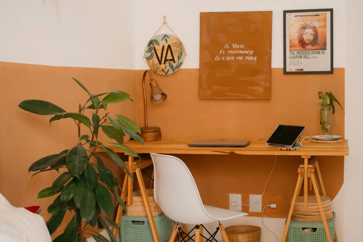
The Overlooked Factor That Makes Small Room Palettes Work
Small room palettes fail when color comes first. Use the Light-Forward 60‑30‑10 Protocol to map light, function, and spatial perception before picking a single swatch.
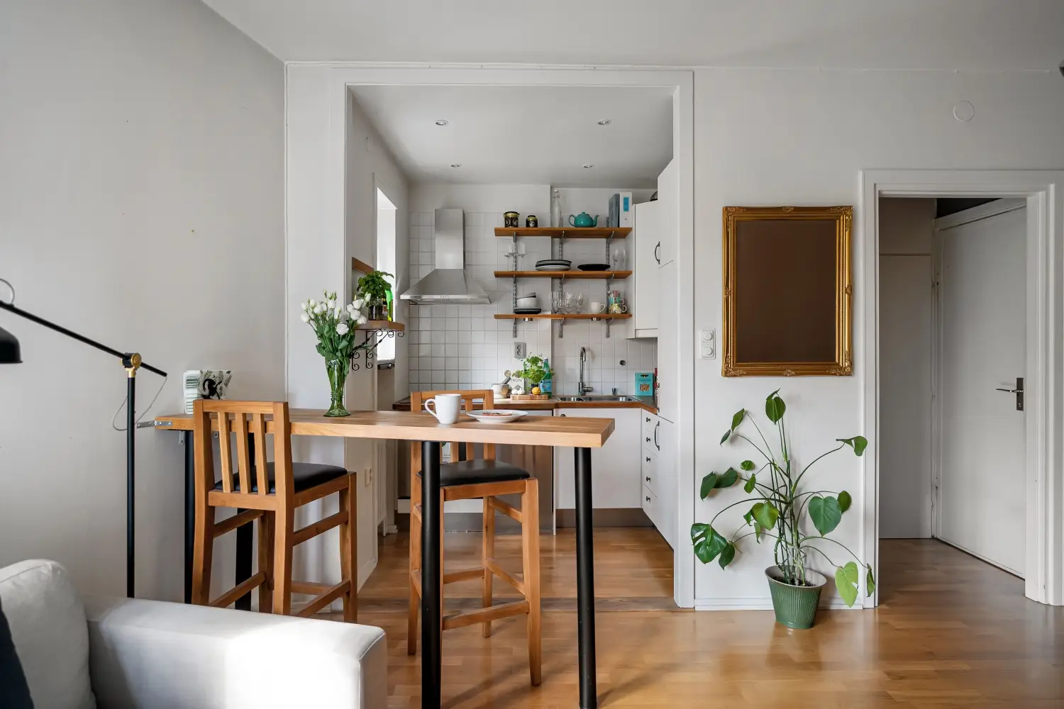
Why Accent Walls Often Shrink Small Rooms (And When They Don’t)
An accent wall can make a small room feel larger or tighter—find out which depends on the room's focal point and shape, not the color you pick.
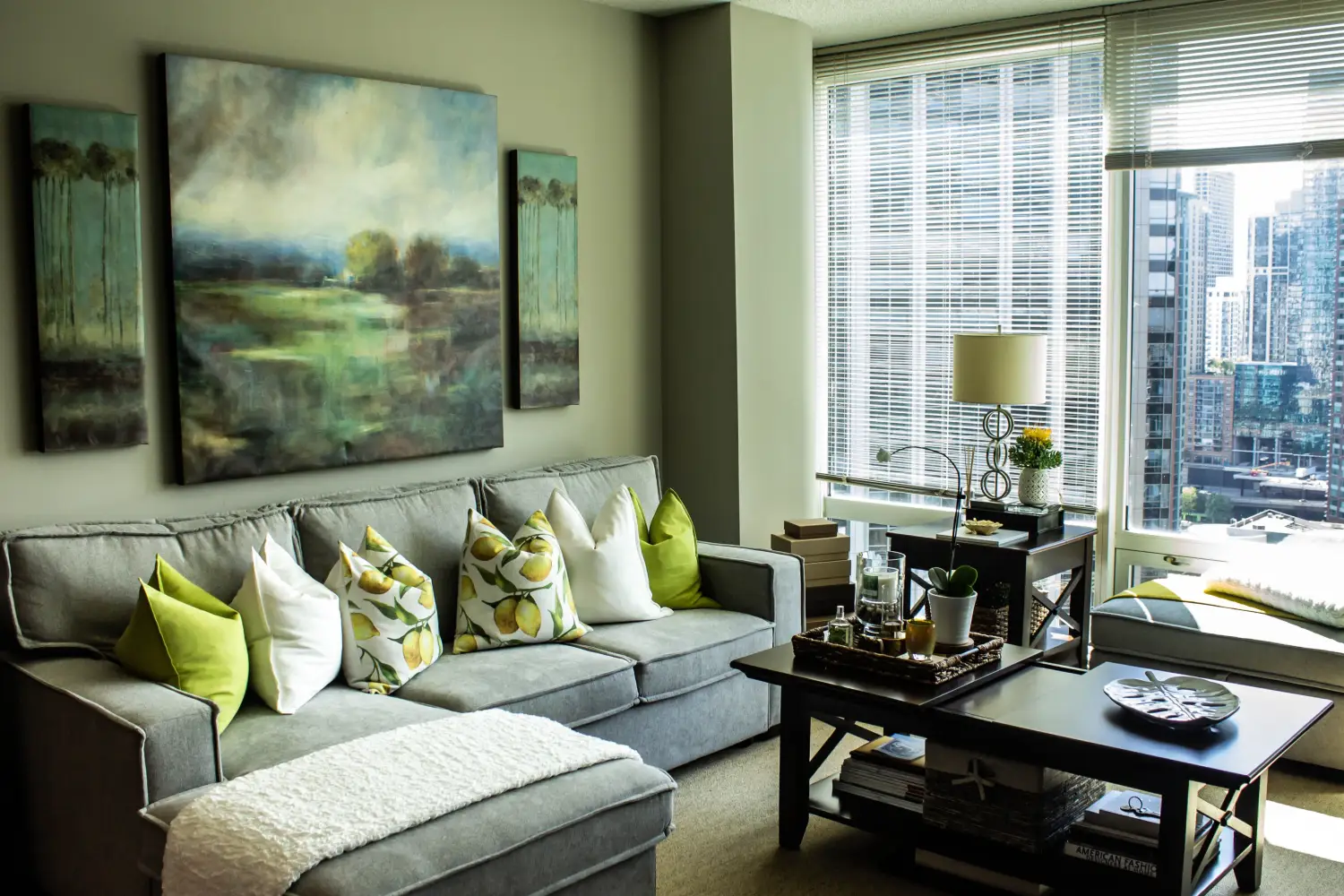
Mixing Warm and Cool in a Small Room? Avoid This Mistake
Blending warm and cool tones in a tiny room often backfires. Learn how to match temperature to your room's function and apply the 80/20 rule for depth without shrinking.
5 Small Room Color Mistakes That Cut Your Space in Half
These paint mistakes can make a room feel half its size. From dark ceilings to glossy walls, learn the spatial consequences and exactly which surface to fix for instant breathing room.