The Overlooked Factor That Makes Small Room Palettes Work
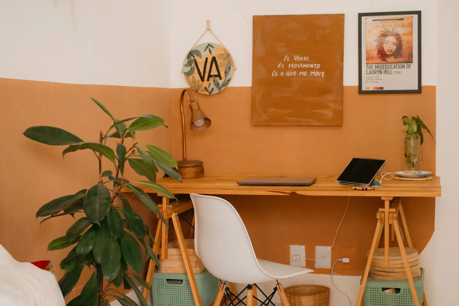
Small room palettes fail for a predictable reason: people choose colors before they know what the room’s light, function, and spatial perception will do to those colors. The 60‑30‑10 rule — 60% dominant, 30% secondary, 10% accent — is only useful when it rides on top of those three forces. Without them, it’s a decorator’s mantra with no purchase on reality. The path out of that trap is a three‑step protocol that treats color selection as the final item on the checklist, not the starting line. This is the Light‑Forward 60‑30‑10 Protocol. Apply it, and the room reads as intentional from every sightline. Skip it, and even the most expensive paint will look like a guess.
The Three Forces That Shape Every Small Room Palette
A small room’s color scheme is not a mood board. It’s a physical event. Three forces control the outcome.
Natural light — direction, intensity, color temperature. North light is cool and steady. South light swings warm and can be punishingly bright mid‑day. East light fades after morning. West light surges in the afternoon. A paint film’s undertone shifts dramatically under these conditions. A greige that looked neutral in the store can show muddy green on a north wall by 10 a.m. Light also determines reflectance — a pale wall can carry daylight deeper into a dim corner; a dark wall opposite a window can swallow it.
Function — the room’s actual workload. A small room that serves as both a home office and a guest bedroom has two distinct functional demands. The desk wall must support reliable color rendering for video calls and minimize screen glare. The bed wall should invite low‑contrast rest. A palette that ignores these split duties will fail at least one of them.
Spatial perception — how color shifts perceived volume. Lighter, cooler colors recede. Warmer, darker, or more saturated colors advance. In a small footprint, a deliberate value shift on one wall can add a foot of perceived depth or raise a low ceiling without moving a stud.
These three forces are not optional. They are the physics of the room. The protocol that follows uses them as its engine.
The Light‑Forward 60‑30‑10 Protocol
This method sequences three decisions. Light comes first. Function second. Color distribution last.
Stage 1: Map Light and Sightlines
Walk the room at three times: morning, midday, evening. Mark the brightest wall, the darkest corner, and the surfaces that receive the most consistent light. North‑facing rooms, for instance, deliver a flat, grey‑tinged wash all day; south‑facing rooms cast sharp, warm beams that change angle hour by hour.
Then map sightlines. From the doorway, which wall commands attention? From the primary seated position — a desk chair, a reading spot — which plane becomes the visual anchor? Those surfaces will later hold the 60% and 30% colors, so identifying them now is non‑negotiable.
Done correctly, this stage produces a simple map that prevents placement mistakes before they happen.
Stage 2: Define Functional Zones
Write down the room’s primary use and any secondary uses. A compact hallway that also stores coats and shoes has different demands than a powder room. Assign each function to a specific surface or wall group.
The payoff: the 60% color — the largest, most neutral surface — will support all functions without competing. The 30% color will anchor the most demanding zone. The 10% accent will mark the smallest functional touchpoints: a pull, a cushion, a shelf edge.
This stage forces the palette to serve use, not decoration. It stops the 60‑30‑10 from becoming a formula that fits only catalog rooms.
Stage 3: Execute 60‑30‑10 With Perception
Now assign the colors themselves, but let the light map and function zones drive value and sheen, not just hue.
60% dominant color. Choose a value that works with the room’s light. In a dim space, a warm, light‑reflective neutral with an eggshell sheen recovers brightness. In a room with harsh western glare, a mid‑tone can tame the light without darkening the footprint. Sheen matters as much as color — flat paint absorbs light, eggshell returns it, and that difference can be the margin between open and oppressive.
30% secondary color. Anchor the primary function zone. If the room’s main job is rest, a cool, low‑chroma wall behind the bed adds calm depth. If it’s a workspace, a slightly darker, focused hue behind the monitor improves contrast and reduces eye strain. The secondary color’s value should be intentionally one to two steps lighter or darker than the dominant to create readable depth — not a mismatch, a deliberate shift.
10% accent color. Inject chroma only here, and only on small, movable objects — a lamp base, a textile, hardware. In a small room, one concentrated shot of color does more work than an accent wall ever could, and it never shrinks the perceived volume.
When the protocol is applied, the room feels layered and spacious without needing a decorator’s instinct. It follows logic, not luck.
The Protocol in Action: A North‑Facing Home Office
Take a compact 8‑by‑10‑foot room with one north‑facing window. It’s a home office weekdays, a guest room occasionally. Daylight is grey and consistent; two walls get almost no direct light.
Light and sightline map. The brightest surface is the wall opposite the window, followed by the window wall itself. The dark corners sit on the perpendicular walls, one of which holds a daybed. The main sightline from the desk: the wall in front of the monitor.
Functional zones. Primary zone — the desk wall — requires a non‑distracting background for video calls and comfortable screen contrast. Secondary zone — the daybed wall — needs a restful surround for overnight guests. Storage along the near‑door wall doesn’t need its own color statement.
60‑30‑10 execution. The 60% color, applied to the ceiling, the window wall, and the storage wall, is a warm greige with a faint pink‑beige undertone to counter the grey north light. Eggshell sheen. The 30% color on the desk wall is a muted sage green, roughly two value steps deeper than the greige — it settles the focus zone without advancing aggressively. The 10% accent appears in a terracotta wool throw on the daybed, a ceramic desk lamp, and shelf hardware. The accent ties the greige and sage together without dominating any surface.
The room reads as one coherent envelope with distinct, functional zones — no visual cacophony, no washed‑out monotony.
Where the Protocol Breaks Down: Three Predictable Missteps
When a small room palette goes wrong, the failure traces back to one of these shortcuts.
Picking a Color Before the Light Audit
Standing in a paint aisle under fluorescent tubes and trusting a chip is not a strategy. It’s a gamble. The only reliable method is to tape large swatches to each wall and observe them under the room’s actual light across a full day. A color that looked luminous at the store can turn grey and heavy by 4 p.m., and repainting after the fact costs time, material, and trust in one’s own judgement.
Treating 60‑30‑10 as a Decorator’s Formula
Applying the distribution to furnishings — 60% upholstery, 30% drapery, 10% accessories — ignores the room’s proportions. In a small room, the 30% color works best when applied to a single architectural plane that shifts perception, not to a chair. When the distribution is tied to objects rather than space, the palette loses its ability to enlarge, balance, or define the volume. It becomes a decorating checklist that fits a catalog but not a specific north‑facing wall.
Ignoring Sheen and Reflectance
Two paints of the same hue read as different colors under light if their sheens differ. In a tight room, a semi‑gloss trim against flat walls draws a hard perimeter line — sometimes that’s useful, sometimes it fractures the space. Even worse is finishing every surface at the same sheen. That flattens the room into a featureless volume with no depth. A deliberate sheen progression — eggshell on walls, satin on trim, matte on the ceiling — gives the eye enough variation to read distance and height without ornament.
The Protocol at a Glance
| Stage | Goal | Key Action |
|---|---|---|
| 1. Map Light & Sightlines | Identify how daylight and shadow land on every plane | Observe the room at three times of day; mark the brightest wall, darkest corner, and primary sightline |
| 2. Define Functional Zones | Anchor the palette in actual use | List primary and secondary functions, then assign each to a specific wall or surface before touching a swatch |
| 3. Execute 60‑30‑10 With Perception | Distribute color to control perceived volume | Choose value, sheen, and placement for 60%, 30%, 10% based on the light and function maps |
Frequently Asked Questions
Does the 60‑30‑10 rule work in a room with no natural light?
Yes, but the values must compensate. The 60% color should be a light‑reflective neutral to multiply artificial light. The 10% accent should be the only saturated note. In windowless rooms, the ceiling deserves special attention — a matte finish and a slightly lighter value than the walls creates a soft overhead lift that prevents the boxed‑in feeling.
Can a small room handle a dark 60% base color?
It can, but only when light and function support the decision. A small south‑facing dining room used mainly in the evening can support a deep hue because its job is intimacy, not brightness. A north‑facing office with a dark 60% will compress the space and strain the eyes during daytime tasks. The protocol forces that evaluation before the swatch is cut.
What’s the right ceiling treatment in a small room under this method?
Choose based on perception, not habit. Painting the ceiling the same color as the walls softens the boundary and can raise felt height. But it also removes a reflective surface that bounces light into the room’s lower half. In spaces where light is scarce, a dedicated ceiling color — typically one or two steps lighter and in a matte sheen — returns more light and adds a quiet canopy effect without a sharp horizontal break.
How do you stop the 10% accent from overpowering the room?
Amplify chroma only within the accent category, and limit its footprint to objects that occupy less than 5% of the visible surface area. Start with a single piece — a textile, a vase — and wait a week before adding more. In a small room, restraint with accent placement consistently performs better than abundance.
What if the room’s functions seem to demand conflicting color directions?
Use the secondary 30% to create visual separation between zones, but unify the whole volume with a consistent 60% base. The dominant color provides the envelope; the secondary and accent colors carry the functional differences. In a compact studio, for example, a soft warm white can span the entire 60%, while the sleeping area gets a dusky blue‑green 30% and the kitchenette receives a terracotta 10% through tile or textiles — two distinct zones within one coherent space.
The Next Move
This protocol succeeds because it postpones color selection until the room’s physical truths are known. Map the light and sightlines. Define the functional zones. Then distribute 60‑30‑10 in a way that serves perception. The stage that pays off fastest for any small room is the first one. Tape samples on the walls tomorrow morning and watch what the light actually does. That single act will save more palettes than any paint‑deck ever will.

Clara Bennett
After five years of transforming my 1920s bungalow room by room, I’ve refinished floors, hung blinds in bay windows, and spent more time choosing light bulbs than I’d like to admit. I learned paint sheens by painting my kitchen ceiling three times, and I found out the hard way that a rug too small makes a room feel unfinished. I believe every home can be both functional and beautiful, no matter the budget.
Related posts
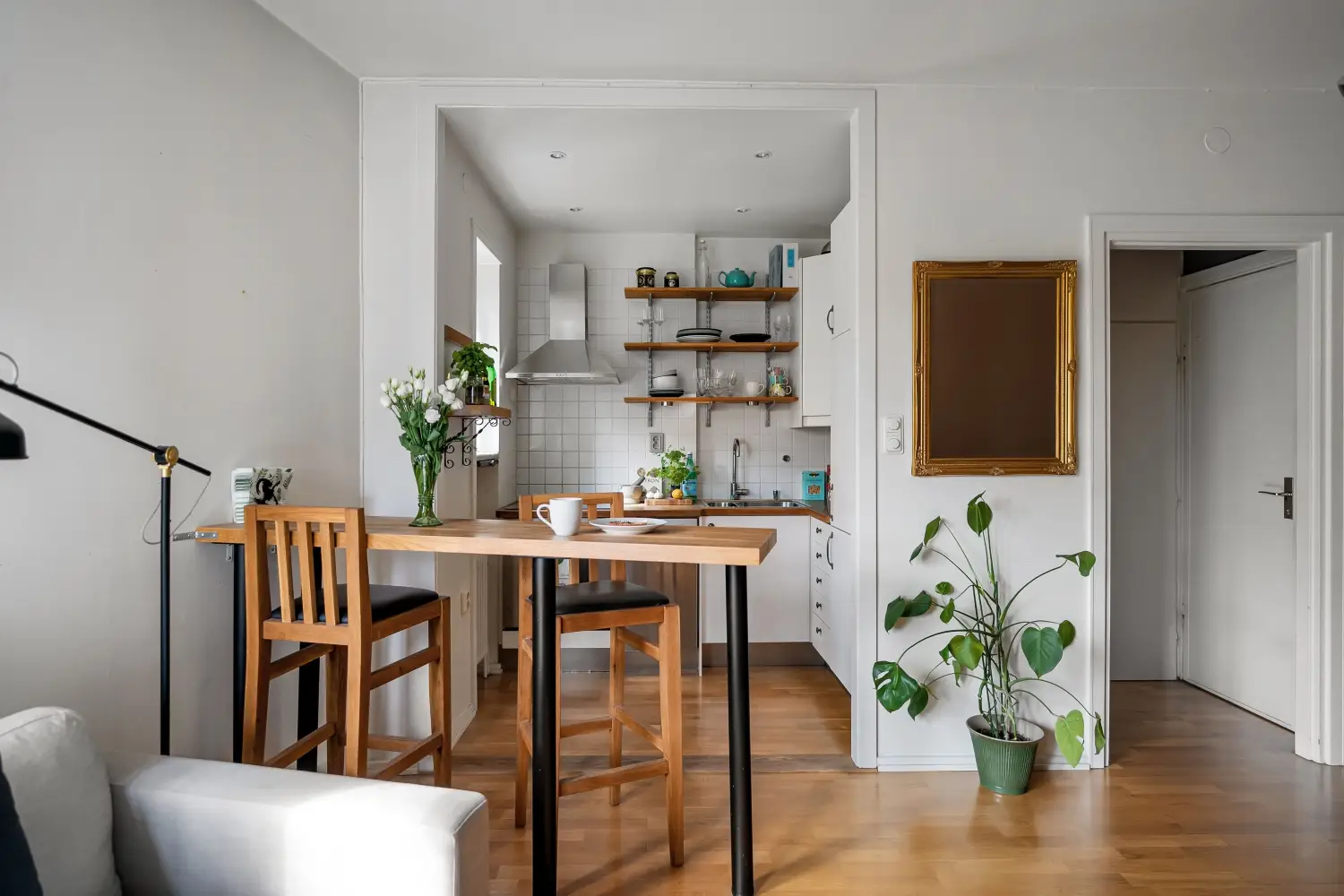
Why Accent Walls Often Shrink Small Rooms (And When They Don’t)
An accent wall can make a small room feel larger or tighter—find out which depends on the room's focal point and shape, not the color you pick.
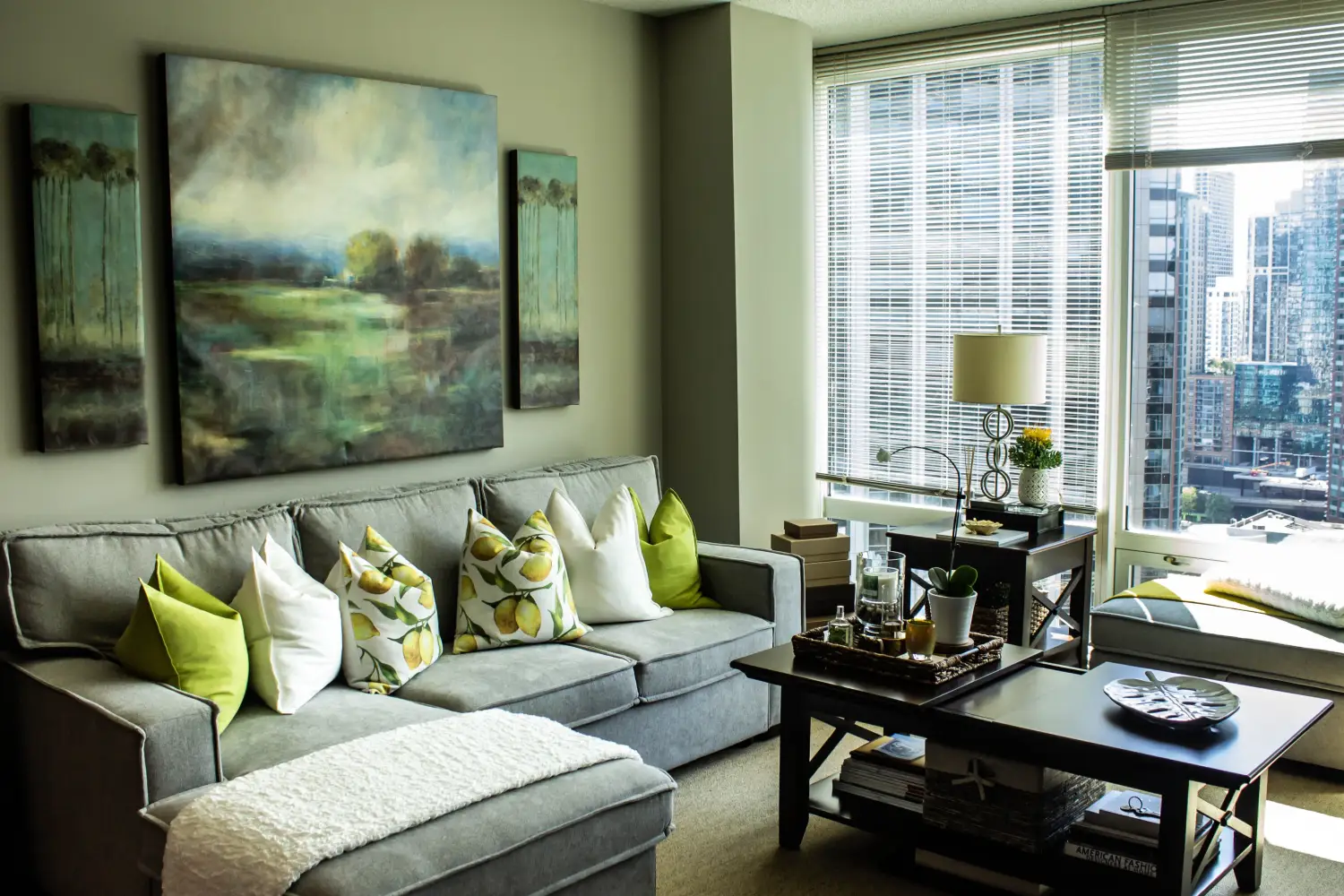
Mixing Warm and Cool in a Small Room? Avoid This Mistake
Blending warm and cool tones in a tiny room often backfires. Learn how to match temperature to your room's function and apply the 80/20 rule for depth without shrinking.
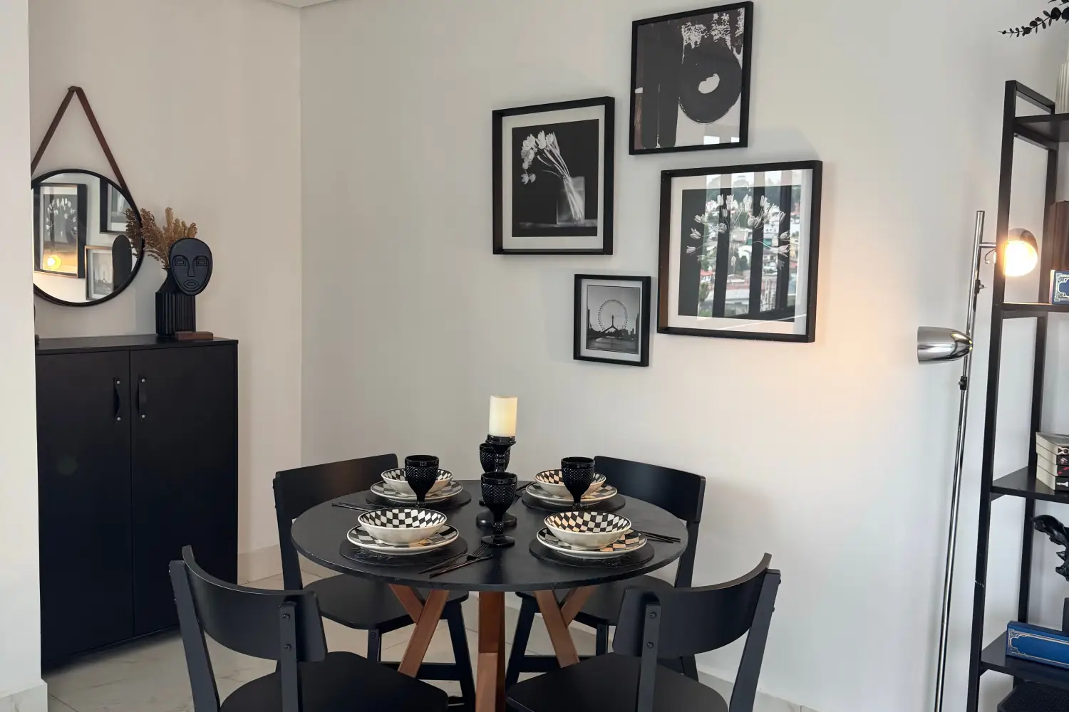
These Monochrome Palettes Actually Work in Small Rooms
Learn the value and sheen tricks that make monochrome small rooms feel spacious, light, and perfectly balanced—without ever looking flat.
5 Small Room Color Mistakes That Cut Your Space in Half
These paint mistakes can make a room feel half its size. From dark ceilings to glossy walls, learn the spatial consequences and exactly which surface to fix for instant breathing room.