5 Decor Accent Mistakes That Scream 'Amateur' to Designers
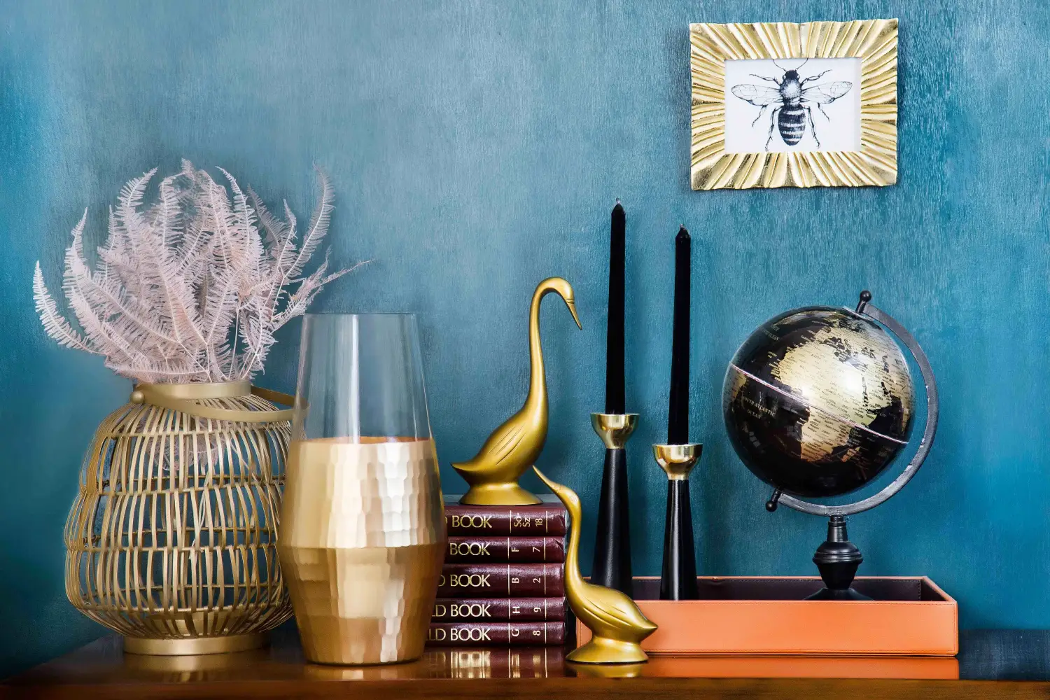
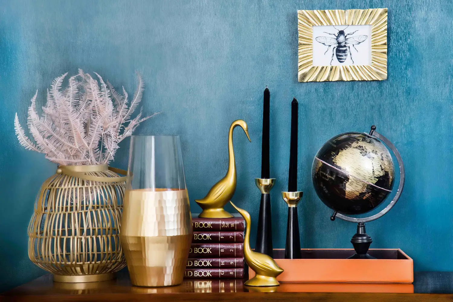
A room that feels off—crowded, flat, or unfinished—almost always suffers from one of five accessorizing mistakes. Overcrowding, scale mismatch, insufficient negative space, matchy-matchy syndrome, and texture poverty are the telltales. Each one signals amateur to a designer, and each one is fixable with a single, deliberate decor swap. The fixes below are direct, proven, and require no second-guessing.
Quick Picks: The Four Accents That Undo the Most Damage
- Best overall: A large, floor-leaning mirror — corrects scale and creates negative space instantly.
- Best budget: A chunky knit or linen throw — adds texture and breaks a monotonous set for very little money.
- Best for beginners: A decorative tray — corrals clutter into one intentional composition, zero risk.
- Best for small spaces: A single, bold sculptural object — commands attention without eating floor space.
The Anchors: Pieces That Command the Room
For anyone whose space feels scattered, lost, or without a clear focal point, these accents introduce scale and breathing room with no apology.
A Floor-Leaning Mirror
A floor mirror leaned rather than hung creates immediate architecture. Its strength is vertical scale: it pulls the eye upward and bounces light, making the room feel taller and more open. The limitation is weight and stability — a tall mirror demands a non-slip base and must be secured if children or pets are present.
An Oversized Abstract Canvas
One large piece of art with generous negative space inside it gives the eye a resting point. This solves the visual noise of too many small accessories faster than a gallery wall ever will. The drawback: sourcing a piece that reads personal rather than hotel-generic takes patience and some budget, but the result justifies both.
A Statement Floor Lamp
A sculptural floor lamp arcing over seating claims the often-ignored upper zone of a room. It fixes scale by occupation, not addition. The snag is wiring: the lamp must reach an outlet without a visible cord run, so placement planning is non-negotiable.
The Layering Pieces: Textures and Contrasts That Break the Pattern
For spaces that feel sterile, repetitive, or too coordinated to be real, these accents force texture, surprise, and a collected look.
A Textural Throw
Linen, bouclé, or a heavy knit draped across a sofa arm adds immediate depth. Its job is to break the smooth-on-smooth monotony that screams matchy-matchy syndrome. The trade-off: high-texture fabrics pill and snag, so they are a poor choice for homes with claws or constant washing.
A Mixed-Material Vase Set
A cluster of three vases in ceramic, raw stone, and metal stops the too-perfect look of a matched set cold. It attacks matchy-matchy syndrome and texture poverty at once. The risk: random materials without a through-line look chaotic rather than considered; each finish needs a second appearance elsewhere in the room.
A Curated Tray
A tray on a coffee table or ottoman gathers remotes, coasters, and a small plant into a single bounded zone. It directly eliminates overcrowding by reducing visual clutter to one composition. The maintenance requirement is uncompromising: once the tray overflows, the problem returns, so editing must be regular.
How to Choose Between the Anchors and the Layering Pieces
If the Anchors group is the answer, select the mirror when a room feels small and dark; it will also fix scale. Take the oversized canvas when a long wall is busy with small frames and needs quiet authority. Deploy the floor lamp in a seating area where the ceiling presses down and corners are empty.
If the Layering Pieces group is the right set, start with the textural throw if the seating reads like a single-suite purchase. Choose the mixed-material vase set when a console or shelf is a line of identical silhouettes. The curated tray belongs on any surface that collects daily debris — it makes even a remote control look intentional.
Comparison at a Glance
| Accent Piece | Best For | Placement Tip | Budget Level |
|---|---|---|---|
| Anchors | |||
| Floor-Leaning Mirror | Scale + negative space | Behind a sofa or in an entry | Mid to high |
| Oversized Abstract Canvas | Negative space + focal point | Centered on a main wall | Mid to high |
| Statement Floor Lamp | Scale + vertical interest | Next to a reading chair | Low to mid |
| Layering Pieces | |||
| Textural Throw | Texture + anti-matchy | Draped on a sofa arm | Low |
| Mixed-Material Vase Set | Matchy-matchy + texture | On a console or mantel | Low to mid |
| Curated Tray | Overcrowding | On a coffee table or ottoman | Low |
FAQ
How do I know if my room is overcrowded with accessories?
If your eye cannot settle anywhere and keeps jumping between small objects without a pause, the room is overcrowded. A fast test: photograph the space and squint. When the image blurs into one busy mass, too many pieces are fighting for dominance.
What is negative space in home decor?
Negative space is the empty area around and between objects. A well-accessorized room uses it to let each piece register. A wall with one large canvas has negative space; the same wall with a gallery of fifteen small frames usually does not.
Can I mix different metals and wood tones without looking amateur?
Yes, but repeat each finish at least twice to show intention. A brass lamp, a brass frame, and a brass drawer pull read as a decision; a single brass object in a room full of chrome looks like an accident.
Start With the Mirror
For the homeowner facing a room that feels crowded, flat, or small, one accent makes the fastest and most dramatic fix: a large, floor-leaning mirror. It corrects scale mismatch and insufficient negative space together, and it demands no styling expertise. Lean it against a wall, watch the room double visually, and then layer the remaining accents from there.

Clara Bennett
After five years of transforming my 1920s bungalow room by room, I’ve refinished floors, hung blinds in bay windows, and spent more time choosing light bulbs than I’d like to admit. I learned paint sheens by painting my kitchen ceiling three times, and I found out the hard way that a rug too small makes a room feel unfinished. I believe every home can be both functional and beautiful, no matter the budget.
Related posts
Why the Best Decor Accents Do More Than Look Pretty
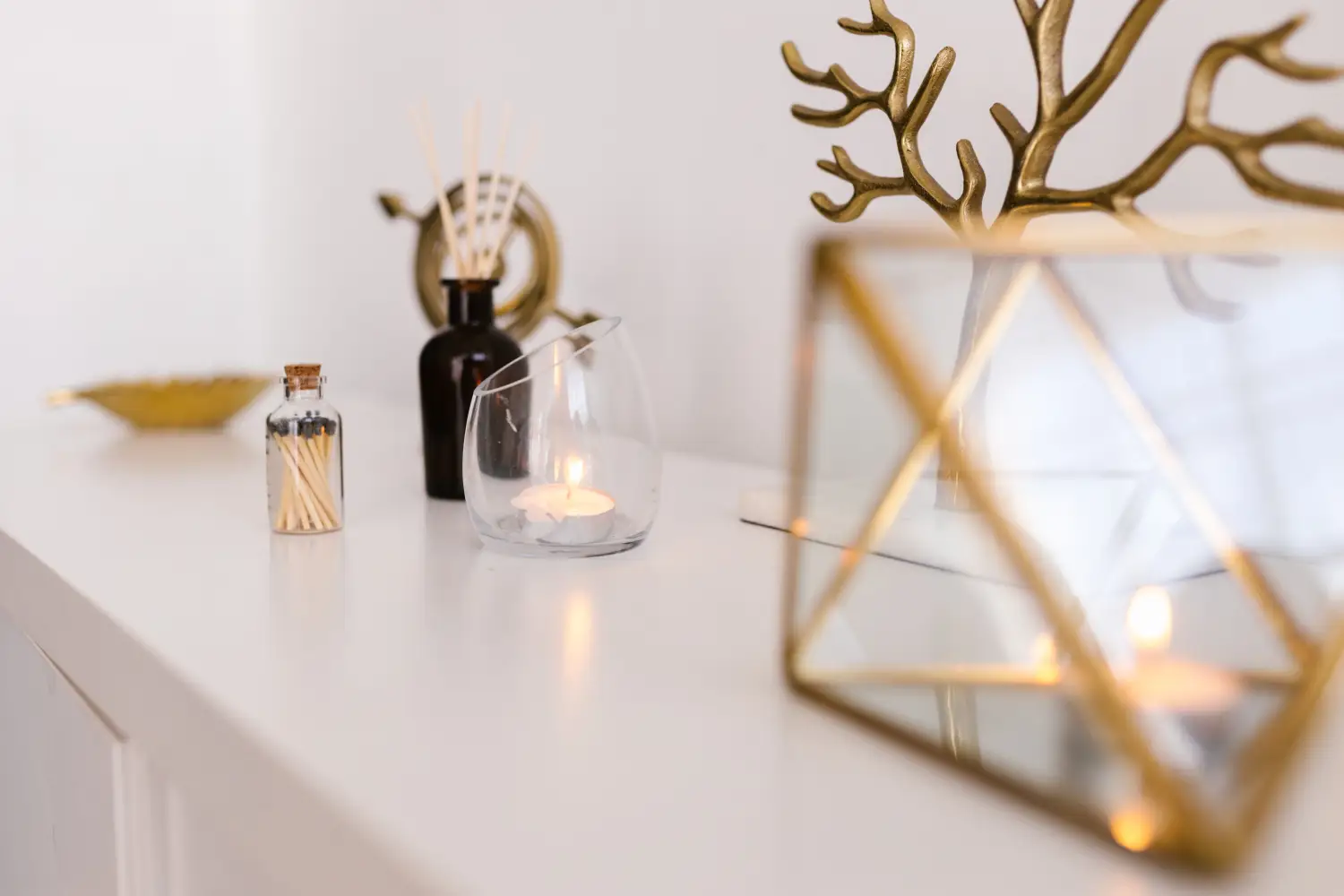
See how clocks, trays, and books stack up against vases and sculptures room by room. Learn when function beats pure decoration—and when it doesn’t.

The Budget Habit That Leaves Every Room Half-Finished
Skipping the last 5% of a room budget leaves it feeling undone. See how a $2,000 spend can finally finish a space—without going over budget.
How to Mix Vintage and Modern Accents Without Regret
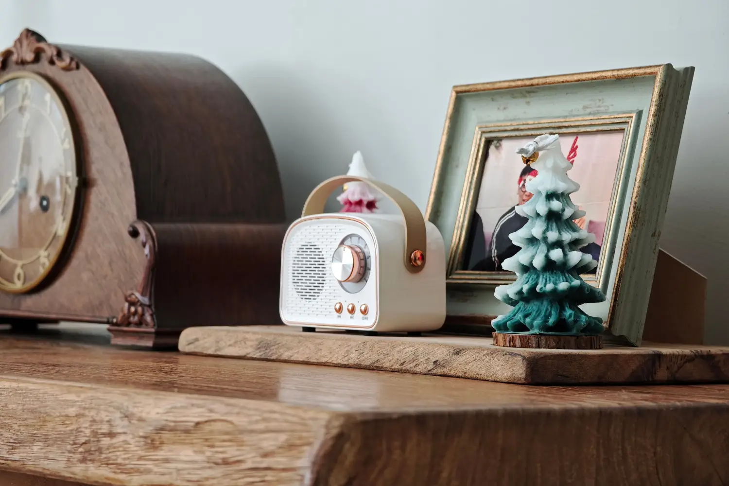
Pair a mid-century lamp with a rustic side table confidently using one shared material. This simple strategy stops the 'doesn't match' regret every time.
The 3-Item Rule for Styling Any Shelf or Tabletop
Use the 3-item rule and layered heights to style any shelf, mantel, or tabletop. Includes a before-and-after mantel case study and troubleshooting for common mistakes.