The One Element That Makes Mixed Styles Look Intentional
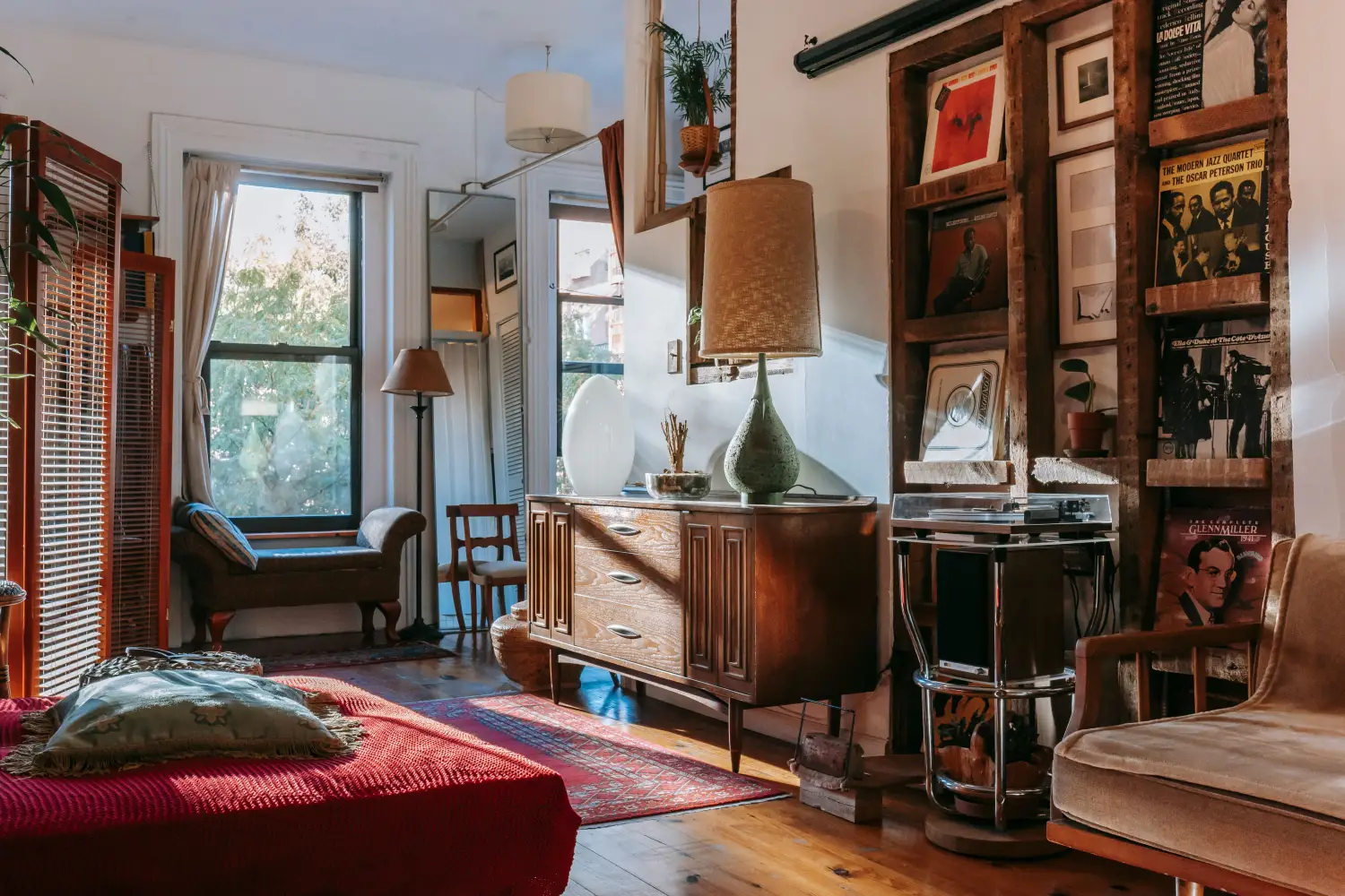
Mixed styles look intentional when a single, repeated element—a wood tone, a geometric motif, or a neutral palette—bridges the gap between them. This element acts as a visual mediator, turning a potential clash into deliberate contrast. Without it, the room reads as a collection of pieces that happened to land in the same space.
The mechanism is pattern recognition: the brain marks a repeated visual cue as a choice, not an accident. Instead of blending styles into a homogeneous middle, you thread a specific, limited element through both sides—enough that the eye registers the repetition within the first few seconds of scanning the room. The trick is choosing the right thread and distributing it with enough consistency to read as a decision, not a fluke.
The Three Forces That Shape a Mixed-Style Space
A mixed-style room runs on three invisible forces: the pull of the first style, the pull of the second, and the friction between them. Without a unifying element, that friction takes over; the space feels like two rooms forced together. The unifying element functions as a perceptual bridge—it gives the eye a consistent track to follow, converting dissonance into structured energy. This is the mental model the rest of the framework depends on: diagnose the friction, then deploy a single element to resolve it.
Where the Room Fractures
This is the diagnostic stage, and it comes first because selecting a bridge requires knowing exactly where the styles are pulling apart. Study the room and isolate the main sources of visual conflict. Is it a material clash—glossy lacquer against raw reclaimed wood? A color clash—warm brass against brushed nickel? A silhouette clash—curved mid-century lines against boxy modern forms? Listing the points of fracture pinpoints where the unifying element must operate.
To execute: stand in the room and record the three most obvious style collisions. A mid-century sofa beside a rustic farmhouse table creates both a material and a silhouette clash. Write those down. Done well looks like a short, specific list of visual snags—the exact points the thread will smooth over, not a vague feeling of “something is off.”
Choosing the Connective Tissue
With the fractures mapped, this step selects the single element that will run across both styles. The choice must be something that already exists in at least one element of each style—or can be introduced so naturally it reads as belonging. The three most reliable categories are: wood tones (a consistent finish like walnut, oak, or a matched stain), geometric motifs (a repeating shape—hexagons, diamonds, or arches), and neutral palettes (a limited range of grays, greiges, and ivories that neutralize color friction).
Why this order: the fractures determine which type of element will do the heavy lifting. A material clash demands a material-based thread; a color clash is best disciplined by a neutral palette. To execute: choose one category, then one specific element within it—one wood species, one pattern, one paint family—and test it by holding samples against both sides of the room. Done well means the chosen element appears visually at home with both the dominant and the contrasting style, not just one.
Distributing the Unifying Element
Placement turns a good choice into an intentional pattern. The element must appear at least three times, across at least two different furniture categories or surfaces. One appearance is a coincidence; three is a repeat. A walnut thread might show up in the legs of a mid-century chair, the frame of a rustic console, and the border of a mirror. A geometric motif could land on a pillow, a lampshade, and the rug.
Why it comes now: diagnosis revealed where the breaks are; selection gave you the material; distribution now closes those breaks. To execute: walk a mental line from one side of the room to the other, placing the element along that path—across furniture, textiles, and wall art. Done well looks like a room where the eye encounters the same note in multiple places without it feeling forced. The repetition is visible but not monotonous.
Tuning the Contrast
Even with a strong thread, two clashing styles can still jar if their core differences remain extreme. This stage adjusts the intensity of the contrast so the unifying element can do its job. It is about pulling the styles slightly toward a middle ground without erasing their identities. A too-rustic table might need sanding back its roughest texture; a too-sleek sofa might need a textured throw to soften it.
Why last: the thread signals intentionality, which gives permission for these adjustments. You are not blending styles arbitrarily; you are calibrating the contrast so the thread can hold. To execute: identify the one or two most abrasive details on each side and dull them just enough that the unifying element reads as the primary visual story, not a footnote. Done well produces tension held in balance—the room still has edge, but it holds together.
The Framework Applied: Mid-Century + Farmhouse Living Room
Consider a living room with a classic mid-century sofa—tapered walnut legs, low profile, charcoal fabric—facing a chunky reclaimed-wood coffee table with raw metal legs. The clash is immediate: refined vs. rustic, delicate vs. heavy. Through the framework:
- Where the Room Fractures: The material clash (smooth wood/charcoal vs. rough reclaimed timber) and the silhouette clash (low, angled lines vs. blocky mass). Without intervention, this reads as two unrelated showrooms.
- Choosing the Connective Tissue: The natural bridge is walnut wood, already in the sofa legs. A walnut tray on the coffee table—or refinishing the tabletop in a walnut stain—introduces that wood tone to the rustic side. The thread becomes walnut.
- Distributing the Unifying Element: Walnut appears in the sofa legs, the tray, a walnut-framed wall mirror above, and a walnut side table with a mid-century silhouette but rustic warmth. The repetition connects the two styles without erasing either.
- Tuning the Contrast: The coffee table’s roughness is softened by sanding lightly and treating with an oil that enriches the grain, bringing it visually closer to walnut. A nubby linen throw on the mid-century sofa adds texture that echoes the farmhouse side. The contrast still reads—but now as a layered mix, not a mistake.
Where People Break the Framework
Skipping the Diagnosis and Guessing the Thread
Many jump to picking a color or shape without first identifying the specific clash. They choose a coral accent because it “pops,” but the room fractures over material texture, not color. The chosen element sits on top of the problem without ever connecting the styles. The result: the room still feels disjointed, and the coral reads as an unrelated afterthought.
Using an Element That Appears Only Once
A single wood-toned lampshade in a room of painted metal and white oak does not unify anything. The element must be distributed enough that the eye notices the repetition. Without that, the thread is invisible, and the room reads as a collection of individual pieces rather than an ensemble. The cost: intentionality never registers; the mix still looks accidental.
Choosing a Thread So Subdued It Disappears
A barely-there beige that matches both backgrounds may read as a neutral backdrop but will not actively bridge two bold styles. The unifying element needs enough presence to be noticed—a distinct wood grain, a graphic pattern, a paint color with sufficient depth to stand apart from white walls. If it’s invisible, it cannot mediate. The friction between styles remains because nothing actively crosses the gap.
Quick Reference
| Framework Step | What It Addresses | Key Action | Sign It’s Done Right |
|---|---|---|---|
| Where the Room Fractures | The exact style conflicts causing visual tension | Make a list of the three biggest material, color, or silhouette clashes | You can point to each fracture and name the two styles fighting there |
| Choosing the Connective Tissue | Which single element can span both styles | Select one wood tone, one motif, or one neutral palette that already lives in at least one piece from each style | The sample feels at home against both the dominant and contrasting elements |
| Distributing the Unifying Element | Ensuring the thread is repeated enough to register | Place the element in at least three locations across two furniture categories | The eye catches the same note in multiple spots without it feeling repetitive |
| Tuning the Contrast | Softening extreme differences so the thread can hold | Pull back the harshest detail on each style—reduce one texture, mute one color, or soften one line | The room still has contrast, but it reads as tension held in balance |
FAQ
What if my two styles already share a material—can that be my unifying element?
Yes, and it is often the easiest thread to deploy. A shared wood species or metal finish that appears in both styles can be amplified simply by repeating it more prominently. The key is distribution: make sure it shows up in more than just the two original pieces.
Can the unifying element be a color instead of a wood tone or motif?
It can, but color alone is trickier because it often acts as background rather than foreground. A neutral palette as a unifying element works when it is a tightly controlled range—say, warm greige and ivory—used across walls, upholstery, and large furniture, effectively suppressing color conflict so the styles meet on a common ground. That is a legitimate strategy, especially when competing wood tones and patterns are the issue.
How many times does the element need to appear to feel intentional?
At minimum, three times in at least two different types of locations. Once is a coincidence, twice still looks incidental, but three appearances establish a pattern the brain reads as intentional.
Can I use more than one unifying element in the same room?
It is possible, but risky. Multiple threads can compete and dilute the effect. Usually one strong, well-distributed element does the job better than two weaker ones. If two are necessary, they must work together—a wood tone paired with a geometric motif that includes that wood’s color, for example—but the framework is most effective when you commit to a single clear thread first.
Where to Begin
The Unifying Thread Framework moves from fracture diagnosis through element selection, distribution, and contrast tuning. Start today by standing in your mixed-style room and writing down the three most obvious visual breaks. That list alone will show you exactly where the thread needs to go—and prevent you from picking a pretty element that never touches the real problem.

Clara Bennett
After five years of transforming my 1920s bungalow room by room, I’ve refinished floors, hung blinds in bay windows, and spent more time choosing light bulbs than I’d like to admit. I learned paint sheens by painting my kitchen ceiling three times, and I found out the hard way that a rug too small makes a room feel unfinished. I believe every home can be both functional and beautiful, no matter the budget.
Related posts

How Designers Mix Styles: The Anchor-and-Contrast Method
Learn the anchor-and-contrast method for mixing decor styles. Set a dominant anchor, layer contrast in 3 levels, and avoid the muddled look.
Stop Over-Mixing: The Editing Rule for Blending Decor Styles
Learn why over-mixing decor styles leads to visual chaos and discover the subtractive editing rule that creates a cohesive, intentional blend of design eras.
60-30-10: The Mix-and-Match Decorating Rule That Works
Use the classic color rule to blend decorating styles. Allocate 60% anchor, 30% secondary, 10% accent for rooms that feel layered and intentional.