How Designers Mix Styles: The Anchor-and-Contrast Method
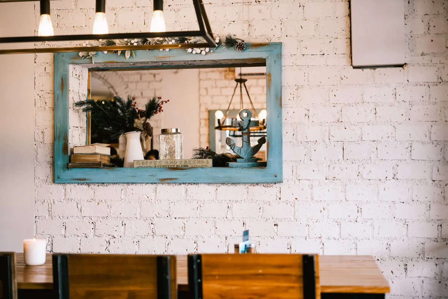
The anchor-and-contrast method sets one style as the room’s dominant anchor, then layers in contrasting elements deliberately — never 50-50. This framework gives you a decision path that eliminates the muddled look common in mixed-style rooms. You’ll learn to set an anchor, add contrast in three measured levels, and stop before the personality disappears.
Most advice on mixing styles pushes for balance: half this, half that. Equal weight fails. It produces a space where every piece vies for attention and none of them win. The anchor-and-contrast method breaks that stalemate. It assigns one style the lead role from the start, then uses carefully chosen contrasting elements to add energy, not confusion.
Why Equal Blending Falls Short
Two styles sharing the spotlight give the eye no resting place. A mid-century sofa next to a rustic farmhouse table under an industrial pendant light might sound curated. In reality, it reads as three competing stories. The problem isn’t the mix; it’s the missing hierarchy. A room needs a dominant melody. Everything else supports it.
Without an anchor, every choice becomes a negotiation. Which color palette leads? Whose scale rules? The room feels hesitant, waiting for a decision it never received.
How the Anchor-and-Contrast Structure Works
The method has two parts. First, declare one style the anchor. It claims at least 70% of the visual weight — through the largest surfaces, the biggest furniture pieces, the overarching color scheme, and the architectural framework. Second, add contrasting elements in measured layers. The contrast never equals the anchor in volume; its job is to create tension that sharpens the anchor’s identity, not to challenge it.
Think of the anchor as the room’s first sentence: clear, confident, impossible to mistake. Contrast is punctuation: a surprise in scale, a jolt of color, a texture that doesn’t belong. Too much punctuation turns the paragraph into noise. Just enough keeps you reading.
This isn’t “mostly this style, plus a little of that.” That’s still a ratio game. The anchor-and-contrast method is a qualitative decision: what does this space need to hold its ground, and what can be introduced to make that ground feel sharper?
Choosing the Anchor Style
Audit What You Already Have
List the fixed elements you cannot easily change: flooring, trim, windows, ceiling height, fireplace materials. These often point to a natural anchor. Original crown molding and wide-plank pine floors lean traditional; slab-front cabinetry and polished concrete read contemporary. Let the architecture lead when it’s strong.
Inventory your existing pieces. If a large sectional sofa, a dining table, or a bed stays, factor in its style. The anchor should feel at home against the backdrop. Forcing a sleek minimalist anchor into a room full of ornate millwork wastes money and effort.
Pick the Style That Solves a Function First
An anchor isn’t only aesthetic. It should advance how the room is used. In a family room, a durable, approachable anchor (relaxed traditional or modern casual) makes more sense than a high-drama aesthetic that demands careful upkeep. In a home office, clean, distraction-free lines anchor better than anything visually busy. Choose the style that keeps the room doing its job, then commit.
What if You Love Two Styles Equally?
One must lead. Pick the one that answers three questions better: Which style is easier to execute well with the space’s bones? Which one forgives budget constraints more readily? Which one will still feel right in five years? The runner-up becomes the primary contrast source.
The Three Levels of Contrast: Layering Without Chaos
Contrast layers are not equal. Treat them as distinct contributions, each with a different risk profile.
Subtle Contrast: Accents That Support the Anchor
The first layer touches roughly 10–15% of the room’s visual surface. It lives in textiles, small accessories, and finish details. With a mid-century modern anchor of walnut tones and clean lines, subtle contrast might arrive as a handwoven wool throw with nubby texture or pillows in a muted jewel tone that sit just outside the mid-century palette. These pieces say, “I see what’s happening here, but I brought something slightly different.” They never break cohesion.
A common mistake is starting with bold contrast. Subtle contrast is the safety net; it teaches how the anchor reacts before bigger disruptions enter.
Moderate Contrast: Pieces That Create Deliberate Tension
This layer occupies about 20% of visual weight, usually through furniture: a side chair, a bench, a light fixture. Contrast is more noticeable. Against a traditional anchor with rolled arms and turned legs, a sculptural acrylic side table reads as deliberate counterpoint. Against a contemporary anchor of leather and metal, a cane-backed armchair introduces warmth and handcraft.
Moderate contrast pieces must share at least one design attribute with the anchor — a color, a proportion, a material finish — so the tension reads as intentional. Without that connecting thread, contrast becomes random noise.
Bold Contrast: The Statement Piece
Bold contrast uses a single element — often a lighting fixture, large artwork, rug, or accent wall finish — to grab immediate attention. It’s the exclamation point. In an otherwise serene Japandi-anchored room, a massive charcoal abstract canvas dominates a wall. The room still feels Japandi because everything else supports that reading, but the artwork injects an edge the anchor would never supply on its own.
This layer works only when the anchor is firmly established. Without a strong anchor, bold contrast becomes the room’s default identity and the composition collapses into a single-note shouting match. Stick to one bold piece, not two or three.
Common Pitfalls: How Contrast Becomes Chaos
Too Many Focal Points
When every contrast piece fights for attention, the eye ricochets. Limit bold contrast to one intentional moment per sightline. In an open-plan space, a bold piece in the dining zone and another in the living zone can work if they don’t compete from the same vantage point.
Ignoring Scale and Proportion
A contrast piece that’s the wrong scale reads as an error, not a design choice. A tiny Moroccan pouf in a cavernous living room gets lost. A massive factory cart coffee table in a delicate traditional room barges in. Match the contrast piece’s visual weight to its role.
Skipping the Connecting Thread
Every contrast element needs a line back to the anchor: color, shape geometry, material lineage, or era adjacency. The acrylic table in a traditional room works partly because its transparency echoes traditional curtain airiness. The cane chair in a contemporary room works because cane brings organic texture that still reads clean. Without that thread, contrast lands as discord.
Real-Room Examples: Anchor-and-Contrast in Three Spaces
Living Room: Traditional Anchor with Industrial Contrast
Anchor: traditional living room with rolled-arm sofa in soft linen, Persian-style rug, warm wall color, classic drapery. Subtle contrast: matte black metal candle holders. Moderate contrast: leather-and-steel armchair with clean lines. Bold contrast: factory-style pendant light hung low over the coffee table. The room reads as traditional, but the industrial pieces prevent it from feeling precious or dated.
Bedroom: Modern Minimal Anchor with Bohemian Contrast
Anchor: platform bed, low profile, neutral bedding, minimal built-ins. Subtle contrast: knitted throw and woven wall hanging add softness. Moderate contrast: vintage carved wood nightstand breaks straight lines. Bold contrast: deeply saturated abstract rug under the bed. The room stays serene and modern; bohemian touches inject warmth and personality.
Compact Home Office: Mid-Century Anchor with Eclectic Contrast
Anchor: walnut desk with tapered legs, classic mid-century task lamp, simple shelving unit. Subtle contrast: ceramic pencil cup with irregular hand-glazed finish. Moderate contrast: vibrant abstract-patterned wool pillow on the desk chair. Bold contrast: gallery wall of mismatched frames holding black-and-white travel photography, intentionally unaligned. The office keeps mid-century discipline; contrast pieces make it feel collected over time.
Quick Reference: The Anchor-and-Contrast Decision Tool
| Decision Point | What to Ask Yourself | Action |
|---|---|---|
| Anchor Selection | Does this style feel natural with the room’s architecture and your biggest pieces? Can you commit to it for most surfaces? | Name the anchor. Write it down. |
| Subtle Contrast | What’s one small accent that introduces a different texture or a slightly unexpected color? | Choose one textile or accessory per zone. |
| Moderate Contrast | Which furniture piece could offer a noticeable but related visual counterpoint? | Add one piece that shares a color or material link. |
| Bold Contrast | Where does the room feel safe to the point of being forgettable? | Place one statement element in that spot. |
| When to Stop | Does any new addition start fighting the anchor for dominance? | If yes, pull back. |
What You Need to Know: 6 Rules for Mixing Styles
- One style always anchors the room; it claims the majority of surface area and visual weight.
- Contrast is layered, not dumped in at once; start subtle, then moderate, then bold.
- Every contrast piece needs at least one design connection to the anchor.
- Bold contrast works only as a single focal point per sightline.
- Scale matters: a contrast piece must hold its physical weight in the space.
- Step back and check the room’s first impression; if the anchor isn’t obvious, strengthen it before adding more contrast.
Your Anchor-and-Contrast Questions, Answered
What if I can’t decide between two styles for the anchor?
Choose the one that aligns better with the room’s architecture and your lifestyle. If both still feel equal, test each by imagining the room stripped to its anchor-only version. Which feels more complete? That one wins. The second becomes the primary contrast source.
How many contrasting layers does a small room need?
Small rooms still benefit from all three layers, but scale each down. Subtle contrast might be a single cushion or a small table lamp. Moderate contrast could be a compact accent chair. Bold contrast could be a large mirror frame or a single piece of art. The amount of contrast doesn’t shrink; the size of the pieces does.
Does the method work if I’m starting completely from scratch in an empty room?
Yes, and it’s even easier. Pick the anchor based on the room’s intended function and the overall feel you want. Build the anchor layer — flooring, largest furniture, wall color — before introducing any contrast. An empty room is a blank canvas; the anchor sets the composition before you add tension.
What’s the difference between contrast and clash?
Contrast is intentional and tethered to the anchor through a shared design element, material, or proportion. Clash is tension without connection: two pieces that have nothing in common and no reason to share a room. If you can’t articulate why a contrast piece relates to the anchor, it’s likely a clash.
Where to Start: Applying the Method Tomorrow
The anchor-and-contrast method isn’t a theory to study — it’s a sequence to run. Pick one room. Name its anchor style based on what’s already there. Remove anything that undermines that anchor. Then add one subtle contrast piece. Live with it for three days. If it holds, add the next layer. The single most important action: commit to an anchor before you buy anything new. Without that, every furnishing is just another voice in a room that never found its melody.

Clara Bennett
After five years of transforming my 1920s bungalow room by room, I’ve refinished floors, hung blinds in bay windows, and spent more time choosing light bulbs than I’d like to admit. I learned paint sheens by painting my kitchen ceiling three times, and I found out the hard way that a rug too small makes a room feel unfinished. I believe every home can be both functional and beautiful, no matter the budget.