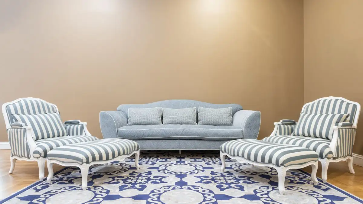
Blending two interior styles comes down to one repeated move: pick a single shared element — a color, a metal, or a wood tone — and carry it into both the dominant style and the secondary style, then hold the split near 80/20 so the dominant style owns the volume and the secondary style supplies the accent. That shared element is the load-bearing piece. Without it, two styles sit side by side in one room instead of reading as one decision.
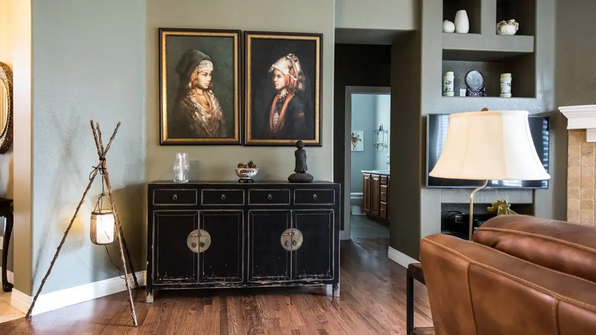
I do this standing at the door, before anything gets moved, at the hour when the light is flat and unflattering. Late afternoon in a west-facing room, gray morning in a north one. Flat light doesn't flatter anything, which is the point — it shows the actual colors instead of the ones the room wears at six in the evening in July.
Start at the floor, at the worst hour
Look down first. Not at the sofa, not at the art. The floor is the largest uninterrupted surface in the room and the one thing you are least likely to change, so it sets terms for everything above it.
Get down on the floor with your samples and slide them along the baseboard. Two or three wood tones, a couple of paint chips, a piece of metal if you have one — a hinge, a pull, the rim of a tray. You are not looking for the prettiest one. You are looking for the one that already shows up somewhere else in the room without you adding anything. If the floor is a mid-warm oak and there is a mid-warm oak object on the mantel you inherited, that bridge is already built. Your job is to not cover it up.
Most people do the opposite. They fall for the secondary style first — a brass fixture, a black window frame, a slab of dark stone — and then try to make the room agree with it afterward. That works about as often as picking a paint color from a photo on a phone.
The 80/20 split is about surface area, not furniture count
The ratio usually gets explained badly. It is framed as "80 percent of your furniture in one style, 20 percent in the other," which makes people count chairs. Count square feet of visible surface instead. Walls, floor, ceiling, cabinetry, the big upholstered piece, the rug. Those are the surfaces that carry visual mass, and whichever style owns them is your dominant style whether you meant it or not.
So the practical question is not which style you love more. It is which style you are willing to let sit quietly on the biggest surfaces. A modern room inside traditional bones means the traditional style stays dominant — trim, paneling, window casings, the floor — and modern arrives through everything that is not nailed down.
That is also where the neutral base does its work, and it is worth being precise about what neutral means here. It does not mean beige. It means low saturation and low contrast with itself: a wall color, a floor, and a large upholstered piece that do not fight each other, so both style directions have somewhere to stand. A neutral base does not erase either style. It keeps them from having to negotiate over the background.
Be honest about the limits of that, though. A neutral base contains two styles; it does not rescue a bad layout. If the seating points at nothing and the traffic path cuts through the middle of the conversation area, a perfectly bridged palette just gives you a well-coordinated awkward room.
One shared element, repeated at three heights
This is the part I would keep if I could only keep one thing. Choose one element — a color, a metal, a wood tone — and place it at three different heights: low, middle, overhead.
Low is the floor plane or something resting on it. Middle is eye level — upholstery, curtains, wall color, a lamp base on a side table. Overhead is a fixture, a ceiling detail, a piece of hardware, the top of a tall bookcase.
Three is the number because that is how many times your eye has to catch the same note before it stops reading it as coincidence. Two placements look like a pair. Three placements look like a rule. Once your eye has picked up the rule, it does the rest of the work for you — it starts connecting the traditional armchair to the modern console because the same warm gray runs through both.
Color is the most forgiving shared element, because it can travel across materials — paint, fabric, ceramic, stone — and still read as the same color. Metal is next. Wood tone is the strictest, because it is welded to the material itself; you cannot put a walnut tone on a cotton curtain and have it stick.
Which brings up the question people ask constantly about wood tones. Having four of them in a room is not automatically a mistake. It is a mistake only when none of them repeats. A light oak floor, a walnut table, and a painted console coexist fine if the floor's tone shows up on a shelf and the walnut shows up in a picture frame. Each additional wood tone raises the price of admission: it needs a repeat partner somewhere else in the room.
What is easy to swap and what locks you in
Sort your two styles into two piles before you commit to anything.
Easy to mix: lamps and light fixtures, hardware, rugs, curtains, pillows, art, accessories, small furniture. These are portable. If the blend is not working, you take them out and the room survives.
Hard to mix: fixed cabinetry, flooring, tile, trim and casings, stair railings, a stone countertop, a built-in. These carry the most visual mass and the least ability to change your mind later. They should almost always belong to the dominant style at full strength, with no hedging.
The mistake I see most is treating a hard element as if it were an easy one — repainting original trim in a color from the secondary style, or swapping period-appropriate tile for something from the other vocabulary. You have now spent your entire secondary budget on a surface you cannot take back, and you will spend the rest of the project fighting it.
There is a scale rule that goes with this, and it matters more than ornament. One large piece from the secondary style beats five small ones. A single oversized piece in a contrasting vocabulary reads as a deliberate counterweight. The same mass spread across five objects reads as clutter, and clutter is what "random" actually looks like in a finished room. Scale carries style harder than detail does.
When the room tips from contrast into conflict
Contrast and conflict are easy to confuse while you are standing in the middle of them, so use these checks.
You see the object before you see the room. If your eye lands on one piece every single time you walk in, that piece is not bridging anything. It is arguing.
There are two focal points that do not acknowledge each other. A fireplace on one wall and a bold cabinet or large screen on the opposite wall, with nothing between them connecting. Rooms can hold two centers, but they need a shared element running through both.
The color temperature is split down the middle. Warm side, cool side, no bridge. Almost always fixable with the shared element — one tone repeated across the boundary.
And the one that is hardest to name but easiest to feel: the room feels like two showrooms with the wall knocked out. You can point to where one style stops and the other starts. When the blend is working, you cannot draw that line, even though you can still name both styles inside it.
What this will not fix, and when the rule does not apply
This method is about making two styles read as one intention. It is not a substitute for getting the scale of the furniture right, and it will not make a room with an undersized rug and a sofa blocking the doorway feel settled. Proportions first, blending second.
It is also not necessary for every pair. Some styles sit close enough — two branches of the same traditional vocabulary, or a soft modern and a warm minimal — that they blend without a bridge, and forcing a shared element on them just makes the room look self-conscious.
And if what you want is the clash, the deliberate collision where the tension is the point, this is not your rule. That kind of room is composed by rhythm and repetition of quantity instead, and a single bridging element is beside the point. Different goal, different method.
For everything else: one element, three heights, and a dominant style that owns the surfaces you cannot move. Then go back to the doorway at the bad hour and notice what your eye does first. If it lands on the shared element, you are finished.