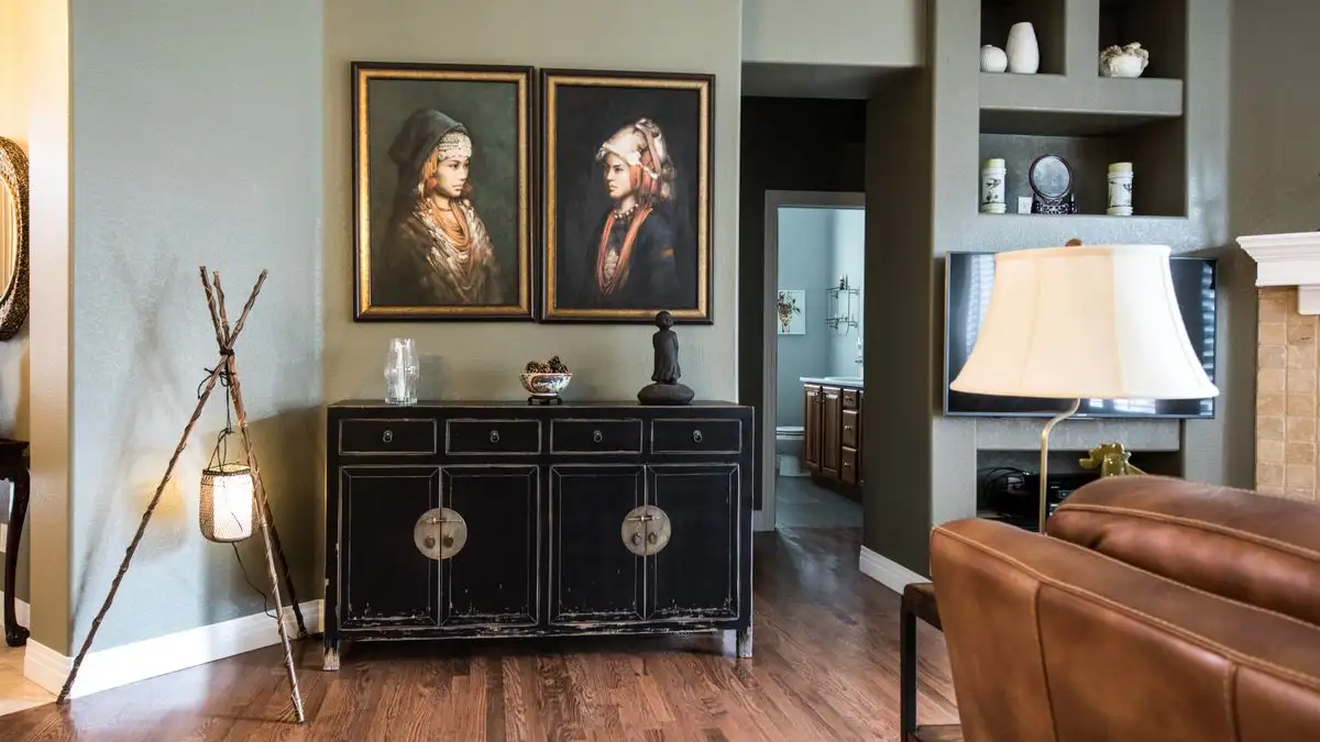
Matching furniture does not make a room feel designed. A focal point and a clear sight line do. A matched set gives the eye nothing to rank and nothing to walk toward, so the room reads as purchased rather than composed, while a room of mismatched pieces that all point at one thing and let you see it from the doorway reads as intentional. Fix the composition before you buy anything else, because composition is what people are actually responding to when they call a room "styled."
The first thing I do in any room is not measure it. I stand in the doorway with one hand on the jamb and look. Fifteen seconds, maybe twenty, before I take a single step inside. The question is not whether I like the sofa. The question is: what did my eye hit first, and where did it go second? If I cannot answer the second one, the room is not composed yet, no matter how much of it matches.
Stand in your own doorway and try it. Close one eye if that helps; it flattens the view the way a camera would, which is closer to how you actually read a room than the way you see it while walking around inside it. Then name the first thing you see. Three words or less. The fireplace. That window. The big blue painting. If you need a whole sentence to describe it, you do not have a focal point. You have a room full of equally loud objects, which is the same as a room with none.
The eye lands somewhere whether you plan it or not
A focal point is not a decorating decision you can opt out of. The eye has to land on something. If you do not decide, it lands on the brightest or highest-contrast thing in view, which is often the ceiling light, or the television, or whatever is closest to the door. That is still a focal point. It is just one you did not choose.
So the real question is whether you are picking it or inheriting it, and the way to answer that is to look at what the room already has before you look at anything you might buy.
What the architecture already gives you
Fireplace, picture window, arched opening, staircase, built-in, a good view. If the room has one of these, the work is not "point everything at it." The work is giving it room and light: nothing tall parked in front of it, a lamp or a picture light that pushes the eye toward it, and enough bare wall around it that it is not crowded by a shelf.
Two dominant features is a fight. A fireplace and a floor-to-ceiling window in the same sight line split the room every time. Pick one as primary and treat the other as a secondary moment. You can still light it. You just do not compete with it.
When the room has nothing to offer
Then you build one, and you build it at the largest scale the room can hold. A big empty wall wants one large piece rather than four small ones, because four small pieces read as four small moments and the eye gives up trying to rank them. A grouping can work, but only if you hang it tight, a few inches apart, so it reads as one shape.
Furniture can be the focal point too. A sofa with a distinct silhouette against a plain wall, a bed with a tall headboard, a piano, a console with two big-shade lamps and nothing else on it. The glow of a lamp is a legitimate target for the eye, and it is the cheapest one to install.
Whatever you choose, the test does not change: three words, from the door.
Sight lines are the part nobody explains
A sight line is the path your eye takes from where you are standing to what you are looking at, and it is set by doorways and hallways, not by taste. Walk into a room from its main door and there is a fairly predictable diagonal reading line running toward the opposite corner. That diagonal is the most valuable real estate in the room, and it is usually the first thing people cover up.
Stand in each doorway that opens into the room. Include the hallway you actually walk down every day, the one with the laundry basket in it. Look from the kitchen if it is open to the space. The room reads differently from each one, and it has to work from at least the main one.
The most common failure I see is a sofa with its back to the entry. Functionally it is fine, and in a big room it is sometimes the only sensible placement, but visually it is a wall. If you can shift it or angle it so the entry sees the corner of the sofa and the view past it, the whole room opens up without moving a single piece of art.
The second most common: something tall parked just inside the door. A bookcase, a cabinet, a coat rack. You walk in and the room is a narrow slice of nothing.
Why matched sets go flat
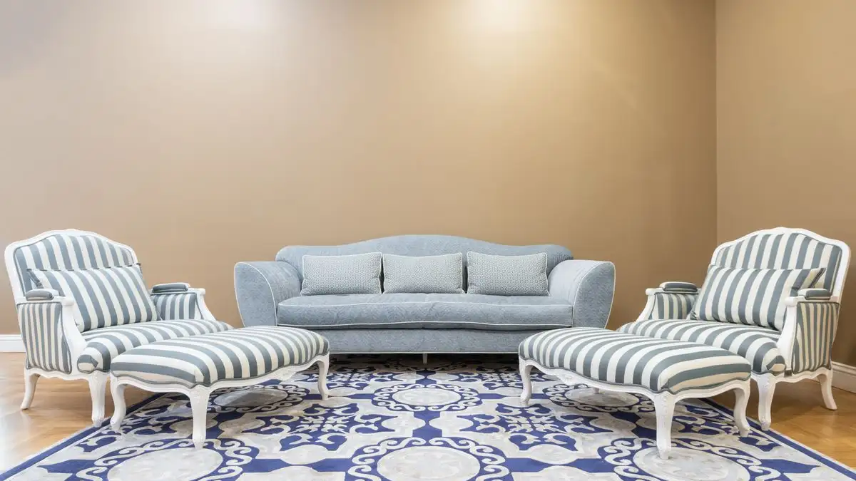
A matched set, meaning sofa, loveseat, and chair in the same fabric on the same frame with the same legs, is not design. It is a receipt. The reason it flattens a room is simple: the eye ranks things by difference. Identical pieces are visually silent. Your eye slides right over them, which is why a room full of matching furniture can cost real money and still feel unfinished.
Cohesion is not sameness, it is repetition. Pick two attributes and repeat them across every seat in the room. Wood tone. Color temperature. Seat height. Level of formality. Texture family. Then let everything else differ. A linen sofa, a leather armchair, and a pair of wood-frame chairs can live together comfortably if they share a warm mid-tone and the same low, deep seat. Nothing matches and the room still holds.
The exception worth naming: a deliberately formal room, where a matched pair of chairs flanking a fireplace is the point. Symmetry is allowed. It just has to be a decision rather than a default.
Symmetry, asymmetry, and what each one signals
This part usually gets skipped. Symmetry and asymmetry are not just arrangement choices; they are style statements, and rooms break when they are doing half of each.
Symmetry, meaning two lamps, two chairs, centered art, matched pillows, reads formal, traditional, calm, hotel-lobby. It is the safest way to make a room look intentional because the eye gets an ordered answer. It is also static. And in a room with a large asymmetry already built in, an off-center window or a door on one side, forcing symmetry around the wrong axis makes everything look crooked even when it is perfectly level.
Asymmetry reads modern, casual, collected, personal. It is harder because the eye still wants balance; you just achieve it with unlike things. A tall lamp on the left of a console balanced by a heavy dark chair on the right. Weight, not mirroring. A large light-colored piece can be balanced by a small dark one, because dark reads heavier.
The mistake I made for years was a symmetric wall over an asymmetric floor. Two matching chairs and centered art above, then a rug pushed off to one side and an ottoman floating. The room never felt finished and I kept buying things to fix it. What it needed was for one of the two to win.
Scale is doing more work than color
Art hung too small above a sofa makes the sofa look like it is floating in a warehouse, and the color choice does not save it. Hang art in relation to the thing below it, usually so the bottom edge sits roughly a hand's width above the sofa back, rather than chasing the gallery height you have read about. That height is correct for hallways and museum walls, not for the wall over your couch.
Rugs: if only the coffee table sits on the rug, the rug reads as an island and the seating reads as scattered. Get the front legs of the main pieces onto it and the group tightens like someone zipped it.
Lighting: one ceiling fixture in the middle of the room flattens everything and makes the fixture itself the focal point, because the eye goes to the brightest thing. Layer instead. Something aimed at the focal wall, something at eye level, something low. Three sources, three heights.
Contrast is how you point
The eye goes to the highest-contrast edge in view. Dark art on a pale wall. A black lamp against a light curtain. One saturated pillow on a neutral sofa. You can use that deliberately: give each sight line a single contrast event and let everything else recede.
Clutter, functionally, is contrast without hierarchy. Twenty things shouting at the same volume. The fix is not fewer things, it is ranked things. One loud, a couple of medium, everything else quiet.
When this does not apply cleanly
Open plan is the honest exception. With no walls, you get competing focal points and very long sight lines, and the usual advice breaks down. The workaround is to treat the space as a series of zones, each with its own small focal point, and one clear path connecting them.
Rentals: you cannot move the fireplace or the radiator, so the focal point is often something you bring in. A large leaning canvas, a floor lamp, a rug with real pattern.
Two-door rooms: two sight lines, no single landing point. Pick the door you use most and design for it. Treat the other as a secondary view. Trying to satisfy both usually satisfies neither.
And the television. If the TV is where your eye goes, stop pretending otherwise. Frame it, build a low console under it, put the seating on axis with it. An acknowledged focal point looks better than a denied one.
The last thing I check
Before I call a room finished, I stand at the main door, close one eye, and name the first thing I see. Then I name the second. Then I check that the path between them is not blocked by the back of anything.
Whatever that first thing is, it is the room's focal point. If it is the one you chose, the room will feel designed even with nothing matching in it. If it is not, if it is a ceiling fan or the back of a sofa or a pile of shoes, then you know exactly what to change, and it usually is not the furniture you were about to buy.