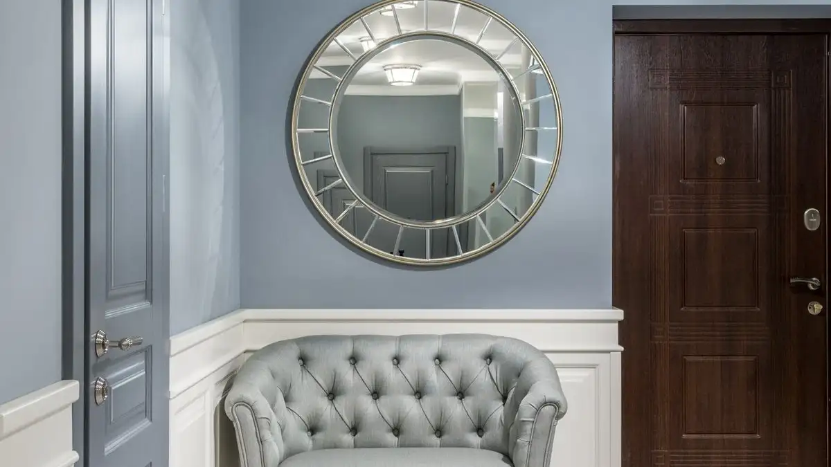
Size a wall's focal point to about two-thirds the width of whatever sits below it, and to about two-thirds of the wall's usable width when nothing sits below it. Hang it so the bottom edge clears the furniture by 6 to 10 inches, with the center near eye level, roughly 57 to 63 inches off the floor for a standing sightline and a few inches lower over a sofa. Shy of that range the wall wins and the piece reads like a postage stamp. Past it, the sofa underneath starts to look like dollhouse furniture.
I got this wrong twice in one afternoon the first time I tried to be deliberate about it. There was a 66-inch sofa against an 11-foot wall and a 24-inch round mirror I had carried home because it looked generous under the store's fourteen-foot ceilings. I taped its outline on the wall with blue painter's tape and stepped back. From six feet away, fine. From the kitchen doorway, a porthole on the side of a ship.
So I re-taped, wider this time, 44 inches across, a rectangle about two-thirds the width of the sofa, and the wall snapped into place. Not because the mirror got prettier. Because the leftover space finally divided into two margins instead of one long puddle of nothing.
That is the whole trick. You are not sizing the object. You are sizing the emptiness and letting the object take what is left.
Two-thirds is a leftover-margin rule, not a taste rule
Run the arithmetic once and it stops being mysterious. A 72-inch sofa with a 48-inch piece above it leaves 12 inches of wall on each side, which is one-sixth of the sofa width. That reads as a frame around a frame, and the eye accepts it immediately.
At half, 36 inches over the same sofa, the side margins are 18 inches each. That is usually the point where a piece starts to look undersized rather than deliberate, and it is also the point where people start asking whether they should add sconces or a narrow shelf to fill in.
At three-quarters, 54 inches, the margins drop to 9 inches each. Tight, but often right when the focal point is a pair of prints or when you want the wall to feel packed rather than airy.
Past about 80 percent, the piece stops being a focal point and becomes paneling, and the furniture under it starts looking like doll furniture. The working band is roughly 60 to 75 percent, with two-thirds sitting comfortably in the middle. What holds that band together is the margin, not any inherent beauty in the number.
One correction that trips people up: two-thirds is measured against the furniture only when the furniture is narrower than the wall. If the sofa spans most of the wall, the wall becomes the constraint and the piece has to be sized to the wall instead. Usable wall width means the paint between whatever actually breaks the wall, a corner, a door casing, a window trim, not the full run of drywall.
Running the ratio on furniture you already own
These are the numbers I keep in my head, and they are rules of thumb, not regulations.
A 72 to 84 inch sofa wants a 48 to 56 inch focal piece. A queen headboard, usually 62 to 64 inches wide, takes somewhere around 42 to 46 inches. A king headboard at 76 to 80 inches takes 50 to 54. A 60-inch dresser takes 40 to 44. A 48-inch console takes 30 to 34. A 40-inch bench takes 26 to 28.
Two things go wrong here more than anything else. First, groups count as one mass. A gallery of five frames is not five focal points, it is one, and you measure from the outer edge of the leftmost frame to the outer edge of the rightmost. Second, measure the widest point of the furniture, which for a sofa is the outside of the arms, not the seat cushions. I have watched people measure the seat, come up ten inches narrow, and then spend a month wondering why the wall feels off.
The gap above the furniture is a joint, not a frame
Six to ten inches is the band, and the reason for it is that the gap should read as a connection rather than as a separate empty stripe. Under six inches and the piece looks like it is resting on the sofa back. Over ten and the eye sees three stacked things instead of one composition: furniture, dead wall, art.
Within that band, lean toward 10 when the piece is tall, and stay near 6 when it is short and wide. Over low furniture (a bench, a floating console, a low platform bed), the gap gets pushed up by simple geometry and everything looks floaty. The fix is usually not to shove the art down onto the furniture. It is to raise the visual top of the grouping with a lamp, a tall plant, or a taller anchor piece, so the joint has something to meet.
Ceiling height is the number almost nobody checks
Ceilings matter because they set the size of the wall band above the furniture. That band, not the piece, is what decides whether the composition feels tight or generous.
With an 8-foot ceiling and a sofa back at 33 inches, you have 63 inches of wall to work with, from 33 up to 96. Take out 8 inches of gap and roughly 55 inches remain for the piece plus whatever air sits above it. A 40-inch-tall piece leaves about 15 inches at the top, comfortable. A 48-inch piece leaves 7, and that starts to pinch.
At 9 feet, the band is about 75 inches, and a 44 to 56 inch piece sits easily. At 10 to 12 feet, the band runs 87 to 111 inches, and now a 40-inch piece reads small not because of the sofa but because of all the air above it. This is where people buy art that is technically two-thirds wide and then wonder why the wall still feels empty. The width was right and the height was wrong.
When width and eye level disagree
Eye level pulls the center of the piece to about 57 to 63 inches off the floor. There is some room to bend that by use. Over a sofa you are sitting, so a center around 54 to 58 often looks better. Over a dining sideboard you are standing, so 60 to 64 works. A mirror reflects whatever is opposite it, which is worth checking before you commit, since a center that looks right can end up reflecting a light fixture.
If the two-thirds width and eye level fight until you run out of room, the width generally wins. You can bend the height by several inches and nobody walking through will notice. Short the width by a foot and it is obvious from the doorway.
Contrast buys you size, within limits
Visual weight is not just area. A small dark piece on a pale wall reads as more mass than a large washed-out canvas. A wide white mat inside a black frame does the same thing: the frame carries the mass and the image is just what sits inside it. Busy, low-contrast, pale pieces shrink on the wall no matter what their measurements say.
So if you are three or four inches under two-thirds, you can usually close the gap with a wider mat, a darker frame, or a subject with strong darks instead of a pale one. What you cannot do is fix a 16-inch piece on an 11-foot wall with framing. Past a certain distance from the ratio, the arithmetic is simply wrong and no mat will carry it.
Testing a size before you buy anything
Cut a shipping box to the outer dimension of the piece, including the frame or mat, and tape it to the wall. Then leave the room and look back through the doorway, because that is where the compression happens. Everything looks bigger at arm's length, and almost everything looks smaller from where you actually stand when you walk in.
Check the two side margins first. They should look like roughly equal strips of wall, not like the piece is pinned in the middle of an ocean. Then check the bottom gap and confirm it reads as a joint. Then check the space from the top of the piece to the ceiling. Under about a foot and the wall looks pinched no matter how good the piece is, which is really a signal that the piece is too tall for the room rather than too wide.
Where I stop trusting the ratio
Gallery walls break the rule on purpose. The mass is the unit, not the frames, so six small prints can hold a wall that one large piece would have had to earn by width alone.
Very short walls, under about 5 feet of usable paint, can make two-thirds produce a piece that is nearly wall to wall. Back off to 55 or 60 percent there and give the corners a little room to breathe.
Very long walls can make two-thirds mean a piece too wide to exist. Break the wall with furniture, a doorway, or a grouping, and size each segment separately. The usable width ends where the sightline breaks, so measure between the corner and the door casing, not the whole run.
Open-concept and two-story walls follow the same logic at larger scale. In a two-story foyer, eye level is nearly irrelevant because nobody stands that close to the wall. What matters is the view from across the room, so center the piece in the part of the wall you actually see rather than following the 60-inch habit.
And when the piece is the thing you love and the wall is a rental you will eventually leave, hang it slightly wrong.
The number that actually matters
When I am standing in a room with a tape measure, the number I care about is not the width of the art. It is the width of wall left over on each side, and the depth of the joint between the piece and the furniture beneath it. Two roughly equal margins and a bottom gap that reads as a connection: that is a focal point that is the right size, whether it is a 30-inch mirror or a 60-inch canvas.