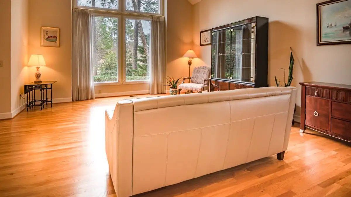
Plank width, grade, and layout direction decide whether a hardwood floor reads calm or restless, and all three should be chosen against the room's real proportions and the way light actually hits the floor — not against whatever the store had stacked near the register. Species and stain get all the attention, but width sets how many lines your eye has to cross, grade sets how many small events happen along those lines, and direction decides which joints the light will find first.
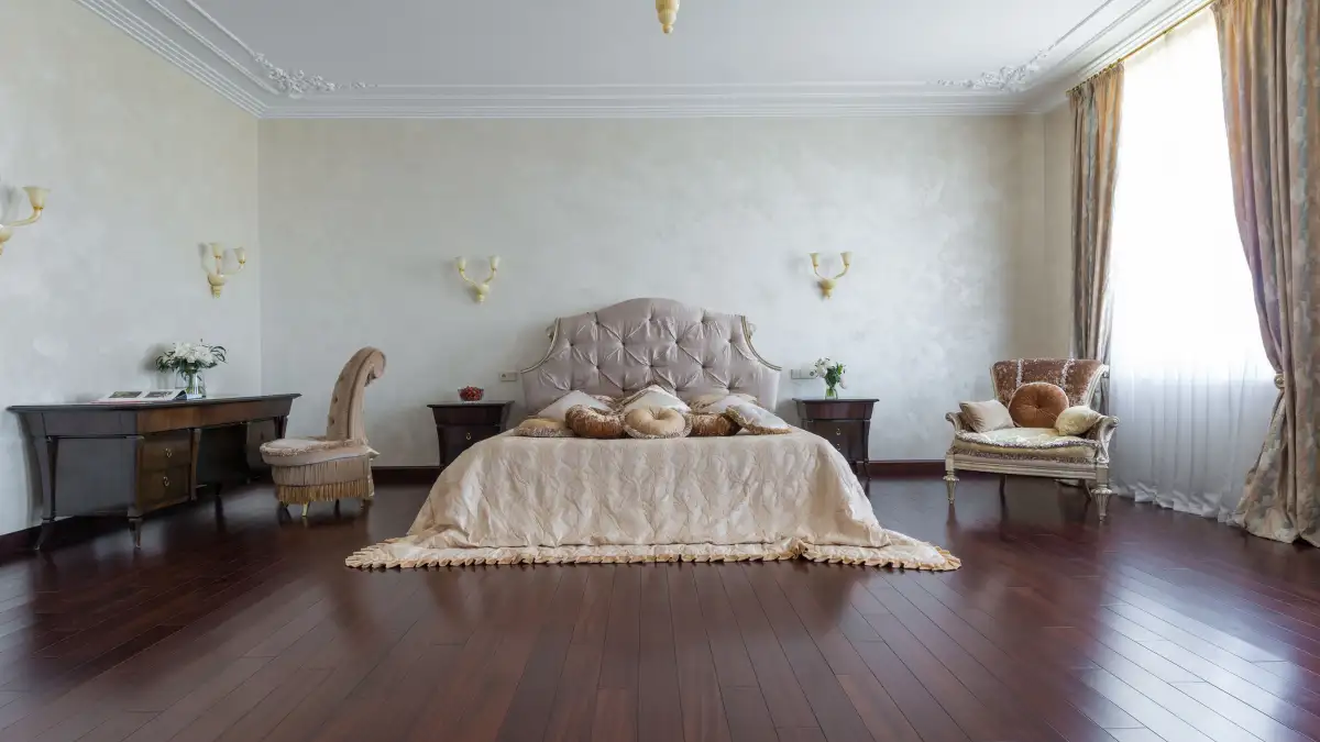
Come stand in the doorway with me. It's a dining room in an old house, maybe twelve by fourteen, one wide window on the long wall, and it's four in the afternoon in January. I've got a sample in each hand — one about three and a quarter inches wide, one about seven — held at arm's length and tipped so the low sun rakes across both at the same angle. Same species, same stain, same finish. The narrow one looks like a floor. The wide one looks like a tabletop that came loose. Nothing about the wood changed between my two hands. Only the number of seams the light could catch.
That was the day I stopped picking flooring off a rack and started picking it in the room it was going into.
Light tells the truth about width before your eye does
Showroom light is flat. It comes from everywhere at once, and flat light erases grain, softens the height difference between planks, and shrinks the difference between grades. Your house does not have that light. It has one or two directional sources, and at the hours you actually live in the room, they come in low and sideways.
So do the walk-through at the right hour. In my old kitchen, the light at seven in the morning came in horizontal off the east windows and turned a floor I liked into a ladder of joints; by noon the same floor went quiet. Same planks, different sun. If the room you're flooring is lit mostly by one window and you care most about how it looks at dinner, that's the light you are designing against — not the light the samples were lit by.
Sheen isn't separate from this, either. A high-gloss finish reflects each board edge and turns a narrow-plank floor into a visible grid. A lower-sheen finish softens seams, which is part of why a busier grade can survive under a matte finish in a room where the same grade under gloss would look frantic.
Width and grade are one decision wearing two price tags
The number I actually use is the seam count. Take the shorter dimension of the room in inches and divide by the plank width. A twelve-foot room is 144 inches. At three and a quarter inches wide, that's roughly forty-plus seams across the floor; at seven inches, it's about twenty. That's the quantity your eye is processing when you walk in, and it explains why two rooms with the same wood can feel completely different in busyness.
So the width question is really a scale question. In a small bedroom, a very wide plank doesn't read as generous — it reads as out of scale, and it can make the room feel smaller than it is, the way an oversized tile can make a bathroom feel like a closet. In a large living room, a narrow plank can read as nervous, all those lines with nothing to rest on. There's a middle where neither happens, and it moves with the room.
Then you multiply by grade, which is where most buying decisions go sideways. Hardwood grades are appearance grades, not quality grades:
- Clear has essentially no knots or mineral streaks and a tight color range. It reads as one continuous surface.
- Select has a few small knots and some tonal movement.
- #1 Common, sometimes sold as Natural, has clear plank-to-plank color variation and occasional knots. The wood is sound.
- #2 Common, sold as Rustic, Character, or Cabin depending on the mill, has pronounced knots, mineral streaks, and a wide color range.
Here's the part that gets lost: a #2 Common board and a Clear board of the same species and milling are equally good floors. What you buy with a higher grade is uniformity, not durability. I've watched people pay a premium for Clear expecting it to wear better. It does not wear better. It looks quieter.
Width sets the number of lines. Grade sets the number of events along those lines. A three-inch plank in a Character grade in a small room is busy multiplied by busy. A seven-inch Clear plank in a great room is nearly silent — and every so often, too silent. A floor with almost no variation under raking light starts to look manufactured, because the products imitating wood can't fake that variation. Calm and dead are neighbors, and which one you get depends on how much else is going on in the room.
Which way the boards run, and which joints you'll live with
Running planks parallel to the long wall is the default because it stretches the room. That's real, and it's usually right. But in a long, narrow room it's also how you get a bowling alley. Running the boards across the short dimension can pull the proportions back toward square, and nobody standing in the finished room will be able to say why it feels better.
Then run the light test, because this is the part people skip. Whichever axis the boards run on, the joints perpendicular to the light direction are the ones that light up. If the window is on the long wall and light enters perpendicular to it, planks running parallel to that wall put the light across every side seam — you see the floor as stripes running away from you. Turn the planks perpendicular instead and the long seams get lit lengthwise and almost disappear, but now every butt joint reads like a bar code across the room.
There is no arrangement where nothing shows. There's only the one where you decided which joints you'd rather look at for the next twenty years.
Pattern floors are a subfloor decision first
Herringbone and chevron cost more in material, and the reason isn't the pattern itself — it's that the pattern forces cuts. Every run begins on a cut and ends on a cut, and the offcuts mostly can't become anything else. On straight-lay rooms my offcut pile has been modest. On a herringbone hall with four doorways, the pile was closer to a quarter of what came off the truck. Treat that as the shape of the problem rather than a number to budget from; a pattern in one open room is a different equation than the same pattern chopped up by closets and thresholds.
Chevron usually runs heavier than herringbone, because the ends are angle-cut to marry into a continuous zigzag, which is more waste per piece and less forgiveness in the field.
And before any of that: the subfloor. Pattern work turns short pieces repeatedly, and every dip in the subfloor becomes a place where the pattern visibly flexes. Herringbone also has to be set off a reference line. If the walls are out of square — and they usually are — you either center the pattern and let the border wobble, or you hold a straight border and let the field run out of parallel with the wall. Neither one is free, and both are decided before the first piece goes down.
Wide planks carry their own version of this. A wide board spans more of a dip than a narrow one, so it telegraphs subfloor unevenness more. Wide planks also move more with humidity swings, which means the gaps that open at the seams are wider and more visible when they do. That's a genuine tradeoff, not a reason to avoid wide plank, but it's the reason wide plank wants a flatter subfloor and steadier indoor humidity.
Doorways are where the layout actually gets decided
The eye follows the boards, and it lands on whatever they run into. So plan the layout from the doorway inward, not from the far wall. The view you get a hundred times a day is the one from the threshold, and a field that's centered in the room but off-center in the doorway will bother you forever.
Same direction, same width, through an open cased opening keeps two rooms reading as one space. A change of direction at a threshold is a real decision, and it costs you a transition strip and a hard line whether you wanted one or not. In a small house, changing direction at every doorway makes the whole house feel chopped into pieces.
Where the wood meets tile or carpet, arrange the field so the transition lands on a plank edge and so the last course before it isn't a sliver. A two-inch sliver at a threshold looks like a mistake even when the install is perfectly sound. Every transition also has a height to solve, which is far easier if you know about it before the material is ordered.
The order that keeps it from going wrong
Work it in this sequence: what the light does in the room, then the room's proportions, then plank width, then grade, then direction, then pattern or not, then a waste factor that reflects how many times the floor has to stop and start.
And accept that sometimes the room says no. A wide plank in a small room can work beautifully if the grade is calm and everything around it is quiet — the width isn't the problem, the noise is. What you're managing the whole time is the total amount of visual activity the floor contributes, and every one of these choices either adds to that total or takes away from it.
The floor you end up regretting is almost never the wrong color. It's the wrong rhythm.